Register for #GIJC25
November 20, 2025 • 09:00
-
day
days
-
hour
hours
-
min
mins
-
sec
secs

Accessibility Settings

color options

monochrome muted color dark

reading tools

isolation ruler

Posts

308 posts

Data Journalism

Data Journalism Top 10: National Geographic Maps, Capitol Riots, Flu vs. Coronavirus, Happiness Index, Black Market Data

Scenes of supporters of outgoing President Donald Trump storming the US Capitol building dominated news headlines and filled social media feeds last week. Our NodeXL #ddj mapping from January 4 to 10 found Reuters producing a play-by-play summary of what happened, and FiveThirtyEight examining the stark difference in reaction by the authorities to the Capitol mob compared to Black Lives Matter protesters. Also in this edition, we feature National Geographic’s cartography archive, Data Crítica’s investigation into under-counting of Indigenous COVID-19 infections, and The Markup’s analysis of the impact of Facebook’s political ads.

News & Analysis

Saving Journalism: A Vision for the Post-COVID World

A new report maps ambitious COVID-era efforts around the world to save journalism, including ideas from the United States, South Africa, Denmark, and Singapore.

News & Analysis

Editor’s Pick: 2020’s Best Investigative Stories in Russian and Ukrainian

In this review of the best investigations in Russian and Ukrainian last year, the GIJN Russian team selected the stories that shed light on systemic societal problems in many countries in the region, and those which may inspire journalists in other parts of the world to investigate corruption, money laundering, and other topics using the same investigative methods and tools.

Data Journalism

GIJN Toolbox: CrowdTangle, Echosec, and Searching Social Media

In this second edition of the revamped “Toolbox” series, GIJN walks readers through how to use Echosec and CrowdTangle to discover content posted to social media sites like Twitter and Facebook. We also discuss the now-defunct Facebook graph search and ways to still crack the case regardless.

Data Journalism

Data Journalism Top 10: Hawaii’s Disappearing Beaches, Stolen Paintings, Investigating Disappearances, Herd Immunity Calculator

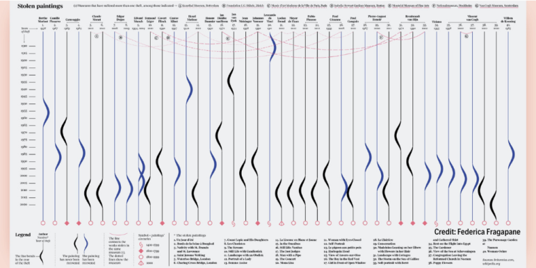
Hawaii’s scenery can be breathtaking, with cliff-rimmed white-sand beaches and surf-worthy waves. But our NodeXL #ddj mapping (Dec. 28-Jan. 3) found ProPublica highlighting dramatic erosion of the island state’s beaches over the past century. Also in this edition, we feature an interactive graphic to calculate the time to achieve COVID-19 herd immunity based on the US vaccination rate, a global vaccine distribution tracker, Federica Fragapane’s visualization of stolen paintings, and a compilation of 2020’s best data visualization lists.

GIJN’s Top Reads for 2020

At the end of the year, GIJN compiles a list of its most viewed stories and resources. Here’s the listing for 2020’s top performing stories, including stories on the good and bad of South African journalism, how the global pandemic is affecting Africa’s print newspapers, the year’s top investigative podcasts from around the world, and more.