GIJN Toolbox: Satellite Data, Tracking Usernames, and Facial Recognition
Read this article in
In this edition of The GIJN Toolbox — which surveys the latest tips and tools for investigative journalists — we’ll take a look at the process of analyzing satellite imagery derived from infrared radiation, a technique The New York Times used to cover a West Coast wildfire. We’ll also explore the controversial practice of using facial recognition technology, how to request NASA satellite data, a new document search tool from Google, and more.
Using Thermal Imagery to Investigate the Origins of a Fire
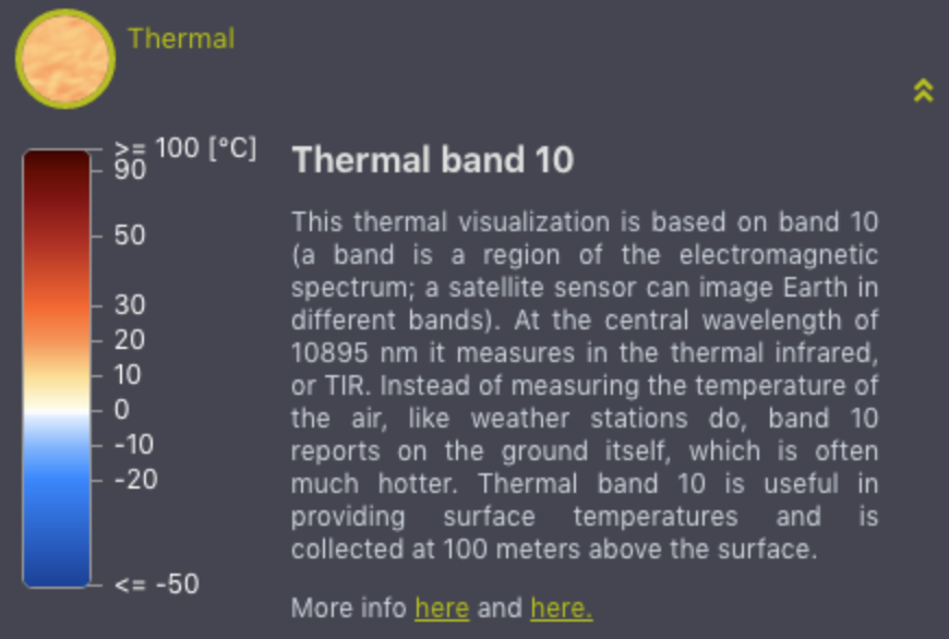
Image: EO Browser
The visual investigations team at The New York Times produced a video describing how a particularly destructive fire in the US state of Oregon started and spread. The video’s producer, Christoph Koettl, used a tool called EO Browser — EO stands for earth observation — to access satellite data. Landsat 8, a satellite built by Orbital Science Corporation, was launched by the US government in 2013 and has several instruments onboard that collect data, which is then sent back to earth. To visualize the area where the fire started, Koettl used imagery from a thermal infrared sensor built by NASA to observe where heat was emanating from. He compared that image with true color satellite imagery, as seen in the video below, to show the area where the fire started.
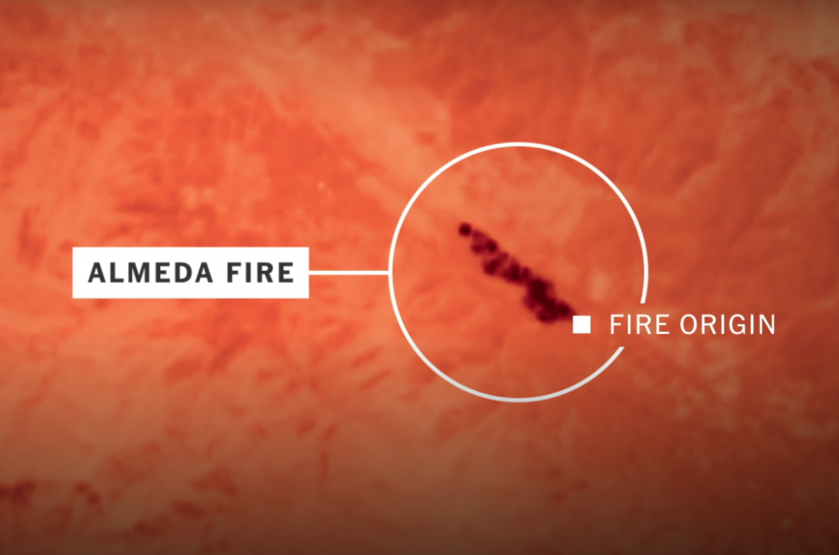
Image: The New York Times
Another useful source is active fire data from NASA’s Fire Information for Resource Management System, or FIRMS. On this page, you can download fire data from the past 24 hours, 48 hours, or seven days, or you can make a download request from the archive for older data.
NASA offers data from two sets of instrumentation: MODIS and VIIRS. MODIS stands for Moderate Resolution Imaging Spectroradiometer and is a key instrument aboard two of NASA’s satellites, named Terra and Aqua. According to NASA, MODIS sees “the entire Earth’s surface every one to two days.” VIIRS, which stands for Visible Infrared Imaging Radiometer Suite, is one of five instruments onboard the Suomi National Polar-orbiting Partnership (NPP) satellite platform that was launched in 2011. It collects “observations that span the visible and infrared wavelengths across land, ocean, and atmosphere.” (To learn more, click here for the metadata pertaining to the MODIS data, and click here for the metadata pertaining to the VIIRS data.) For a journalism example that uses this data, see this article from Germany’s ZDF heute about fires in the Arctic.
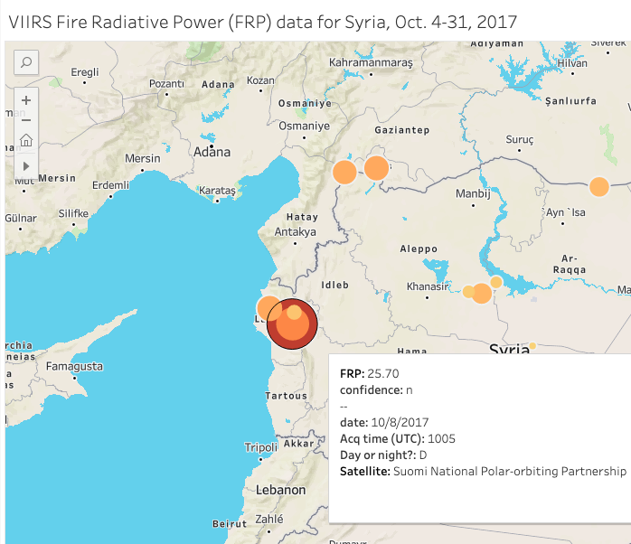
NASA’s active fire data is geotagged (with latitude and longitude) and can be mapped using Geographic Information Systems (GIS) software such as ArcGIS or QGIS, or data visualization platforms like Flourish, Datawrapper, or Tableau. I made this visualization in Tableau using the VIIRS data for Syria in October 2017. And, for comparison, I made this visualization using the MODIS data for the same time period. You can click through the days using the button in the top right corner of the map. Using the FIRMS data from NASA, you might be able to substantiate claims of airstrikes or verify that fighting took place in a specific area by cross referencing the visualized data against news reporting or user-generated content.
The satellites transmit date and time data in UTC, or Coordinated Universal Time. Since I requested data from NASA for the time period between October 4-31, 2017, it’s important to note for verification purposes that Syria was UTC +3 for October 4-26, and UTC +2 for October 27-31. Between both MODIS and VIIRS data, you get fairly decent coverage throughout the day. What’s really interesting is when the acquisition times — when a satellite collects an image or data — overlap or get close to overlapping, and you can see if the instruments detect similar readings on the ground. For example, on the morning of October 8, 2017, two separate satellites using two different sets of instrumentation picked up similar readings at almost the exact same coordinates in Latakia Governorate. Here’s the VIIRS readout:
And here’s what MODIS instrumentation aboard NASA’s Terra satellite picked up about two hours earlier:
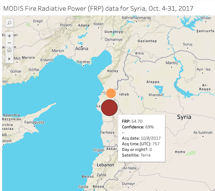
Fire radiative power, often abbreviated as FRP, “is a measurement of the amount of heat released by a given fire in megawatts” that helps “scientists pinpoint the active front of a fire,” according to NASA. Since both the MODIS and VIIRS datasets contain high FRP readings in nearly the exact same spot, we can infer that something of interest happened at that location on the morning of October 8. What exactly, we’re not sure, but we can use conflict trackers like Liveuamap to go back to that day to see what was posted on social media in our area of interest in Latakia Governorate.
Finding Usernames on Social Media
If you find a username that you’re interested in researching further, try plugging it into Whatsmyname.app. It will find other accounts at websites with the same username. This can be very useful if you found your person of interest, say on Twitter for example, but they haven’t tweeted much. Using this tool, you can find other websites where that person, using the same handle or username, might have accounts.
If you’re comfortable with the Python programming language and the command line, you can also try a similar tool called Sherlock. You can install Sherlock on your own machine or, if you have a Google account and some command line knowledge, on a Google Cloud Shell instance. A third tool is called Holehe. The tool is easy to install via the command line and presents a simple, color-coded output. I ran my own username through these three tools, and they found slightly different results. So if you run your username of interest through all of these, you should be able to scoop up just about every account with that username.
Another way to find a person’s social media accounts is by using Social Links PRO, a paid tool (in roughly the $1,000-3,000+ range) that is used within the network mapping software Maltego Pro, which itself costs $999 per year. Social Links and Maltego are a powerful combination because many data sources (including OpenCorporates, DocumentCloud, and Pipl) are integrated into one tool. An added benefit is being able to search for social media accounts using facial recognition and outputting results into a network graph.
Here’s a quick example: Let’s say I want to find all the social media accounts for Los Angeles County District Attorney George Gascón. I’ll create an “entity” or a node and add his name and a picture of his face, and the tool will use facial recognition and text matching to find his social media accounts. Doing this, I was able to find four of his social media accounts: Facebook, Instagram, Twitter, and LinkedIn.
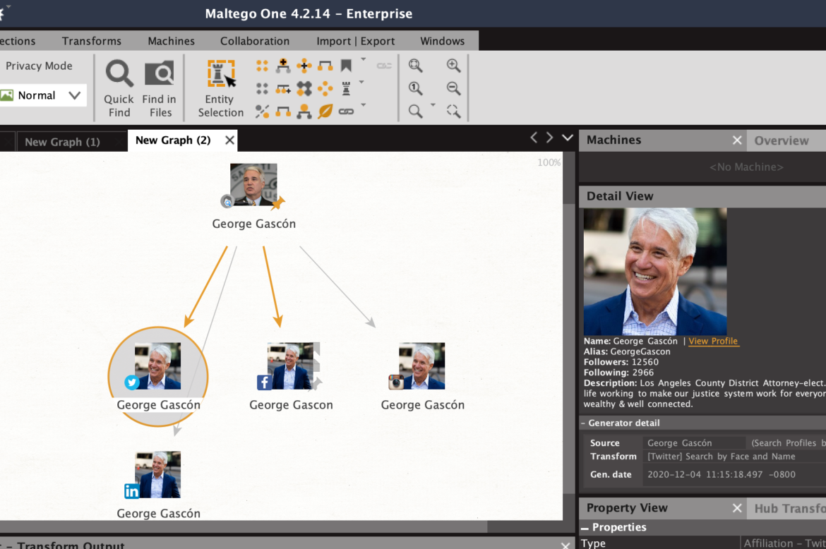
Screenshot: Maltego
Facial Recognition: Valuable but Risky
There are other tools that can search by face, like Pimeyes and Findclone.Ru, but before you go running to those sites to upload your face to see if it works, take heed of the risks of doing so. The Markup’s Blacklight tool, which scans and lists user-tracking technologies on websites, found a “session recorder” on the Findclone website, meaning that it could be tracking your keystrokes and mouse movements. Blacklight also found that Pimeyes “seems to use [Google Analytics’] ‘remarketing audiences’ feature that enables user tracking for targeted advertising across the internet.” And be aware that uploading your face means giving up control of your biometric data, and uploading someone else’s face without their consent could violate terms of service or even laws.
The Russian search engine Yandex also has a reverse image search that can detect faces, but the search results may turn up many false matches. Also, note that when you upload an image to Yandex, it will likely be forever archived on a server in Russia somewhere, so proceed with caution. (For more on Pimeyes and Yandex, listen to Henk van Ess’ comments on our GIJN webinar here.) The New York Times has covered Clearview.ai’s facial recognition capabilities, but the company is currently only offering access to law enforcement agencies.
Privacy concerns notwithstanding, facial recognition could prove to be a valuable tool for investigative journalists who might want to identify and then research people seen in videos posted online, as in the recent assault on the US Capitol. Or consider the case of Libyan warlord Mahmoud Mustafa Busayf Al-Werfalli. For the first time, prosecutors at the International Criminal Court used videos posted to social media to obtain an arrest warrant in 2017 for an individual seen on video committing what prosecutors allege are war crimes. In the videos, a military commander appears to be conducting brutal extra-judicial killings by firearm — either by ordering his subordinates to fire or by pulling the trigger himself. Videos posted to social media can be used as evidence — both in legal and journalistic contexts — but emerging facial recognition technology presents moral and ethical quandaries, as well as privacy and security issues.
Pinpoint
We’ll round off this month’s Toolbox with a new tool from Google that will have wide appeal to any reporter working with various types of documents. Pinpoint (formerly known internally at Google as Backlight) is a document search tool that automatically pulls proper names, organizations, and places from large troves of data and displays them in a clickable list format. Pinpoint accepts many different file types, including PDFs, audio, images, text, and Microsoft Office files like Word and Excel.
Pinpoint will analyze documents in seven languages: English, French, German, Italian, Polish, Portuguese, and Spanish. It also automatically transcribes English-language audio files. You can view the launch press release from the Google News Initiative here, or click here to apply for access to Pinpoint.
Recommended Links
- “Digital Witness: Using Open Source Information for Human Rights Investigation, Documentation and Accountability.” (Available for purchase on Amazon)
- The article: How OSINT Helps Us Hold Governments to Account During the COVID-19 Pandemic, by Amnesty International’s Citizen Evidence Lab
- And Free for All — October: Freely Accessible Wildfire Maps and Data by Apollo Mapping
Additional Reading
Resources for Finding and Using Satellite Images
How The New York Times Tracked Public Data to Produce “Killing Khashoggi”

Brian Perlman is an assistant editor at GIJN. He specializes in human rights violations research using advanced digital forensics, data science, and open source techniques. He is a graduate of the UC Berkeley Graduate School of Journalism and a former manager at the Human Rights Center at Berkeley Law.

Tipsheet: Latest Tools for Investigating with Telegram

Investigating Elections: Threat from AI Audio Deepfakes

Updated GIJN Databases (Poverty, Crime, Corruption, and Terrorism)

Updated Resources on Corruption
Data Journalism Top 10: Global Water Stress, Fentanyl Proliferation, Maui Fires
Data Journalism Top 10: Europe’s Drying Rivers, US Student Debt, Revisiting the Moon, Censoring Big Bang Theory

Sigma Awards: 10 Lessons for Data Journalists Around the World
Data Journalism Top 10: Chaos in Kabul, Heat Deaths, Earth’s Biomass, Mapping Global Wildfires, Smearing the Greens

This work is licensed under a Creative Commons Attribution-NoDerivatives 4.0 International License
Republish our articles for free, online or in print, under a Creative Commons license.
Republish this article
This work is licensed under a Creative Commons Attribution-NoDerivatives 4.0 International License
Read Next
Data Journalism Data Journalism Top 10
Data Journalism Top 10: Global Water Stress, Fentanyl Proliferation, Maui Fires
With stories about global water stress, the boom in fentanyl trafficking at the US-Mexico border, the devastating fires in Maui, and strategies for taking penalty kicks.
Data Journalism
Data Journalism Top 10: Europe’s Drying Rivers, US Student Debt, Revisiting the Moon, Censoring Big Bang Theory
Our weekly analysis of the most popular data journalism stories on Twitter features the mapping of Europe’s drought-stricken rivers, NASA’s plans to return to the moon, how the war in Ukraine compares to other modern conflicts, tracking a stolen truck, and examining Chinese censorship of foreign content with edited episodes of The Big Bang Theory.
Data Journalism News & Analysis
Sigma Awards: 10 Lessons for Data Journalists Around the World
The Sigma Awards celebrate the best in data journalism from around the world. Speaking at the Perugia International Journalism Festival, three of the founders of the award highlighted the best projects of recent years and pointed to what journalists can learn from these data stories.
Data Journalism
Data Journalism Top 10: Chaos in Kabul, Heat Deaths, Earth’s Biomass, Mapping Global Wildfires, Smearing the Greens
Our mapping of top data journalism links from August 16 to 22 found maps by The New York Times and Washington Post showing chaos at Kabul airport as thousands flee the Taliban, an investigation into heat-related deaths by NPR and Columbia Journalism School, a look at a mysterious poster campaign attempting to smear Germany’s Green party, and a comprehensive visualization of Earth biodiversity.