Data Journalism Top 10: Musical Taste by Politics, Podcasts, Polling Problems, COVID Tweet Analysis
Read this article in


The recent US presidential election dominated Twitter chat waves last week. Our NodeXL #ddj mapping from November 2 to 8 found data journalists sharing live election results trackers by Bloomberg, The Washington Post, and The New York Times. The Atlantic and Slate weighed in on the problems of polling, Germany’s ZDF heute looked at musical taste by political party, while open source platform Mapbox organizes an election mapping contest. In other news, Lazer Lab created a dashboard to explore 29 million tweets related to COVID-19, while Microsoft Research released an open source visualization platform.
Musical Tastes Across the US
Does musical taste vary by political persuasion? Using data from digital streaming service Spotify and Google Trends, German television program ZDF heute analyzed the musical tastes of Americans and found that people in Republican states apparently prefer pop and country, while those in Democratic states often listen to hip hop and rap.
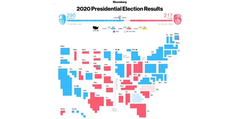
Election Results Trackers
Many news organizations were live-tracking the results of the US presidential election last week. Bloomberg’s graphics drew particular praise from the data journalism community. The Washington Post’s live results page and The New York Times’ interactive were also popular.
The Polling Problem
There isn’t much sympathy for pollsters on Twitter in the wake of the US presidential election, particularly for FiveThirtyEight — a site well known for its opinion poll analysis. The site was among those predicting a bigger win for Democratic candidate Joe Biden, but Republican incumbent Donald Trump came much closer than expected. The results raise questions about the value of polling, and about what went wrong. David A. Graham and Joshua Keating both weighed in on the problem in The Atlantic and Slate, respectively.
Podcast: The Seen and The Unseen
In episode 196 of The Seen and the Unseen podcast — which looks at politics, economics and behavioral science — Amit Varma interviews data journalist Rukmini S. The segment covers her background in journalism, the learning curve for working with data, and her podcast on COVID-19, The Moving Curve, in which two nights a week she considers a question around the coronavirus epidemic in India.
US Election Mapping Contest
Back to the US: In the aftermath of the vote, Mapbox is running an election mapping contest. Build a map, write a blog post to describe how you built it, and enter the contest before the November 30 deadline. Categories include: best untold story, best practical tool, and best data mashup. Find out about the criteria and prizes here.
Charticulator: A Visualization Platform
Microsoft Research has released an open source visualization platform — Charticulator. The platform not only enables charts to be created from data using a simple drag-and-drop interface, it enables full customization of the elements within charts in the same way.
https://twitter.com/LaughlinPaul/status/1323679835940704256
Analyzing COVID-19 Tweets
What are a half million Americans tweeting about regarding COVID-19? Researchers from Northeastern University’s Lazer Lab in Boston created a dashboard that allows you to explore the top links, domains, and keywords extracted from 29 million tweets related to COVID-19 shared between January 1 and October 30.
https://twitter.com/aleszubajak/status/1318939157562052611
Swing States Explained (in Spanish)
Journalists Ferran Morales, Maria Crosas, and Miquel Pellicer put together an explainer on swing states related to the US presidential election and analyzed potential outcomes based on historical election data from the 2008, 2012, and 2016 elections.
Data Journalism Funding (Malaysia and Latin America)
Malaysian journalists can apply for a data journalism workshop organized by the European Union, Internews, Data-N, and the Sinar Project, which takes place over four days later this month. Selected participants stand a chance to win story grants worth €2,000 each upon completion of the workshop. Apply here. For journalists in Latin America who attended at least one of the Knight Center’s recent Spanish-language data journalism training sessions, there is an opportunity to win US$10,000 data journalism funding for your newsroom. Details here.
Data Journalism Tutorials (in Russian)
Russian investigative news site IStories is uploading data journalism tutorials on its YouTube channel. The latest lessons deal with the programming language Python, for which you can view part 1 and part 2. For more, check out this tweet thread.
Thanks again to Marc Smith and Harald Meier of Connected Action for gathering the links and graphing them. The Top Ten #ddj list is curated weekly.
 Eunice Au is GIJN’s program manager. Previously, she was a Malaysia correspondent for Singapore’s The Straits Times, and a journalist at the New Straits Times. She has also written for The Sun, Malaysian Today, and Madam Chair.
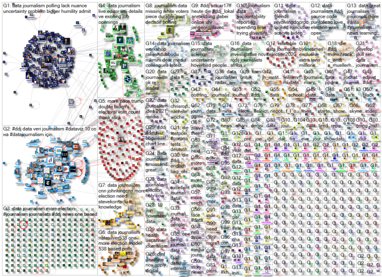
For a look at NodeXL’s mapping on #ddj and data journalism on Twitter, check out this map.

This work is licensed under a Creative Commons Attribution-NoDerivatives 4.0 International License
Republish our articles for free, online or in print, under a Creative Commons license.
Republish this article
This work is licensed under a Creative Commons Attribution-NoDerivatives 4.0 International License
Read Next

Data Journalism
10 Outstanding Data Projects Win the 2024 Sigma Awards
There were 52 data journalism entries from 22 countries in shortlist for the 2024 Sigma Awards. Here are the top 10 winning projects.
Data Journalism Methodology
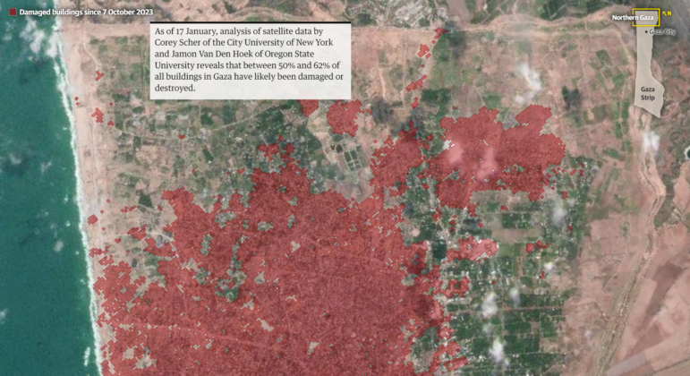
Mapping Conflict: Using Satellite Radar Data to Track the War Damage in Gaza
Gaza’s urban landscape has changed profoundly since the start of Israel’s military campaign. Researchers Jamon Van Den Hoek and Corey Scher have been mapping the impact.

Data Journalism Data Journalism Top 10
Trump’s Disappearing Donors, Tracking the Mars Rover, and the Ongoing Wars in Gaza and Ukraine
Our column of the best in data journalism also features stories on AI’s ability to forecast the weather, analyzing the Argentine president’s Tweetstorms, and apathetic EU voters.

Data Journalism
Updating the Inverted Pyramid of Data Journalism
Data journalist and instructor Paul Bradshaw has updated the Inverted Pyramid of Data Journalism — and brought together resources for every stage.