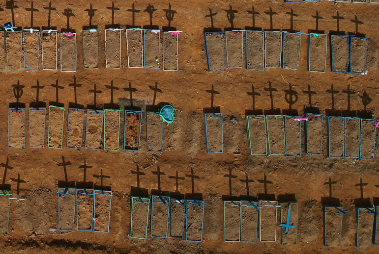
An aerial view of crosses casting shadows at the Parque Taruma cemetery, amid the coronavirus disease (COVID-19) outbreak, in Manaus, Brazil, June 15, 2020. Picture taken with a drone. REUTERS/Bruno Kelly - RC2S9H9D3KH3
How Data Journalists Exposed the Real COVID-19 Death Toll in Brazil
An aerial view of crosses casting shadows in June at the Parque Taruma cemetery in Manaus, as COVID-19 deaths continue to mount in Brazil. Photo: Bruno Kelly / Reuters
With the help of two former students, Brazilian data journalist Marcelo Soares collected data showing that deaths from COVID-19 in Brazil’s cities were far higher than authorities claimed.
“In March, in the early days of the pandemic in Brazil, I was intrigued by the lack of detailed data [from] the Health ministry,” Soares said. “They only published case counts aggregated by state, with a delay in comparison to what state secretaries published.”
Using Datawrapper, Flourish, and Google’s Data Studios, Soares created interactive graphics, including a heat map that was published along with his stories in Brazilian Report.
“I began checking all the 27 states to get the city-level data,” Soares said. “States had different formats to report data, and formats changed every day, so it was hard to automatize.”
Soares visited state health secretaries every day to collect the data gathered by each municipality and found out state data was more up-to-date than the federal government’s, as the ministry was collecting them by phone.
“Even if there is a national notification system that goes right up to municipalities, there are multiple parallel systems,” Soares said.
The data came in various formats that Soares had to standardize in order to be able to analyze it all together.
“Some had HTML tables, some had micro data, some had PDF reports, and one in the Amazon published the cases only in social media cards,” he said. “In March, it was taking me half an hour a day, and it paid [off].”
By mid-April, Soares was spending three hours a day on data collection and asked two former students from a data journalism course, Pedro Teixeira and Fabio Freller, to help him.
“Curiously, both had initially studied engineering, and there they had a taste for programming before transferring to a journalism degree,” he said.
He found that different kinds of categorizations meant deaths from COVID-19 had been under reported.
“Usually COVID deaths are classified as Severe Acute Respiratory Syndrome (SRAG) deaths until they are confirmed by tests,” Soares said. Once they realized that, they supplemented their research with SRAG micro data.
Soares publishes live charts of the coronavirus research on his website Lagom Data, which gathers, analyzes, and visualizes data for newsrooms and civil society organizations.
One of the tools he used for data analysis was BigQuery by Google’s DataStudio; his query report is available here.
“This is the tool where I gather my city level data, enriched by metadata (like is it a capital, is it in the Amazon, is it on the border, etc.),” he said. “It was hosted in Google Sheets until it had 40,000 lines.”
Soon, many different media outlets started using the data, including Roda Viva, a traditional weekly interview show on São Paulo’s public television channel.
After being invited as a guest on the show, many of its viewers found their way to the website. And in late April, Soares started a subscription-based membership for Lagom Data to improve the website and pay the students who were helping him out.
By the beginning of June, TV news reported daily on the numbers collected by Lagom Data and other similar initiatives. The government then tried to stop them, but this had [the opposite] effect and actually increased the number of subscribers, including people with official positions.

Data reflecting cases identified in the north east of Brazil. Image: Screenshot
“One of those new subscribers is a state planning secretary in the north of Brazil,” Soares said. “Another is a respected reproductive health researcher who left Brazil after being threatened by the government.”
Some of his new subscribers have even come to rely on Soares’s data to guide the reopening of public institutions.
“One [of the new subscribers] works in the coordination of a private school in a city in São Paulo, and needs the series for his city so they can plan when to reopen,” Soares said.
“I’m so proud of our subscribers,” he added. “[But] it wouldn’t be possible to do that without the help of the students.”
How They Did It

Marcelo Soares
Soares was excited to work with Teixeira and Freller.
“Those are students whose work I knew, and it would be a nice opportunity to keep in touch and share some tricks of the trade,” he said.
Their former teacher first divided Brazil’s 27 states and made sure the groups were evenly divided by difficulty.
The primary communication was over WhatsApp, “which is our watercooler, and a Google Sheets template that they fill daily with city name, state, known COVID-19 case count, and confirmed COVID-19 death count, ” he said.
“If the city name matches the official spelling, the template returns the city code defined by IBGE, our census bureau. With that, I can match the data to other databases, like population (to calculate rates by 100,000), per capita GDP, city characteristics and so on, to enrich each data point with analysis possibilities.
“In early May, the government began publishing cases by city. For a while we compared the results and found out they became pretty similar to what we collected. So, we began collecting city data from the government and getting the students to do other analysis.”
“Fabio, for example, began working with the micro data for SRAG, a placemark classification for cases with no known cause. In March, a healthcare research institute noticed a huge spike in SRAG cases — way above the average from previous years.”
The students noticed the SRAG cases were pretty similar to COVID-19 and found that most states were testing SRAG cases to see whether they’re actually COVID-19 cases.
“Usually COVID deaths are classified as SRAG deaths until they are confirmed by tests,” Soares said. “So, when we began having more latitude to work other kinds of data, Fabio began working with SRAG microdata to see what he could pull. We constructed a time series of SRAG x COVID deaths which led to the story published at [Brazilian newspaper] Folha de S. Paulo.”
For the analysis and visualization, they used Datawrapper, Flourish, and Google’s Data Studios. “They are free, aesthetically pleasant to see and very easy to use,” Soares said.
“Datawrapper and Flourish do nice charts. In Flourish we can do animated charts. The Datawrapper maps are updated manually every day. The bar charts are automatically updated. Initially, I fed a Data Studios map from the Google Sheet, but it broke with 100 points, and that’s why I moved to Datawrapper.
“Now, I use Data Studios to make the dashboard for data hosted on BigQuery. [On the Lagom Data website], Máquina do Tempo (Time Machine) has the full series of case and death counts, as reported by states. Subnotificômetro (Underreportmeter) looks at SRAG deaths in comparison to known COVID deaths for each city, day by day.”
“Initially I was collecting the data on Google Sheets, until it became too big and I had to upload it to BigQuery, a paid tool which is part of Google Cloud Services. I keep many big databases there, including formal jobs (one line for each formal contract in Brazil, 68 million lines in 2018) and company records with full names of company partners (28 GB).”
It would have been hard to imagine a data project of this scope 15 years ago.
“That was unthinkable here in Brazil when I learned to use Access from [Knight Professor in Investigative and Enterprise Reporting] Brant Houston in 2003, in the early days of Abraji [the Brazilian Association of Investigative Journalism]. More than the tools and the cloud, detailed data was hard to come up with in Brazil. I still have the pocket CD in which Brant put a slice of US immigration records for us to analyze in class to see patterns in Brazilian emigration to the US.
“In 2002, to collect candidate assets data, Folha had to send reporters to electoral courts in all 27 states to get photocopies of property disclosure statements they delivered to be candidates. I was part of that, and I remember carrying some 40 pounds of candidate registry folders to photocopy somewhere else because the court was not prepared to charge for that many copies.
“Four years later, as a result of that work and subsequent work, those records were put online every election. With another six years, we had a freedom of information law.”
“A lot has changed here,” Soares concluded. “Usually for the better.”
Corrections: In order to clarify Soares’ role on the Roda Viva TV show and the government’s response, two corrections were made to this story on July 30, 2020.
This article was originally published here by the Investigative Journalism Education Consortium (IJEC) and is republished here with permission.
 Jelter Meers is a coordinating editor at the Organized Crime and Corruption Reporting Project and a member of the IJEC, a consortium of university journalism educators who teach investigative reporting throughout the world.

Investigating Latin America’s Global Reach Of Illicit Activities

The Investigative Agenda for Climate Change Journalism

GIJC23 – Measuring Impact

GIJC23 – What Does AI Have to Do with Investigative Journalism? Everything!

Finding — and Building — Your Professional Community to Strengthen Investigative Journalism

Tracking US Migrant Detention Data: What Journalists Need to Understand

Editor’s Pick: Top 10 Data Journalism Projects of 2024

‘Shining a Light Where There Are Shadows’: Latin American Outlets Innovating With Data

This work is licensed under a Creative Commons Attribution-NoDerivatives 4.0 International License
Republish our articles for free, online or in print, under a Creative Commons license.
Republish this article
This work is licensed under a Creative Commons Attribution-NoDerivatives 4.0 International License
Read Next
News & Analysis
Finding — and Building — Your Professional Community to Strengthen Investigative Journalism
Networking in journalism, especially investigative journalism, is not merely about establishing superficial contacts but about building a trust-based, ethical, and resilient professional community.
Data Journalism News & Analysis
Tracking US Migrant Detention Data: What Journalists Need to Understand
The US government’s detained immigrant population flatlined in April, but there’s more to the numbers than meets the eye. Here’s what journalists need to know about the data.
Data Journalism Top 10 Editor's Picks News & Analysis
Editor’s Pick: Top 10 Data Journalism Projects of 2024
Highlights from a year of data journalism columns, from elections to the Olympics and the evolution of the love song.
Data Journalism LATAM Focus News & Analysis
‘Shining a Light Where There Are Shadows’: Latin American Outlets Innovating With Data
Data journalism is helping outlets across the region carry out innovative projects that reveal the stories hidden in large volumes of data.