Using Geospatial Technology during a Pandemic


Image: Pixabay
When there is an outbreak of a new disease, efficient use of geospatial data and mapping technologies can help in both containing and responding to the crisis. The past decade stands testimony to that.
Be it an interactive story map presenting a narrative of what COVID-19 is, how the disease has spread, and similar cases in the past, or the World Health Organization’s dashboard providing the latest updates on the coronavirus outbreak, reliance on mapping to track and depict such events has reignited the discussion about the significance of geospatial technologies and data in disease prevention and control.
However, this is not the first time that geospatial data and tools — especially the Geographic Information System (GIS) — have been used to check a disease outbreak and help governments and healthcare professionals respond to an epidemic. Let us revisit some of the past cases.
West African Ebola Virus Epidemic
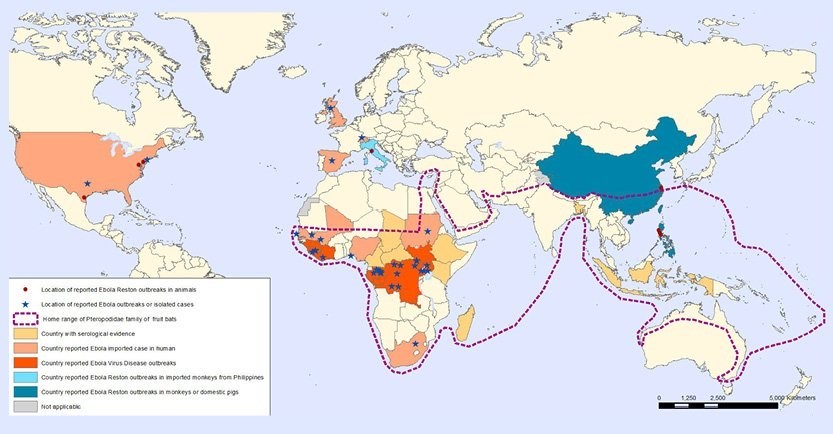
Image: A WHO map showing geographic distribution of Ebola virus in humans and animals
The Ebola virus epidemic (2013-2016) wreaked havoc in western Africa and other parts of the world. It was the most widespread outbreak of Ebola virus in history, leading to massive loss of life, and socio-economic disruption. While the worst-hit countries were Guinea, Liberia, and Sierra Leone, cases were reported in several parts of the world.
“At that time, [the geographic information system] ArcGIS was used to understand and predict disease transmission behavior, as well as support responding agencies to accurately specify where, how, and when to deploy resources. The technology also helped communities to support communications with organizations and to collaborate in a more transparent way, so they could get the help they needed to the right location more rapidly,” recalls Jack Dangermond, the founder and president of Esri [which Forbes calls the industry leader in GIS technology].
During those years, mapping of cases by first responders ensured that Ebola treatment units were set up at the right places and that remote areas with no connectivity received maximum assistance.
“In the beginning of the Ebola virus crisis, 23 of our member organizations were working in Liberia and Sierra Leone. It was very difficult to get information about rural areas as there was no connectivity,” Lauren Woodman, CEO of NetHope, a consortium of over 50 leading humanitarian, development, and conservation organizations, told Geospatial World.
Frontline health workers couldn’t be paid because it would take four days to send a text message. NetHope went in with its technology partners and donor organizations and provided connectivity to more than 400 organizations. “When we started mapping, it emerged that infection rates were falling in areas with connectivity. Even then Ebola treatment units were being set up in such areas. However, in areas where the rates were high, there was no connectivity or treatment units. Had we not mapped these areas, we wouldn’t have found that correlation,” she added. “There are so many applications of geospatial data for our members. When combined with other data, geospatial data becomes very rich.”
The integration of geospatial data with emerging technologies like artificial intelligence (AI) presents great opportunities and applications in healthcare, since the location factor plays a key role in both population and individual health.
Multiple disciplines within public health such as precision medicine benefit from it. “With regard to artificial intelligence, we already see its deployment across the entire ArcGIS community. This is not a new trend — it started as far back as 2014, when AI was used along with ArcGIS in response efforts for the Ebola outbreak,” says Dangermond.
Apart from mapping, spatial-temporal analysis to assess household risk factors for Ebola in remote and severely-affected areas was performed and gravity spatial models of transmission for the epidemic were developed. Not only did geospatial tools and data help authorities in countering the virus, they also facilitated quick response and sound decision-making.
Zika Virus Epidemic
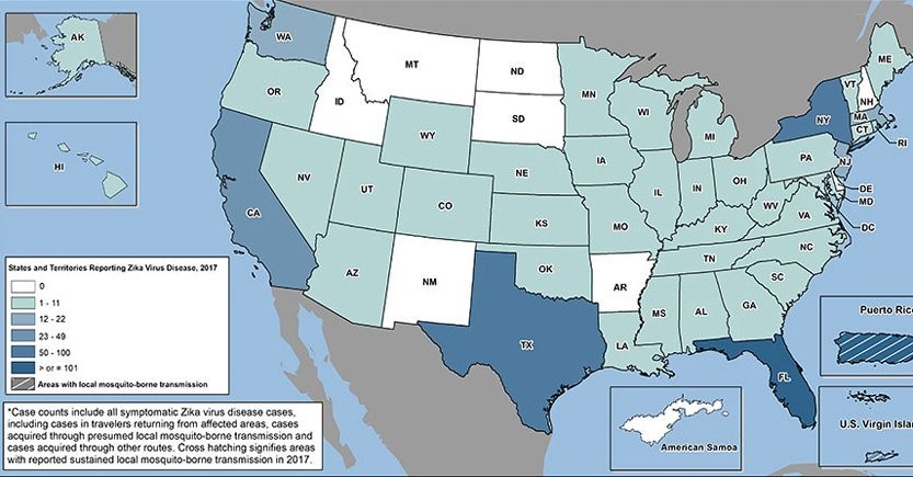
Image: This US Centers for Disease Control and Prevention map shows the Zika case count in the US in 2017
Towards the beginning of 2015 a widespread epidemic of Zika originated in Brazil, spread to parts of South and North America, and also affected several islands in the Pacific and Southeast Asia. In February 2016, the World Health Organization declared the outbreak a public health emergency. To monitor the diffusion of Zika virus, which is spread by the Aedes aegypti mosquito, the United States’ Centers for Disease Control and Prevention used GIS.
Mapping of the Zika virus enabled researchers to identify parts of the world where the mosquito could thrive and cross-reference the results with census data. Soon, it became clear that Zika posed great danger to pregnant women, and areas with a large population of expectant mothers were marked. Necessary steps were taken in those areas for the safety and well-being of this vulnerable section of society.
Geospatial technology use in tracking the virus eventually led to effective policy-making, testing, and social awareness. Residents of the worst-hit areas were encouraged to use insecticide and larvicide, among other things, to limit the spread of the disease. In the US, a dashboard monitoring the number of Zika cases in the country was made available to the general public.
H1N1 Pandemic
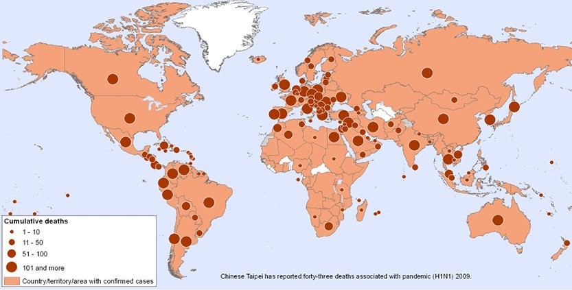
Image: WHO map showing worldwide distribution of H1N1 during the 2009 pandemic
H1N1, a novel influenza virus, emerged in January 2009 and lasted for more than a year, until August 2010. During this period, cases of people infected with the virus were reported in all parts of the world, with the US, Brazil, India, Mexico, and China being the worst-hit countries.
In the US, the first few patients were detected in the beginning of 2009. The cases of those infected with the virus — which contained a unique combination of influenza genes not previously identified in humans and animals — shot up quickly and spread across the country. At that time, GIS was used extensively for visualization and exploratory spatial analysis to gain insights into the outbreak.
National and local health departments in the US, including the Centers for Disease Control and Prevention, used Esri’s GIS technology to gauge concentration of the H1N1 virus. The mapping tool came in handy for both the general public, professionals, and researchers since the epidemic had a geographic component.
To track the virus, Daniel Janies, a researcher from Ohio State University, used a supercomputer, Google Earth, and a network of scientists who shared genetic data.
The researcher’s program reflected how the H1N1 virus mutated, spread, and made people sick all over the world. His map showed how standard influenza changed over time to become resistant to a class of drugs meant for fighting flu that were overused treating livestock in China. Even though the virus first emerged in Mexico, Janies traced its genetic ancestry and linked it to viruses found in pigs, birds, and humans.
As the education agency in Texas recommended rescheduling or cancelling several events to prevent student travel and minimize contact, Lubbock Independent School District students used the school’s ArcGIS Desktop ArcMap application to create a base map of Texas counties. While analyzing the data, they discovered that the darkest colors (on the map) representing the maximum confirmed cases appeared in the heavily populated areas, not the border counties. The visual element created by the students using GIS became relevant not only to the healthcare officials, but to all of western Texas.
Burundi Malaria Outbreak
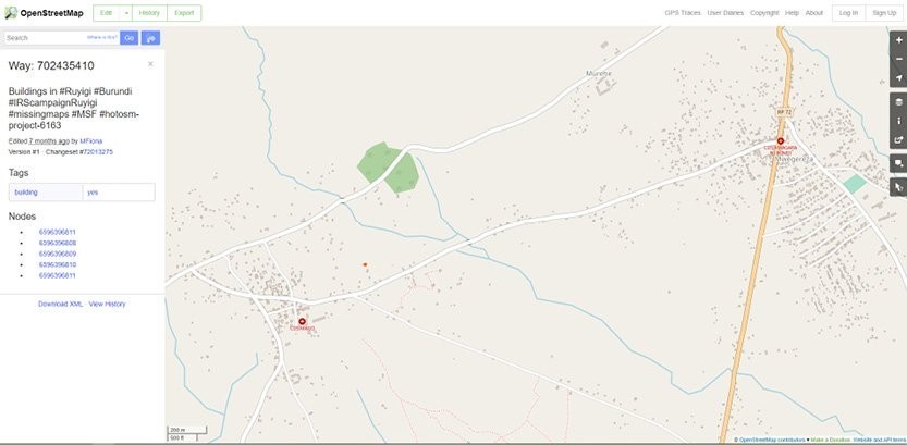
Image: Missing Maps volunteers traced nearly 90,000 buildings in the rural region of Ruyigi near the border with Tanzania
Burundi, a landlocked country in the Great Rift Valley, where the African Great Lakes region and East Africa converge, witnessed a malaria outbreak last year, leaving more than two third of its 11-million population suffering from the disease from January 2019.
As the country’s health authorities sought help from Doctors Without Borders (MSF), the problem of areas not finding a mention on the map surfaced. That was when the Missing Maps volunteers stepped in and traced nearly 90,000 buildings in the rural region of Ruyigi near the border with Tanzania. In the following months, 64 teams on the ground managed to carry out indoor residual spraying in 97% of households in the health district of Kinyinya.
The challenge of covering a vast territory with far-off settlements was overcome with meticulous preparation and organization using GIS. “It helps us plan all aspects of the … activity: the size of the teams, the number of days required, and the associated financial aspects,” explains Traoré B. Housséini, MSF water and sanitation manager, in a blog on Missing Maps website. Through its relentless efforts and efficient use of geospatial technology, MSF prevented malaria from spreading in eastern Burundi, with an indoor residual spraying campaign to protect around 300,000 inhabitants.
Avian Influenza
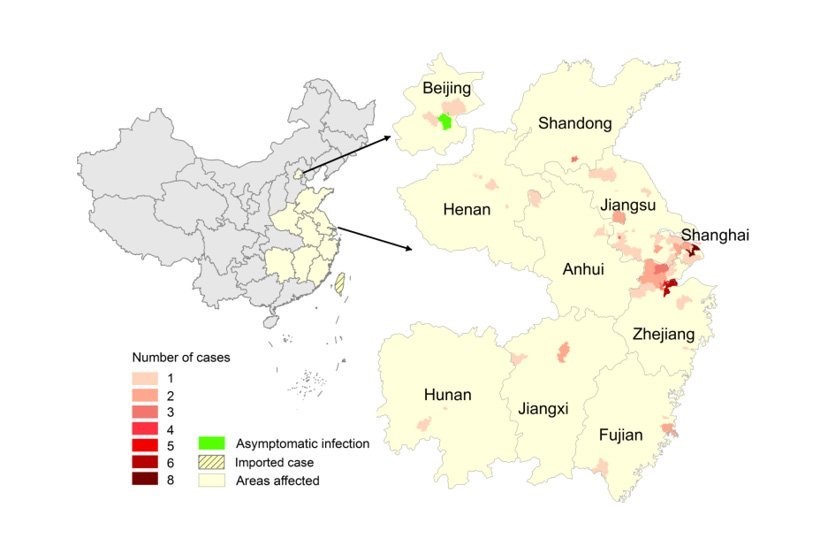
Image: This thematic map of the avian influenza A(H7N9) epidemic in China shows distribution of cumulative numbers of cases. The map was created in ArcGIS (ESRI Inc., Redlands, CA, USA).
Between February 2013 and March 2015, cases of humans being infected with an avian influenza A(H7N9) virus were reported from mainland China. To understand and counter the virus, researchers used the available data to map the spread and forecast where it would strike next. Mapping the virus helped in determining some very crucial information such as factors instigating its spread.
Mapping of different layers of data offered a valuable approach to describing the spread of — and risk factors for — the influenza. Further, a predictive risk map of human infections in China on the basis of modelling was useful in identifying the areas where surveillance and preventive interventions were required.
Polio Eradication in India and Nigeria
Image: Map showing areas covered by vaccination teams during a polio eradication campaign in northern Nigeria
Geospatial technologies, especially satellite imagery and GPS, played a pivotal role in eradicating polio from the eastern Indian state of Bihar. A large number of cases due to low immunization levels were tackled by enhancing evidence-based advocacy, setting up additional vaccination sites, and planning and monitoring supplemental immunization activities in remote areas. With the help of these technologies, the full immunization coverage increased from 32% in 2005-06 to over 70% in 2013 in certain parts of the state.
Similarly, the battle against polio in Nigeria was won by tracking vaccination teams using GPS and satellite imagery. Satellite images allowed precise location of remote settlements and hamlets that did not feature on maps. Additionally, GPS tracking helped in efficiently planning assignments for vaccination teams and supervising their movement in real time. Also, accurate maps of 10 states that were previously not recorded helped in the dramatic reduction of chronically “left out” settlements.
SARS Outbreak
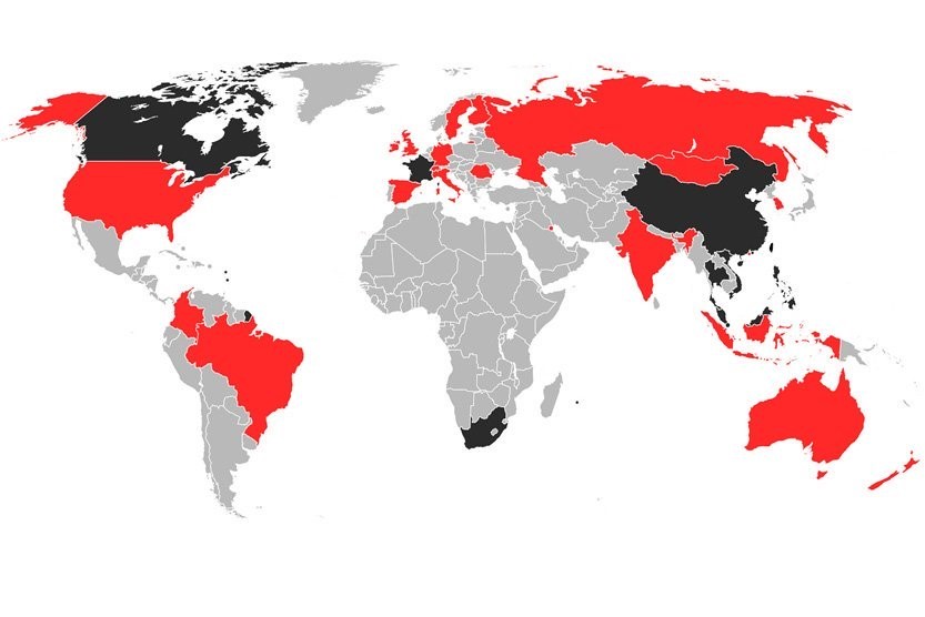
Image: This map shows countries infected with SARS between November 2002 and August 2003
Severe acute respiratory syndrome (SARS, or SARS-1), a viral respiratory disease of zoonotic origin, surfaced in the early 2000s. As many as 10,000 SARS cases from 30 countries were reported in one-year period between 2002 and 2003. The outbreak provided an opportunity for GIS professionals to demonstrate the effectiveness of modern spatial analysis and mapping techniques in modelling, tracking, and presenting the information about the spread of the disease.
During the outbreak, multiple websites were launched to offer frequently updated maps showing the dynamics of the disease at three different scales — by region, by country, and worldwide. Some of those sites offered the functions for interactive mapping and spatial analysis. This was perhaps the first time when the general public got quick and easy access to information about how a dangerous disease is spatially close to them and what the conditions are in other parts of the world.
Getting the Basics Right
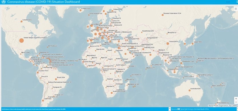
Image: The WHO’s Situation Dashboard on the coronavirus outbreak, as on March 31, 2020
Location is the basic principle of any field investigation. In case of an outbreak of the magnitude of COVID-19, the dimension of ‘where’ assumes more significance than ‘who’ and ‘when’. Geospatial tools and data have tremendous potential in epidemiology — mapping the event, procuring relevant supplemental data, and taking evidence-based decisions.
In the process of fighting an epidemic, geospatial information can be used for personnel tracking, confirmed case distribution, grid management, and spatial big data analysis to help authorities make smart decisions. “When combined with Big Data, geospatial data can play a positive role in rapid visualization, dissemination of epidemic information, spatial tracing of virus source, prediction of regional spread, risk division of regions, identification of prevention, and control priorities, control of resources and panic elimination,” say SuperMap’s Zhou Wenwen and Li Yunxia.
While the continuing loss of life and business due to the coronavirus is both tragic and worrisome, it is also an opportunity for the decision-makers to understand that geospatial technologies and data not only prove crucial in containing and responding to the spread of a disease, but also help in pre-empting and preventing them.
This article first appeared on the Geospatial World website and is reproduced here with permission.
 Avneep Dhingra is associate editor with Geospatial Media and Communications. With over 12 years of experience writing and editing, he takes keen interest in politics, economy, policy and technology, and writes on varied subjects.

This work is licensed under a Creative Commons Attribution-NoDerivatives 4.0 International License
Republish our articles for free, online or in print, under a Creative Commons license.
Republish this article
This work is licensed under a Creative Commons Attribution-NoDerivatives 4.0 International License
Read Next

Reporting Tools & Tips
How Investigative Journalists Can Fight Back Against Health Misinformation
A new wave of investigative health journalism is exposing deadly misinformation, turning complex data into accessible truths that can save millions of lives.

Guides Data Journalism Reporting Tools & Tips
Step-By-Step Guide for Journalists on the Basics of Google Sheets
Knowing how to use spreadsheets is a crucial skill, as it allows you to find potential stories in large amounts of data and to think critically about how to use it.
Case Studies Reporting Tools & Tips
Tips for Investigative Reporters from Winners of the Goldsmith Prize
Two Washington Post reporters discuss how they overcame obstacles, talked to hesitant sources, and built their own datasets to investigate failures at the agency that manages disasters in the United States, offering their tips for other reporters in the process.
Reporting Tools & Tips
Video Resources for Health, Women, Podcasts, & Indigenous Issues
To share best practices and other lessons learned from our most recent global conference, GIJC21, we are releasing a series of videos from the event’s many seminars, panels, and workshops. This latest installment focuses on key issues like health and medicine, women’s leadership, investigative podcasts, and Indigenous reporting.