GIJN’s Data Journalism Top 10: Weird Maps, ‘Out of Control’ Airbnb, Augmented Reality Graphics, Russian Doctors, Brazilian Data
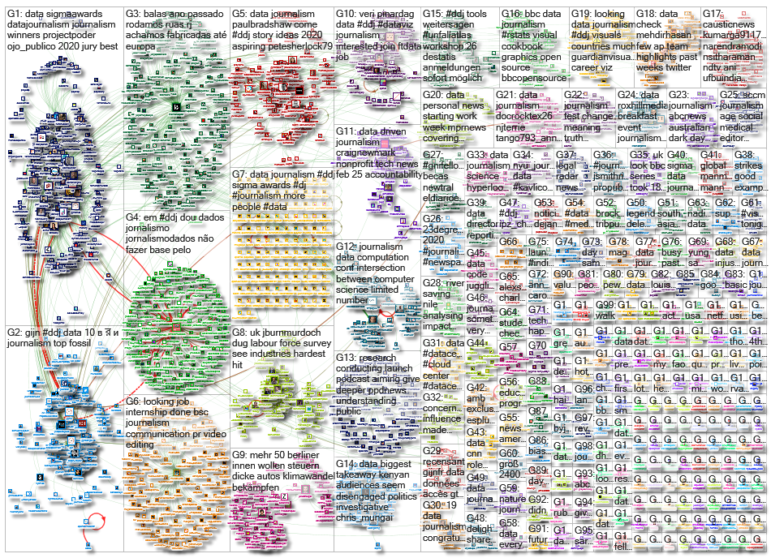
What’s the global data journalism community tweeting about this week? Our NodeXL #ddj mapping from February 17 to 23 finds geographer Tim Wallace collecting some amusingly unusual maps, The Guardian analyzing the effect of Airbnb on home ownership in Great Britain, and former Ogilvy & Mather chief creative officer Tham Khai Meng sharing how a Japanese newspaper utilized augmented reality to animate graphics.
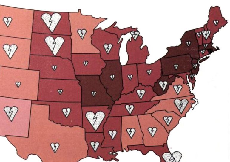
‘Forgotten’ Unusual Maps
Overlapping pie charts, a cylindrical globe, and checkerboard bar charts: just a few examples of amusingly perplexing old maps that will either make you laugh or cringe. A list of 30 of these gems were collected by geographer Tim Wallace in this post and spreadsheet.
Airbnb ‘Out of Control’ in Britain
The prevalence of Airbnb in Britain has prompted concerns that the expansion of short-term rentals on the platform is “out of control” and negatively affecting home ownership of local communities. The Guardian cross-referenced a database of more than 250,000 Airbnb listing with government housing stock figures to calculate the “penetration rate” of Airbnbs across England, Wales, and Scotland.
Animated Graphics Using Augmented Reality
Here’s something cool, shared by former Ogilvy & Mather chief creative officer Tham Khai Meng: A Japanese newspaper paired augmented reality with its printed paper to display chart animations.
Analyzing Operation Lava Jato Sentencing
According to an analysis by Brazil’s Agência Pública, it used to take less than a year (more precisely 263 days) to deliver a sentence in federal court criminal cases related to the corruption investigation Operation Lava Jato before the impeachment of the country’s 36th president, Dilma Rousseff. Now the pace of resolving the lawsuits and issuing sentences takes almost twice as long at 448 days. (In Portuguese.)
A Look at Doctors in Russia
Proekt Media looks at data on doctors in Russia: How the numbers have changed since 1990; how salaries affect the numbers of doctors; growth in public sector versus private sector; and how doctors’ burden rates affect mortality rates. (In Russian.)
https://twitter.com/wwwproektmedia/status/1217341527267123202
Democratic Race Advertising Blitz
The Financial Times analyzed ad spending by Democratic candidates during the US presidential primary season. Hard to miss: billionaire Michael Bloomberg’s $400 million TV ad blitz.
BBC R Graphics Cookbook
In case you missed it, the BBC released a “cookbook” for R graphics last year, to make it easier for other data journalists to create graphics using the programming language. This includes open source code for making line charts, bar charts, histograms, and more.
Mapping Systems Using Empathy
Data journalist Paul Bradshaw shares tips on how to tap into one’s empathy to come up with investigative story ideas. The process involves mapping out existing systems, such as housing, transportation, or health systems, and exploring their human impact.
Collaborative Database Catalog
Base dos Dados is a collaborative catalog of Brazilian and international databases to assist academics, journalists, developers, and civil society in finding available data. It does not provide data itself, but links to where particular data is located and provides instructions on how to access the data. (In Portuguese.)
One Year On: Data Viz Society
The Data Visualization Society looks back at the development and growth it made in its first year in terms of membership, organizational infrastructure, published articles, social media following, and more.
Thanks again to Marc Smith of Connected Action for gathering the links and graphing them. The Top Ten #ddj list is curated weekly.
 Eunice Au is GIJN’s program coordinator. Previously, she was a Malaysia correspondent for Singapore’s The Straits Times, and a journalist at the New Straits Times. She has also written for The Sun, Malaysian Today, and Madam Chair.
For a look at NodeXL’s mapping on #ddj and data journalism on Twitter, check out this map.

Guide to Mapping Analysis Using QGIS

GIJC23 – Using Social Network Analysis for Investigations

Basic Data Journalism Tips for Editors

My Favorite Tools: Venezuela’s Lisseth Boon on Design and Data Visualization
How a WhatsApp Community Is Bringing India’s Data Storytellers Together

Turning the Threat to a Distant Glacier into a Local Story Through Data Visualization

Making Trillions Make Sense: How Reuters Visualized the AI Economy

Summer Reading List for Data Journalists: For Those Who Believe in the Power of Storytelling with Numbers

This work is licensed under a Creative Commons Attribution-NoDerivatives 4.0 International License
Republish our articles for free, online or in print, under a Creative Commons license.
Republish this article
This work is licensed under a Creative Commons Attribution-NoDerivatives 4.0 International License
Read Next
Data Journalism
How a WhatsApp Community Is Bringing India’s Data Storytellers Together
Recently, more than 400 people gathered in the Indian city of Bengaluru for VizChitra 2026, a conference on data visualization and storytelling — but that is only a small part of the story.
Climate Data Journalism
Turning the Threat to a Distant Glacier into a Local Story Through Data Visualization
New York Times climate and environmental graphics reporter Mira Rojanasakul discusses how her team visualized the sea level rise threat from the melting Thwaites Glacier in Antarctica.
Data Journalism
Making Trillions Make Sense: How Reuters Visualized the AI Economy
How do you make a trillion dollars feel real to someone who has never seen that much money? Vineet Khare and Mayank Bhatt faced that very challenge for their data-driven investigation into AI investment.
Data Journalism
Summer Reading List for Data Journalists: For Those Who Believe in the Power of Storytelling with Numbers
Featuring books spanning four continents, these recommended reads provide a global perspective on data journalism.