GIJN’s Data Journalism Top 10: Avengers on the Move, Nonprofit Tax Filings, Visualizing Uncertainty


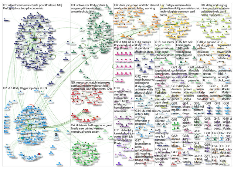
What’s the global data journalism community tweeting about this week? Our NodeXL #ddj mapping from June 3 to 9 finds @sto3psl mapping places the Avengers visited in Europe, @fedfragapane visualizing which elements in the periodic table are in danger of running out, @srfdata highlighting the top worries of the Swiss and @propublica doing researchers and journalists a huge public service by making 3 million US nonprofit records text-searchable.
Eurotripping Avengers
Most of the action in the Marvel Cinematic Universe may have taken place in the United States or in space, but the heroes did not miss out on Europe. Software engineer Fabian Gündel visualized where the Avengers had traveled to using a locator map and included a tutorial on creating locator maps.
Periodic Table: Elements in Danger
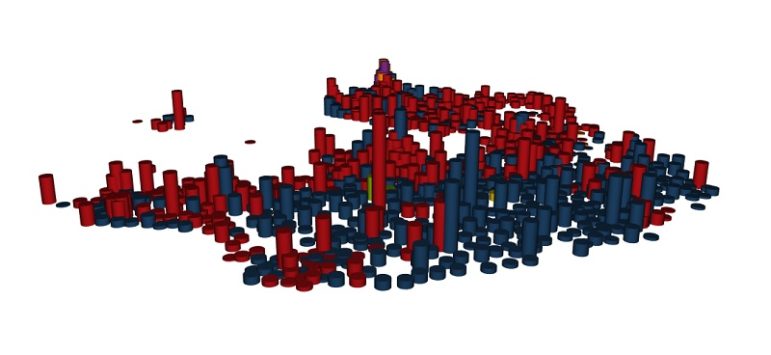
In an article in March, Science Focus celebrated Dmitri Mendeleev’s publication of the periodic table 150 years on by examining which elements in the table are running out. Visual designer Federica Fragapane visualized each substance’s total abundance on Earth, scarcity, price per kilogram, state at room temperature and part of the smartphone the element is used in.
Swiss Worry Barometer
What keeps the Swiss up at night? Every year, Crédit Suisse and the gfs.bern research institute publish an annual Worry Barometer — a survey of Swiss residents’ top concerns — to discover what’s on the electorate’s mind. The SRF data team visualized these concerns and show how they have evolved from 1995 to 2018.
Research on Visualizing Uncertainty
Jessica Hullman and Matthew Kay have launched a series of posts on visualizing uncertainty. They begin with discussing what the term “uncertainty” means in visualization, and go on to review some ineffective strategies for communicating uncertainty and some possible techniques to convey probability.
Search 3 Million Nonprofit Records for Free
Most nonprofits in the United States file their tax forms electronically. ProPublica has now made it possible for researchers, reporters and the general public to search for text that appears anywhere in these tax filings since 2011.
Data Visualization Book Reviews
Software engineer Elsa Birch reviewed resources on data visualization and categorized them into jump-start books, foundational texts, specialty resources and even not recommended ones.
Corn Victim of Climate Change
Unprecedented rainfall in the past two months across the United States’ major corn and soy producing states has affected its prime planting season significantly. The Washington Post visualized this year’s corn planting progress compared to past years. For many farmers, the clock has run out on corn for 2019.
https://twitter.com/Timmeko/status/1135977725812977664
Danish Election Results Visualized
The Danish Broadcasting Corporation analyzed the recent election results in Denmark and presented the data in a series of dot density maps. They decomposed the layers of dots in a neat scrollytelling explainer so you can see which party got votes across the country and which had votes concentrated in big cities, as well as where battles were won and lost. (In Danish but easily understood via Google Translate.)
Ambiguous Dot Density Maps
Data visualization expert Alberto Cairo describes the characteristics of a dot density map and explains how its ambiguity may confuse readers.
https://twitter.com/AlbertoCairo/status/1136994786123091968
Understanding Margin of Error
In this resurfaced piece from 2016, computational journalist Jonathan Stray wrote about understanding the margin of error in data journalism and warns about the dangers of ignoring the uncertainty in data. Three years on, this is still a relevant topic of discussion for the data journalism community.
Thanks, once again, to Marc Smith of Connected Action for gathering the links and graphing them. The Top Ten #ddj list is curated weekly.
 Eunice Au is GIJN’s program coordinator. Previously, she was a Malaysia correspondent for Singapore’s The Straits Times, and a journalist at the New Straits Times. She has also written for The Sun, Malaysian Today and Madam Chair.
For a look at Marc Smith’s mapping on #ddj on Twitter, check out this map.

This work is licensed under a Creative Commons Attribution-NoDerivatives 4.0 International License
Republish our articles for free, online or in print, under a Creative Commons license.
Republish this article
This work is licensed under a Creative Commons Attribution-NoDerivatives 4.0 International License
Read Next

Data Journalism News & Analysis
Lessons Learned: 10 Common Mistakes in Data Journalism
GIJN asked speakers and attendees in the NICAR conference hallways for the data journalism gaps they see, and for under-covered topic areas and under-used skills that newsrooms can address.

Data Journalism News & Analysis
From Space to Story in Data Journalism
Over the past 10 years satellite imagery has become an important component of data journalism. In the next 10, it will likely evolve further, from a tool used primarily for illustrating stories to an integral part of research and investigative reporting.

Data Journalism
10 Outstanding Data Projects Win the 2024 Sigma Awards
There were 52 data journalism entries from 22 countries in shortlist for the 2024 Sigma Awards. Here are the top 10 winning projects.
Data Journalism Methodology
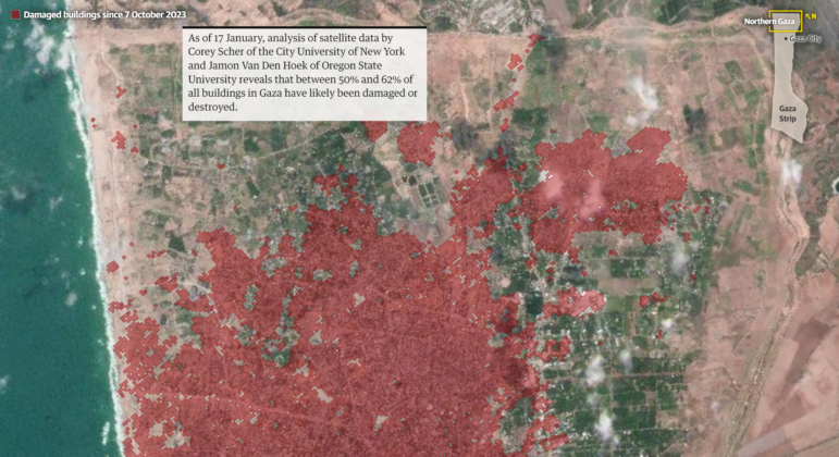
Mapping Conflict: Using Satellite Radar Data to Track the War Damage in Gaza
Gaza’s urban landscape has changed profoundly since the start of Israel’s military campaign. Researchers Jamon Van Den Hoek and Corey Scher have been mapping the impact.