GIJN’s Data Journalism Top 10: Game of Thrones Deaths, Visualizing Rich Hungarians, European Parliament


What’s the global data journalism community tweeting about this week? Our NodeXL #ddj mapping from May 20 to 26 finds @PostGraphics‘ meticulous cataloguing of all on-screen deaths in Game of Thrones, @datajournalism‘s tips on covering the crime beat, @DIEZEIT‘s analysis of a politically diverse European Union, and a quick beginner’s guide to learning data visualization by @AlliTorban.
Guide to 6,887 Deaths in Game of Thrones
[SPOILER ALERT]. This illustrated guide to all 6,887 on-screen deaths in the now-concluded Game of Thrones series is an equally beautiful and insane endeavor. Washington Post’s Shelly Tan watched eight seasons, meticulously logged each death and illustrated them. You can download the data for this story on Github.
Covering the Crime Beat
“Finding your next great investigative story on the crime beat begins with collecting your own data,” advises Ryan Martin of the Indianapolis Star. In this edition of the Conversations with Data newsletter, journalists suggest ways that data can inform your crime investigations.
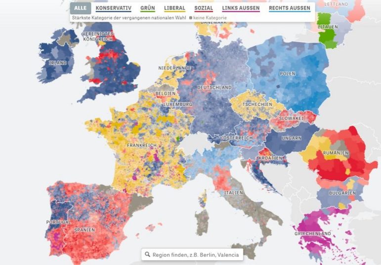
Politically Diverse EU
Europe is certainly a mixed bag, with an extremely broad political spectrum ranging from leftist-socialist to far right-nationalist. Die Zeit analyzed voting patterns in recent national elections in Europe from all 28 EU member states and mapped how strong each party group is in Europe. Article in German and English.
How Do I Learn DataViz?
It took two years and the creation of some cringe-worthy charts for Alli Torban to go from zero knowledge about data visualization to working as a data viz designer. She wondered if there was a faster and more effective way to learn and found that one great way is to collaborate with a more skilled professional.
Solitary Confinement
The International Consortium of Investigative Journalists analyzed more than 8,400 records of immigrant detainees being placed in solitary confinement in facilities operated by the US Immigration & Customs Enforcement (ICE). Y0u can filter the data by citizenship, facility, reason of placement and days in solitary.
Data Journalism Awards Shortlist
In case you missed it, the shortlist for this year’s Data Journalism Awards is out! It includes 103 projects from 26 countries, and 73 organizations made the list. Winners will be announced at the Global Editors Network Summit, this June 13 to 15.
Politically Polarized Urban America
What are the most politically segregated cities in the United States? FiveThirtyEight used each city’s 2016 election results to calculate its dissimilarity index, a number that lets us know how separated its Republicans and Democrats are from one another, and found Jackson, Mississippi, as the most polarized. Alberto Cairo mentions this story in his blog.
https://twitter.com/aaronwiener/status/1130543462778990592
The Power of Young Voters
Deutsche Welle analyzed the impact young voters could have had if they turned up to vote for the European Parliament elections. Find the data for this story here.
Visualizing Rich Hungarians
Hungary’s Atlatszo analyzed the annual rankings of the 100 richest Hungarians from 2002 to 2019 and visualized the change in assets and wealth of the top 25 richest over the years.
What Charts Say, Mean and Do
“No chart is an unbiased view of the data.” Elijah Meeks, a senior data visualization engineer at Netflix, wrote in this year-old piece. The choices that designers make in creating charts, even as simple as picking a title, color, or whether a time series is drawn with a jagged line or a softened curve, can affect and impact readers’ impressions, he argues. Read his full series, “Data Visualization Fast and Slow,” here: Introduction, What Charts Say, What Charts Mean and What Charts Do.
Thanks, once again, to Marc Smith of Connected Action for gathering the links and graphing them. The Top Ten #ddj list is curated weekly.
 Eunice Au is GIJN’s program coordinator. Previously, she was a Malaysia correspondent for Singapore’s The Straits Times, and a journalist at the New Straits Times. She has also written for The Sun, Malaysian Today and Madam Chair.
For a look at Marc Smith’s mapping on #ddj on Twitter, check out this map.


This work is licensed under a Creative Commons Attribution-NoDerivatives 4.0 International License
Republish our articles for free, online or in print, under a Creative Commons license.
Republish this article
This work is licensed under a Creative Commons Attribution-NoDerivatives 4.0 International License
Read Next

Data Journalism
Data Don’ts: Expert Tips to Avoid Misleading Audiences With Numbers
At a NICAR 2025 panel, data journalism experts discussed nuanced number errors that watchdog reporters often make that can confuse readers and disrupt story angles.

Climate Data Journalism
How The Pudding Used Data Visualizations to Recontextualize the Story of Climate Change
What does climate change feel like? How will your city’s climate shift, 50 years from now? Data scientist Derek Taylor explains his latest piece.

Africa Focus Data Journalism
How Data Journalism Is Changing the Face of Africa
Data journalism in Africa has made a powerful impact, from holding leaders accountable to refuting myths around domestic violence. But the field faces formidable challenges.

Data Journalism My Favorite Tools
My Favorite Tools: Sigma Award-Winning Data Journalist Leonardo Nicoletti
The data visualization expert and former academic stresses the importance of having an ‘interdisciplinary mindset’ when approaching data-driven stories.