
GIJN’s Data Journalism Top 10: Copycat Laws, Melting Ice, Rwanda’s Genocide Trials, Data Do’s and Don’ts


What’s the global data journalism community tweeting about this week? Our NodeXL #ddj mapping from April 1 to 7 finds @JuliaAngwin sharing do’s and don’ts of data journalism projects at @journalismfest, @elconfidencial highlighting the negative effects on Spain’s economy if women stopped working for a day, @azcentral and @USATODAY revealing just how many bills in the United States are copied from model legislations, and @justiceinfonet visualizing data on trials for the Rwandan genocide.
Do’s and Don’ts of Data Journalism Projects
Working on a story that might require data evidence? Involve the data team from the start. In two simple slides, Julia Angwin, editor-in-chief of The Markup, explains when and how newsrooms should include data journalists in the reporting process.
https://twitter.com/angelozehr/status/1114115062367698944
Who Runs the World? Girls.
“When women stop, the world stops.” In 1975, Icelandic women went on strike to demonstrate the indispensable work that they do, both waged and unwaged, that affects the economy and society. That momentous protest would later inspire the creation of the International Women’s Strike on March 8. In this piece published in March, El Confidencial calculated the effects on the economy and public services in Spain if women did not work for a day. (In Spanish.)
Copycat Laws
Copy, paste, legislate. In the United States, bills are not necessarily written from scratch by legislators. Instead, they may use fill-in-the-blank documents, also called model legislation, drawn up by corporations, interest groups or their lobbyists. A two-year investigation by USA Today and the Arizona Republic analyzed about 100,000 bills introduced in the 50 states and found that at least 10,000 bills across the country were substantially copied from such models.
Rwandan Genocide Trials
Since the 1994 genocide in Rwanda, more than 1 million suspects have faced trials in 12,000 community-based gacaca courts. JusticeInfo.net looks at the numbers and timeline of this massive judicial undertaking.
Spotlight on Disappearing Ice
How do you write about something that doesn’t exist anymore? Using data and footage from the National Snow and Ice Data Center (NSIDC), Neue Zürcher Zeitung tries to shed light on the extent of disappearing ice in the Bering Sea and its consequences for nature, politics and the economy. (In German.)
New Data Journalism Platform
A brand new data journalism platform, DataJournalism.com, was recently launched by the European Journalism Centre. It aims to be a go-to place for data enthusiasts to access free resources and online video courses and to participate in community forums.
Better Quality Data Needed for AI
Although big data may be increasingly made available, the data is often improperly formatted, incomplete or inconsistent. In a survey of 179 data scientists in 2017, half the data scientists ranked “access to quality data” as one of the top three obstacles to success for AI initiatives.
Data Journalism Handbook 2: Ask Anything
Christina Elmer, Paul Bradshaw and Lindsay Green-Barber, who all contributed a chapter to the Data Journalism Handbook 2, shared their thoughts on reporting on algorithms and how to measure the impact of data journalism at this year’s International Journalism Festival.
Brazil’s Company Registry Data
Looking for company data from Brazil’s Cadastro Nacional De Pessoas Jurídicas (CNPJ)? Software developer Álvaro Justen has done data journalists in Brazil a favor by downloading and cleaning the data. Find the data here and more information on his process on GitHub. (In Portuguese.)
Free Data Visualization Seminar
Good news for data professionals in the Netherlands! Infographics and data visualization expert Alberto Cairo will be giving a free seminar at Eindhoven’s High Tech Campus on May 14, 2019. He will explain how to determine whether data has been represented accurately in a visualization and explore ways to construct more meaningful and effective visualizations. The seminar will also be livestreamed.
https://twitter.com/AlbertoCairo/status/1112712370651049985
Thanks, once again, to Marc Smith of Connected Action for gathering the links and graphing them. The Top Ten #ddj list is curated weekly.
 Eunice Au is GIJN’s program coordinator. Previously, she was a Malaysia correspondent for Singapore’s The Straits Times, and a journalist at the New Straits Times. She has also written for The Sun, Malaysian Today and Madam Chair.
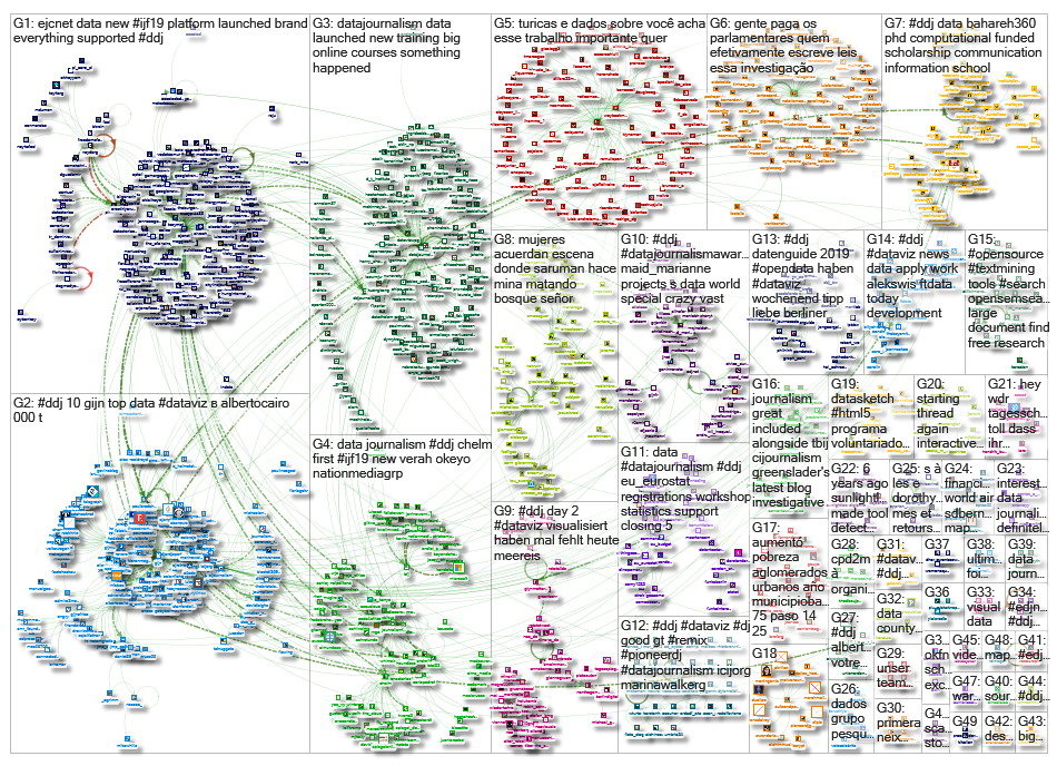
For a look at Marc Smith’s mapping on #ddj on Twitter, check out this map.

This work is licensed under a Creative Commons Attribution-NoDerivatives 4.0 International License
Republish our articles for free, online or in print, under a Creative Commons license.
Republish this article
This work is licensed under a Creative Commons Attribution-NoDerivatives 4.0 International License
Read Next

Data Journalism News & Analysis
From Space to Story in Data Journalism
Over the past 10 years satellite imagery has become an important component of data journalism. In the next 10, it will likely evolve further, from a tool used primarily for illustrating stories to an integral part of research and investigative reporting.

Data Journalism
10 Outstanding Data Projects Win the 2024 Sigma Awards
There were 52 data journalism entries from 22 countries in shortlist for the 2024 Sigma Awards. Here are the top 10 winning projects.

Data Journalism Data Journalism Top 10
Trump’s Disappearing Donors, Tracking the Mars Rover, and the Ongoing Wars in Gaza and Ukraine
Our column of the best in data journalism also features stories on AI’s ability to forecast the weather, analyzing the Argentine president’s Tweetstorms, and apathetic EU voters.

Data Journalism
Updating the Inverted Pyramid of Data Journalism
Data journalist and instructor Paul Bradshaw has updated the Inverted Pyramid of Data Journalism — and brought together resources for every stage.