GIJN’s Data Journalism Top 10: Visualizing Air Raids, Dictator Decrees, Dataviz Crimes, Random Samples
What’s the global data journalism community tweeting about this week? Our NodeXL #ddj mapping from March 25 to 31 finds @ajlabs visualizing air raids through sound, @infobae exposing secret dictatorship decrees in Argentina, @albertocairo presenting on how charts can mislead (and how to fix them), and @TheEconomist laying bare “crimes” against data visualization they have committed.
Visualizing Air Raids Through Sound
The AJ Labs team walks us through their process of visualizing 19,000 air raids carried out by the Saudi coalition in Yemen since 2015. They explain why they resisted using a traditional map with circles showing the location of the raids and opted instead for an audio visualization.
Secret Dictatorship Decrees Analyzed
The Infobae data unit downloaded and reviewed more than 7,000 secret decrees signed by the last Argentine military dictatorship between 1976 and 1983. The declassified decrees had never been processed and analyzed in their entirety until now.
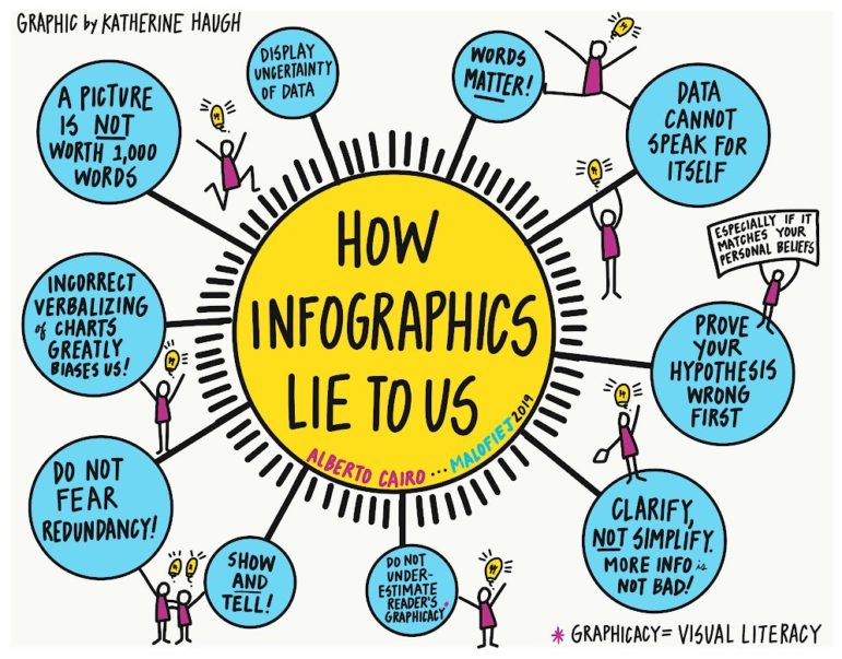
How Charts Lie
At the 27th Infographics World Summit, data viz expert Alberto Cairo presented his thoughts on how infographics can be misleading due to a variety of factors, such as graphical illiteracy, confirmation bias, fear of complexity, uncertainty and inaccurate descriptions. Get Cairo’s book on the topic here.
Crimes Against Data Visualization
Getting data visualization right isn’t easy, and even the experts get it wrong sometimes. The Economist’s Sarah Leo writes a refreshingly honest and revealing post on the mistakes the organization has made in producing visualizations.
Can AI Break the Next Panama Papers?
Three years ago, 400 journalists used open source data mining technology and graph databases to wrestle with 11.5 million documents and expose offshore finance secrets now known as the Panama Papers. In hindsight, Marina Walker Guevara, deputy director of the International Consortium of Investigative Journalists, wonders what stories they might have missed and how artificial intelligence could possibly help to uncover more money laundering in the future.
Random Sampling Explained
How can a survey of a small group of people measure the public opinion of a whole country? This neat explainer by Pew Research Center (published in 2017, but relevant as ever) breaks down how random sampling works and how the data collected can be weighted and adjusted to match the general population.
From Pulp Fiction to Rock Bands in Rio
Multidisciplinary designer Carol Cavaleiro has been designing infographics for the past seven years and has worked for Estadão, UOL, Metro and O Globo. Her portfolio is a glorious, colorful visual feast, and includes visualizations about Pulp Fiction, dogs matching Volkswagen cars and rock bands in Rio.
https://twitter.com/AlbertoCairo/status/1111560914371792896
Football Finances
Kieran Maguire, a lecturer in football finance analysis at the University of Liverpool, assesses how three English football clubs ended up struggling financially. One of the key factors he outlined is the lack of control of player costs in terms of both wages and transfer fees.
Final Call: Submit Your Data Projects
April 7 is the deadline to submit your brilliant data journalism project for the Data Journalism Awards. Stand a chance to win an all-expenses-covered trip to Athens, Greece, to attend the GEN Summit and Data Journalism Awards 2019 ceremony, taking place from June 13 to 15.
https://twitter.com/smfrogers/status/973241998822920192
UK Data Journalism
Top UK data journalists will gather on May 3 to share tips on producing cutting-edge reporting and finding stories in structured information. Speakers include the BBC Shared Data Unit’s Pete Sherlock, The Times’ Leila Haddou and The Guardian’s Caelainn Barr.
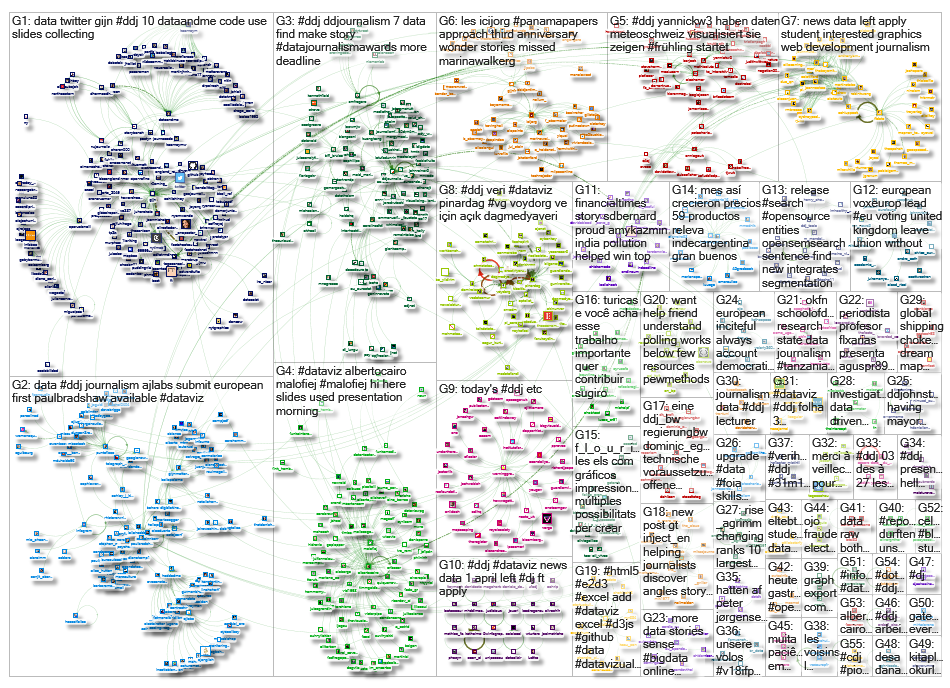
Thanks, once again, to Marc Smith of Connected Action for gathering the links and graphing them.
 Eunice Au is GIJN’s program coordinator. Previously, she was a Malaysia correspondent for Singapore’s The Straits Times, and a journalist at the New Straits Times. She has also written for The Sun, Malaysian Today and Madam Chair.
For a look at Marc Smith’s mapping on #ddj on Twitter, check out this map.

Basic Data Journalism Tips for Editors

My Favorite Tools: Venezuela’s Lisseth Boon on Design and Data Visualization

Document of the Day: Visual Vocabulary

Nils Mulvad – The story behind the data

From Data to Storytelling: Concept and Design Tips from the Financial Times’ John Burn-Murdoch

Tracking US Migrant Detention Data: What Journalists Need to Understand

Data Don’ts: Expert Tips to Avoid Misleading Audiences With Numbers

How The Pudding Used Data Visualizations to Recontextualize the Story of Climate Change

This work is licensed under a Creative Commons Attribution-NoDerivatives 4.0 International License
Republish our articles for free, online or in print, under a Creative Commons license.
Republish this article
This work is licensed under a Creative Commons Attribution-NoDerivatives 4.0 International License
Read Next
Data Journalism
From Data to Storytelling: Concept and Design Tips from the Financial Times’ John Burn-Murdoch
The chief data reporter for the Financial Times discusses how he considers the use of text, color, and annotation to aid visual storytelling through charts and graphics.
Data Journalism News & Analysis
Tracking US Migrant Detention Data: What Journalists Need to Understand
The US government’s detained immigrant population flatlined in April, but there’s more to the numbers than meets the eye. Here’s what journalists need to know about the data.
Data Journalism
Data Don’ts: Expert Tips to Avoid Misleading Audiences With Numbers
At a NICAR 2025 panel, data journalism experts discussed nuanced number errors that watchdog reporters often make that can confuse readers and disrupt story angles.
Climate Data Journalism
How The Pudding Used Data Visualizations to Recontextualize the Story of Climate Change
What does climate change feel like? How will your city’s climate shift, 50 years from now? Data scientist Derek Taylor explains his latest piece.