
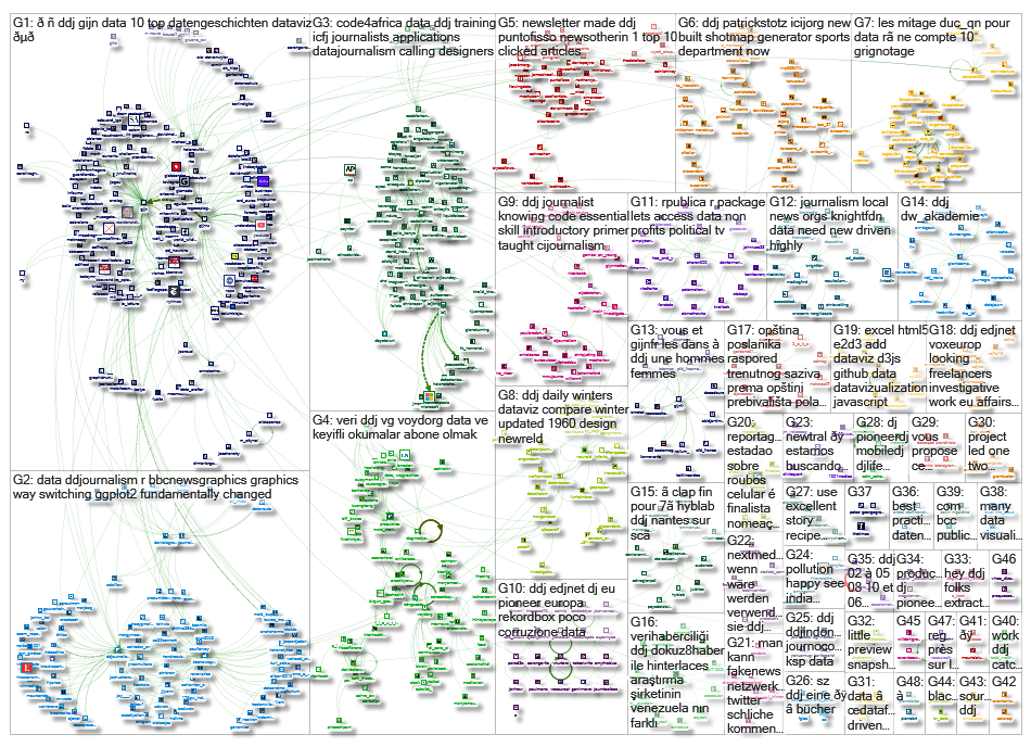
GIJN’s Data Journalism Top 10: ICIJ’s Datashare, Visualization Talkies, Kyrgyzstan Labor
What’s the global data journalism community tweeting about this week? Our NodeXL #ddj mapping from February 4 to 10 finds exciting releases with a document analysis tool by @ICIJorg and an audio-driven visualization tool by @f_l_o_u_r_i_s_h, while @kloopnews highlights domestic labor imbalance in Kyrgyzstan and @davidottewell emphasizes that data journalism is not just for nerds in a corner.
Datashare Document Analysis Tool
The International Consortium of Investigative Journalists (ICIJ) just released an open source app called Datashare. This document analysis tool is powerful enough to search PDFs, images, texts, spreadsheets, slides and more to find people, companies and locations. ICIJ welcomes feedback on the app, which is still in beta.
Interactive Visualization Talkies
Flourish just released an interesting new feature that allows you to create audio-driven interactive visualizations. Or, as its creators like to call it — talkies! Not sure what we’re yapping on about? Check out Flourish’s example and happy exploring!
Domestic Labor Imbalance
In Kyrgyzstan, domestic work is unequally distributed in the family. Women spend threefold more time handling chores compared to men, which reduces their available time for work and education. Investigative center Kloop visualizes this data in a video fashioned after a video game. (In Russian).
Not Just Nerds in a Corner
David Ottewell, head of The Reach’s data unit, talks to Interhacktives about data journalism. He shares his ideas on valuable data sources and emphasizes the importance of data journalism being a fundamental part of general journalistic output, and not just done by “nerds in a corner.”
Tying Local Newsrooms to Data
The Associated Press recently shared some results of its collective data empowerment project to connect local newsrooms with vetted, story-rich data. The data, which is shared on the collaborative platform data.world, saw 1,400 downloads from 300 local newsrooms in 2018. More details here.
Comparing Winters in Germany
How extreme is this winter season compared to past years? WAZ visualizes the amount of snow in Germany since 1960 and retraces the coldest winters on record in the country. (In German).
Data Literacy Versus Visual Literacy
“Let’s be real: most people don’t want to look at a page full of bar charts.” Data designer Benjamin Cooley makes the distinction between data literacy and visual literacy, and advocates for data visualization practitioners to go beyond data literacy and challenge themselves to make visualizations more interesting and accessible for audiences.
EIJC19/Dataharvest Call for Ideas
Feb. 15 is the last day for you to suggest ideas for speakers, panels, tools and talks for the European Investigative Journalism & Dataharvest Conference, which will take place in Mechelen, Belgium from May 16 to 19, 2019.
Open Data Day
Open Data Day is an annual celebration of open data worldwide and this year, it will be held on March 2. Check opendataday.org for events in your area. Can’t find one? Anyone is welcome to host their own open data event. Data Journalism in Turkey will host one at Kadir Has University; those interested in attending should email dagmedyaveri@gmail.com. (In Turkish).
DataViz Training with Fragapane
If you’re a fan of award-winning information designer Federica Fragapane’s beautiful data visualizations, here’s a chance to learn from her in a hands-on two-day workshop in Utrecht, Netherlands. Priced at €549, the workshop will cover a wide range of topics from designing elegance to data sculpture. Check out her portfolio here.
Thanks, once again, to Marc Smith of Connected Action for gathering the links and graphing them.
 Eunice Au is GIJN’s program coordinator. Previously, she was a Malaysia correspondent for Singapore’s The Straits Times, and a journalist at the New Straits Times. She has also written for The Sun, Malaysian Today and Madam Chair.
For a look at Marc Smith’s mapping on #ddj on Twitter, check out this map.

No Coding Required: A Step-by-Step Guide to Scraping Websites With Data Miner
Free, Game-Changing Data Extraction Tools that Require No Coding Skills

Basic Data Journalism Tips for Editors

My Favorite Tools: Venezuela’s Lisseth Boon on Design and Data Visualization

Data Don’ts: Expert Tips to Avoid Misleading Audiences With Numbers

How The Pudding Used Data Visualizations to Recontextualize the Story of Climate Change

How I Did It: Extracting and Analyzing National Budget Data Using a Custom AI Bot

How Data Journalism Is Changing the Face of Africa

This work is licensed under a Creative Commons Attribution-NoDerivatives 4.0 International License
Republish our articles for free, online or in print, under a Creative Commons license.
Republish this article
This work is licensed under a Creative Commons Attribution-NoDerivatives 4.0 International License
Read Next
Data Journalism
Data Don’ts: Expert Tips to Avoid Misleading Audiences With Numbers
At a NICAR 2025 panel, data journalism experts discussed nuanced number errors that watchdog reporters often make that can confuse readers and disrupt story angles.
Climate Data Journalism
How The Pudding Used Data Visualizations to Recontextualize the Story of Climate Change
What does climate change feel like? How will your city’s climate shift, 50 years from now? Data scientist Derek Taylor explains his latest piece.
Data Journalism How They Did It
How I Did It: Extracting and Analyzing National Budget Data Using a Custom AI Bot
Filipino journalist Jaemark Tordecilla explains how he made and refined a custom AI tool that makes it easier to report on public spending from budgets published online.
Africa Focus Data Journalism
How Data Journalism Is Changing the Face of Africa
Data journalism in Africa has made a powerful impact, from holding leaders accountable to refuting myths around domestic violence. But the field faces formidable challenges.