GIJN’s Data Journalism Top 10: Forecasting Elections, Counting Fast Food, Kampala’s Swamp City, Gasping for Air
What’s the global data journalism community tweeting about this week? Our NodeXL #ddj mapping from October 22 to 28 finds @NateSilver538 talking about election forecasting, @BBCNews highlighting the prevalence of fast food outlets in the UK, @washingtonpost comparing how tough it is for Americans to vote by state, and @business and @HowWeGetToNext on battling for fresh air in India and Europe.
Nate Silver on Election Forecasting
Ezra Klein talks to FiveThirtyEight founder Nate Silver about how he builds his forecasting models, whether there’s a purpose to predicting election outcomes, which campaign reporters he reads and whether Trump is the favorite for 2020.
The High Cost of Pollution in India
Bloomberg profiles India — home to the world’s 10 most polluted cities. The country’s air pollution has been linked to ailments from asthma to heart disease and lung cancer, contributing to the deaths of more than 1.1 million Indians in 2015. Healthcare fees and productivity losses from pollution also cost India as much as 8.5 percent of GDP, amounting to about $221 billion every year.
https://twitter.com/DavidInglesTV/status/1054247733379260418
UK’s Growing Fast-Food Outlets
Despite UK town halls trying to limit the spread of fast food outlets, figures from the Office of National Statistics show that the UK has seen a 34 percent increase in such outlets from 2010 to 2018. BBC highlights research that suggests people most exposed to fast food are nearly twice as likely to be obese.
How Easy Is It for Americans to Vote?
Washington Post created an interactive for Americans in each state to find out how easy or difficult it is to exercise their right to vote based on voting registration, restrictions, requirements and wait times. These factors affect the voting turnout and may even discourage people from voting.
Turkey’s New Data Bulletin
Turkey’s Data Literacy Association now produces a weekly bulletin with updates on data literacy, open data and data journalism developments around the world. Subscribe here. The association also held their first general assembly just last week, here’s their recap. (In Turkish)
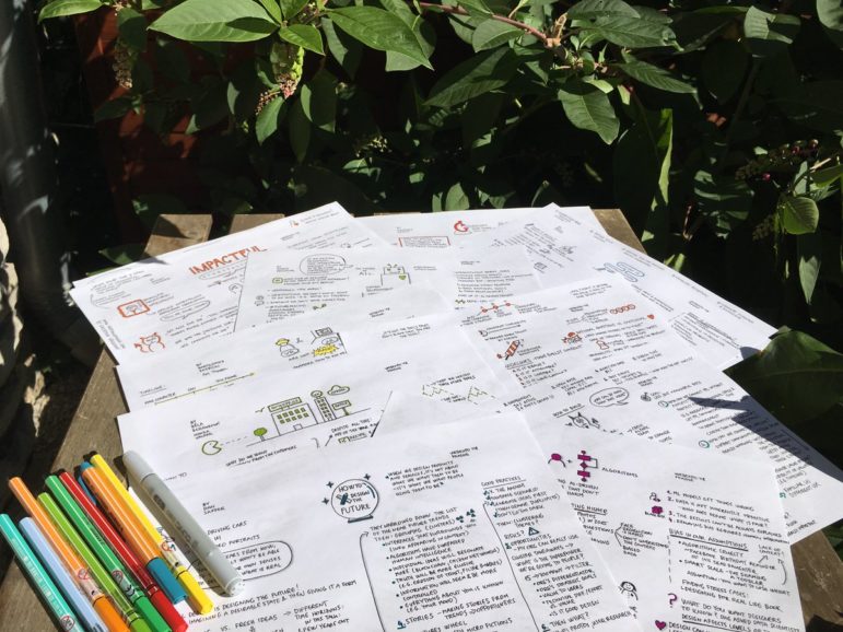
UX Knowledge Base Sketches
UX (user experience) designer Krisztina Szerovay regularly draws UX knowledge base sketches, covering a wide range of topics, from cognitive bias to data modeling.
Kampala’s Swamp City
The annual Uganda WASH Media Awards just honored excellent reporting on Water, Sanitation and Hygiene (WASH). Top prize: @Code4Africa’s supported #ddj project Swamp City on how urbanization destroyed a critical Kampala wetland, written by Annika McGinnis and Fredrick Mugira. By the way, Code4Africa has vacancies for part-time data journalism trainers.
The Battle for Fresh Air in Europe
National governments frequently conspire to block pollution restriction measures that would undeniably save lives. Corin Faife discusses the efforts made by EU states to reduce air pollution and their shortcomings.
Young Lives in Grand Est
Webullition analyzed which areas in the Grand Est region of France attract more young people between the ages of 15 and 29, and the factors influencing the young population to settle in these areas. (In French.)
Talking Data Journalism with Reuters Institute Fellow
“Data gives us facts, and this is ever more important in times of fake news,” Reuters Institute for the Study of Journalism fellow Bettina Figl on data journalism said in the Tüv Nord Group #explore series. (In German.)
Thanks, once again, to Marc Smith of Connected Action for gathering the links and graphing them.
 Eunice Au is GIJN’s program coordinator. Previously, she was a Malaysia correspondent for Singapore’s The Straits Times, and a journalist at the New Straits Times. She has also written for The Sun, Malaysian Today and Madam Chair.
For a look at Marc Smith’s mapping on #ddj on Twitter, check out this map.
Improve Your Data Literacy: 16 Blogs to Follow in 2016
A Call for Debate: Taking Open Data and Government to the Next Level

Tipsheet on Partnering with Civil Society Organizations and Non-Governmental Organizations

AI Accountability Reporting Guide
Data Journalism Top 10: A Year of War in Ukraine, Russian Casualties, Trans Identities, Unexpected NBA Performances
Data Journalism Top 10: Global Migration, EU Pesticides, Russian Occupation, a Congressman’s Lies
Data Journalism Top 10: Escaping Russia’s Mobilization, Xi Jinping’s Path to Power, Plastic Pollution, Data Journalism in Iran

Interpreting Data: Tips to Make Sure You Know How to Read the Numbers

This work is licensed under a Creative Commons Attribution-NoDerivatives 4.0 International License
Republish our articles for free, online or in print, under a Creative Commons license.
Republish this article
This work is licensed under a Creative Commons Attribution-NoDerivatives 4.0 International License
Read Next
Data Journalism Data Journalism Top 10
Data Journalism Top 10: A Year of War in Ukraine, Russian Casualties, Trans Identities, Unexpected NBA Performances
GIJN’s weekly look at the best in data journalism examines one year of war in Ukraine, Russian casualty totals, trans coverage in the French media, and the most unexpected performances in NBA history.
Data Journalism Data Journalism Top 10
Data Journalism Top 10: Global Migration, EU Pesticides, Russian Occupation, a Congressman’s Lies
Our weekly look at the most popular data journalism stories on Twitter reveals a global urge to migrates as well as analyses of a US Congressman’s lies, the use of pesticides in EU apple farming, the online patterns of Brazil’s coup plotters, and an interactive US snowfall chart.
Data Journalism Data Journalism Top 10
Data Journalism Top 10: Escaping Russia’s Mobilization, Xi Jinping’s Path to Power, Plastic Pollution, Data Journalism in Iran
This week’s most popular data journalism stories on Twitter highlights efforts to evade Russia’s war mobilization, Xi Jinping’s path to power, abuses of child welfare policing, teacher demonstrations in Hungary, and caesarean birth rates in Spain.
Data Journalism Reporting Tools & Tips
Interpreting Data: Tips to Make Sure You Know How to Read the Numbers
When using data for investigative stories, it is important to learn how to obtain and clean the information. But it is also vital that you interpret your findings correctly and extract the right conclusions from the numbers, filters, and spreadsheets. If you do the math correctly but fail to read the answers properly, you may end up misleading your audience.