This Week’s Top 10 in Data Journalism


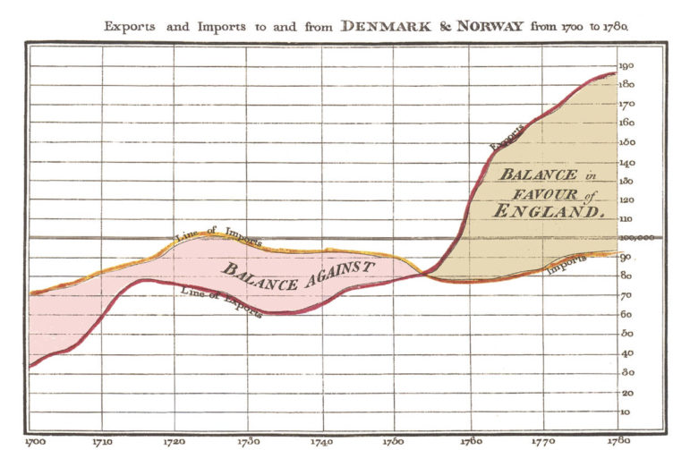
A chart drawn by Playfair in 1786. Photo: George Mason University Press
What’s the global data journalism community tweeting about this week? Our NodeXL #ddj mapping from January 8 to 14 finds free font-for-numbers by @InVisionApp, a William Playfair biography book review for @WSJBookReviews and @PublicDataLab’s just-released full version of its fake news field guide.
Free Font for Numbers
The first rule for picking a good number font is to make sure it comes with lining and tabular figures. Here is a neat breakdown of the best free fonts for numbers.
Finding The Best Free Fonts for Numbers https://t.co/iJo3gytl1n Should have read this long ago. By @invisionapp pic.twitter.com/TFu09wQbQO
— Maarten Lambrechts (@maartenzam) January 9, 2018
Data Journalism Handbook 2.0
Translated into 12 languages, the Data Journalism Handbook has been a mainstay of the data journalism community since its first release in 2012. Here’s all you need to know about the new edition: It’s a complete revision that will complement the first edition by examining the current state of data journalism, with profiles of emerging practices and projects and a look at their broader consequences.
RT @ejcnet: ICYMI: Here is all you need to know about the upcoming #datahandbook! #ddj – textbook and useful resource for an emerging field. https://t.co/syx1DdDYf8 Learn more at @journalismfest 2018! https://t.co/pG6JVvGZpp pic.twitter.com/xr81mc6Zli
— NUJ LondonFreelance (@NUJ_LFB) January 12, 2018
Playfair Book Review
“Playfair is the most famous man you have never heard of,” Bruce Berkowitz declares of the subject of his biography. William Playfair was a spy, speculator, inventor, pamphleteer—and pioneer of the pie chart. Richard Davenport-Hines reviews the ‘Playfair’ book for the Wall Street Journal.
@CabreraAngel “Playfair”, the latest title from GMU Press favorably reviewed by the Wall Street Journal https://t.co/VjwXSD4mOp
— Wally (@grotophorst) January 16, 2018
Fake News Field Guide
Now out: The full version of “A Field Guide to ‘Fake News’ and other Information Disorders,” by the Public Data Lab. It contains methods and recipes for tracing trolling practices, the modes of circulation of viral news and memes online, and the commercial underpinnings of this content.
Just published: full version of “A Field Guide to ‘Fake News’ and other Information Disorders”: https://t.co/2EaBmPquhB #ddj #digitalmethods #dmi18 pic.twitter.com/6KrwsWcDoi
— Jonathan Gray ? (@jwyg) January 8, 2018
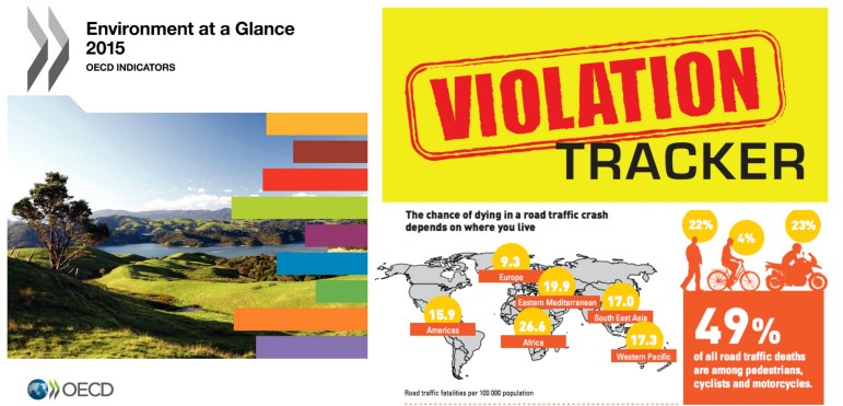
Environmental Data
Seven experts share with the Global Editors Network their top nine places to find environmental data, including the Planet OS Datahub, Aqueduct, and FAOSTAT.
9 Places to find data on the environment: https://t.co/lYXSmxHoEj #ddj #journo @Maid_Marianne pic.twitter.com/89Dd3C1Utm
— DataDrivenJournalism (@ddjournalism) January 11, 2018
DataViz Catalogue
The Data Visualisation Catalogue developed by Severino Ribecca is a library of different information visualisation types. It is now available in Turkish, in addition to Chinese, Spanish, and Russian.
Nihayet #VeriGörselleştirme Kataloğu’nu Türkçeye çevirdik
(öncelikle .@SR_Visual_Info ve beraberinde @TeksanOnur @isil_y @FarukAydiner1 @enguraysegul @egesabri örge tümer, @demirelsadettin , Kübra Sultan Yüzüncüyıl ‘a çok teşekkürler) #ddj #dataviz #vg https://t.co/OtgTL183pN pic.twitter.com/Zi6Zaj077N— Pınar DağⓋ (@pinardag) January 13, 2018
Data Journalism Blog
This blog gathers the data journalism work of students from the Institute of Political Science at the University of Zurich.
Leseempfehlung: 20 interessante Blogbeiträge mit Datenanalysen über #Zürich von den Studenten des Forschungsseminars Politischer Datenjournalismus @IPZuser (!) https://t.co/h1d4EUlMrS#ddj #DataViz pic.twitter.com/omvtNSYOjG
— Open Data Zurich (@OpenDataZurich) January 13, 2018
Quartz’s Atlas for Africa
Over the last year, Quartz Africa has trained hundreds of journalists in half a dozen countries on how to use its free chartbuilder Atlas, with the support of a Code for Africa grant. Blaise Aboh from Nigeria, one of its enthusiastic users, is Quartz’s Atlas for Africa competition winner.
Congratulations to @AimLEGEND_ on winning the Quartz’s Atlas for Africa competition.https://t.co/Qk3X0q00JN #ddj #CodeForNigeria
— StoryLab Academy (@StoryLabAcademy) January 12, 2018
NODA Awards
The Nordic Data Journalism Conference Awards honours outstanding work in the field of data journalism in the Nordic countries, including a category for investigative data journalism. Submission deadline is Feb. 2, 2018.
Så er det nu, du skal indstille dine bedste datahistorier fra 2017 til den nordiske pris NODA Award https://t.co/eRKRjVoWRo #ddj #dataviz #noda2018 #NODAAWARD pic.twitter.com/XIiTnpMYNW
— Birkedal Frich (@DataKatrine) January 8, 2018
French Sailing Statistics
In France, 82,598 people practice sailing with a sports license, of whom 75.76% are men and 24.24% are women. Find everything you want to know about sailing competition in France here.
Quelle région compte le plus de “voileux” ?
Tous les chiffres de la voile de compétiton en France sont icihttps://t.co/Q7sUEDPS2w@FFVoile @LBretagneVoile pic.twitter.com/eyrcveGLGH— Philippe Eliès (@baiedemorlaix) January 12, 2018
Thanks, once again, to Marc Smith of Connected Action for gathering the links and graphing them.
For a look at Marc Smith’s mapping on #ddj on Twitter, check out this map.


This work is licensed under a Creative Commons Attribution-NoDerivatives 4.0 International License
Republish our articles for free, online or in print, under a Creative Commons license.
Republish this article
This work is licensed under a Creative Commons Attribution-NoDerivatives 4.0 International License
Read Next

Data Journalism News & Analysis
Tracking US Migrant Detention Data: What Journalists Need to Understand
The US government’s detained immigrant population flatlined in April, but there’s more to the numbers than meets the eye. Here’s what journalists need to know about the data.

Data Journalism Reporting Tools & Tips
Best Practices for Working With Mass Shootings Data
There can be confusion among journalists about “mass shootings” data, which leads to wildly different numbers and deeper confusion among audiences.

Case Studies Data Journalism GIJC23
Data-Driven Journalism: Roundup of Recent Standout Stories
The best of modern data journalism tells powerful stories that test assumptions. At GIJC23, two experts discussed strong recent investigations and what makes them stand out.
Data Journalism GIJC23
Expert Tips for Journalists on Building Your Own Datasets
What do you do when you don’t get the dataset you need from authorities, or it doesn’t exist? Two experts provided tips at GIJC23.