This Week’s Top Ten in Data Journalism
 What’s the global data journalism community tweeting about this week? Our NodeXL #ddj mapping from October 2 to 8 has @source‘s overview of two years of mass shooting visualizations in the U.S., @merbroussard‘s callout for information to future-proof data stories, and @paulbradshaw sharing his four favorite computational-thinking examples from @DailyMirror, @puddingviz, @BuzzFeed and @washingtonpost.
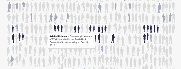
Visualizing Mass Shootings
The Source team kept tabs on two years of interactives and data on gun killings in the U.S. Here’s an overview of the coverage.
Visualizing Mass Shootings https://t.co/9a8YZtuDGf via @source
— Mike Bowser (@mikebowser) October 6, 2017
Saving Data Projects
From interactive visualizations to easy-to-use databases, storytelling with data has revolutionized modern reporting. But these projects are disappearing from the internet because newsrooms have no process for archiving these stories. To help out, take the survey; the results will be used to create new tools for preserving data journalism.
“Save the Data: Future-proofing data journalism” @merbroussard https://t.co/7SK1GviYO8 #ddj pic.twitter.com/u0sRO9NJj1
— Alberto Cairo (@albertocairo) October 7, 2017
Computational Thinking
Here’s Paul Bradshaw’s list of four favorite examples of computational thinking being used to spot and execute data journalism stories. The examples are from the Mirror, The Pudding, Buzzfeed and The Washington Post.
Note this, #students >> 4 examples of computational thinking in #journalism https://t.co/N8ZbC59Bcl via @wordpressdotcom
— Christina Zaba (@christinazaba) October 7, 2017
Data Journalism Definition
Andy Dickinson presents his definition to good data journalism — when it has a visible methodology and data. Otherwise, it may be good journalism but it’s not good data journalism.
I’ve been pondering the fundamentals of good data journalism – https://t.co/3T0jCSnLt8 #ddj pic.twitter.com/SQYqupYeqS
— Andy Dickinson (@digidickinson) October 3, 2017
Collaborative Journalism Models
The Center for Cooperative Media at New Jersey’s Montclair State University studied the rise of cooperation among news entities, and published a report outlining how collaborative journalism has “evolved from experiment to common practice.” The report, written by research director Sarah Stonbely, identifies six models for collaborative journalism and catalogs 44 ongoing collaborations across 500-plus newsrooms.
From Panama Papers to Electionland: The six types of collaborative journalism – and their benefits and pitfalls https://t.co/vxxXGacwMb https://t.co/4relNlRV8k
— EJC (@ejcnet) October 3, 2017
Investigative Data Journalism
The Global Editors Network gathered Amita Kelly of NPR (U.S.), Jelena Vasić of KRIK (Serbia) and Tiago Mali of ABRAJI (Brazil) to discuss the challenges of using data to hold the powerful accountable.
How to investigate #corruption that powerful individuals want to keep hidden https://t.co/XfL3TQs5nr #journalismjobs pic.twitter.com/kyatMkWYsl
— Advocacy Assembly (@Advocassembly) October 8, 2017
Visual Network Exploration
Tommaso Venturini, Mathieu Jacomy, Liliana Bounegru and Jonathan Gray’s paper “Visual Network Exploration for Data Journalists” dissects the potential of networks for exploration and collaborations between data journalists and digital researchers.
Our paper on visual network exploration for data journalists is now available on @SSRN https://t.co/BOXEaz1h0j #ddj #dataviz #networkviz pic.twitter.com/KracWN221B
— Liliana Bounegru (@bb_liliana) October 4, 2017
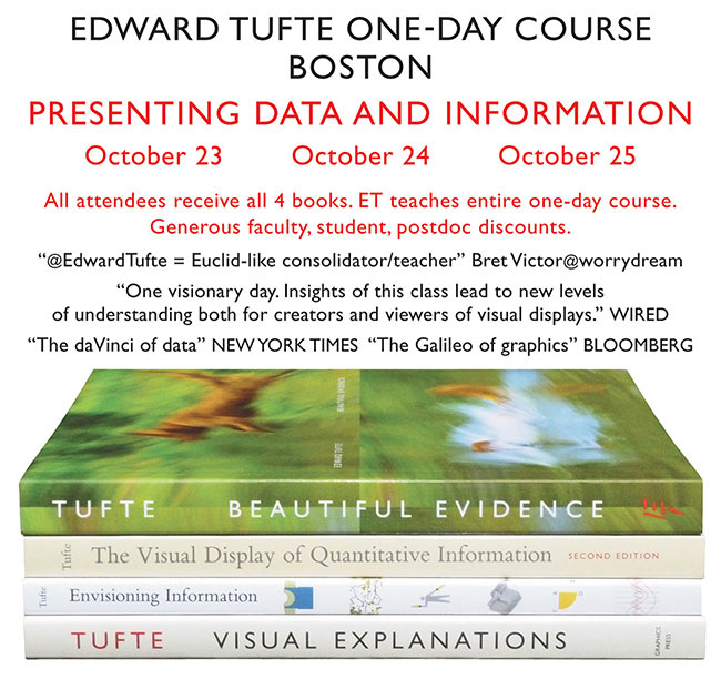
The da Vinci of Data
Nicknamed “the da Vinci of data” and “the Galileo of graphics,” data expert Edward Tufte will be teaching a one-day course on “Presenting Data and Information” on October 23, 24 and 25 in Boston.
StoryLab Academy Alerts
Sign up here to receive alerts about the next StoryLab Academy webinars, newsroom-based workshops and meetups in partnership with local Hacks/Hackers chapters.
Learn powerful #dataviz tools to tell the stories you find in data: https://t.co/asNgGOisKX. Apply: https://t.co/3x96Me9GEB #StoryLabAcademy pic.twitter.com/ogrYic8sLA
— Code For Africa (@Code4Africa) October 4, 2017
German Election Analysis in R
Berliner Morgenpost‘s interactive team prepared a script in the statistical programming environment R for their analysis of German election data. It includes the preprocessing — cleaning and structuring the raw data — and the analysis.
If you want to create election maps like we did for #btw17 – here’s the R code: https://t.co/vemLKIfxHP #ddj pic.twitter.com/FikL1sTgDk
— Julius Tröger (@juliustroeger) October 4, 2017
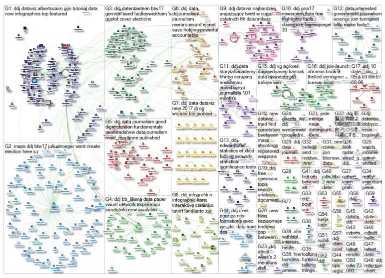
Thanks, once again, to Marc Smith of Connected Action for gathering the links and graphing them.
For a look at Marc Smith’s mapping on #ddj on Twitter, check out this map.
GIJN Guide to Investigating Foreign Lobbying
Guide to Investigating Caste

Gathering Evidence and Documents in Conflict and War Zones — A MENA Case Study

Tipsheet: How Journalists Can Use a UN Process to Evaluate National Human Rights Records
Data Journalism Top 10: A Year of War in Ukraine, Russian Casualties, Trans Identities, Unexpected NBA Performances
GIJN’s Data Journalism Top 10: Sigma Awards, Campaign Trail Food, Data Cleaning Nightmares, Massive Leaks

GIJN’s Data Journalism Top 10: Your Health Data for Sale, Music & Politics, Predictive Journalism, AI Accountability, Data Women

GIJN’s Data Journalism Top 10: Visualizing Philosophy, El Salvador’s Violence, the UK’s John Bercow, Mexican Bikes, and Russian Data

This work is licensed under a Creative Commons Attribution-NoDerivatives 4.0 International License
Republish our articles for free, online or in print, under a Creative Commons license.
Republish this article
This work is licensed under a Creative Commons Attribution-NoDerivatives 4.0 International License
Read Next
Data Journalism Data Journalism Top 10
Data Journalism Top 10: A Year of War in Ukraine, Russian Casualties, Trans Identities, Unexpected NBA Performances
GIJN’s weekly look at the best in data journalism examines one year of war in Ukraine, Russian casualty totals, trans coverage in the French media, and the most unexpected performances in NBA history.
Data Journalism
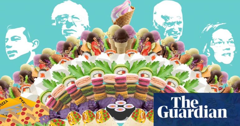
GIJN’s Data Journalism Top 10: Sigma Awards, Campaign Trail Food, Data Cleaning Nightmares, Massive Leaks
What’s the global data journalism community tweeting about this week? Our NodeXL #ddj mapping from February 10 to 16 finds The Guardian US analyzing food expenditure on the Democrats’ campaign trail, The Washington Post’s Steven Rich sharing the pains of cleaning spelling permutations in data, The International Consortium of Investigative Journalists explaining the process of handling the massive #LuandaLeaks records, and the Sigma Awards announcing its shortlist.
Data Journalism
GIJN’s Data Journalism Top 10: Your Health Data for Sale, Music & Politics, Predictive Journalism, AI Accountability, Data Women
What’s the global data journalism community tweeting about this week? Our NodeXL #ddj mapping from November 11 to 17 finds an investigation by The Financial Times uncovering how private health information is being traded online by health sites to big advertisers, The Economist looking at the correlation between Americans’ music preferences and political leanings, The Bureau of Investigative Journalism investigating the government’s algorithmic decision-making, and the data community coming together to highlight excellent female data journalists.
Data Journalism
GIJN’s Data Journalism Top 10: Visualizing Philosophy, El Salvador’s Violence, the UK’s John Bercow, Mexican Bikes, and Russian Data
What’s the global data journalism community tweeting about this week? Our NodeXL #ddj mapping from October 28 to November 3 finds The Economist’s summary of a great year in print data journalism, an interesting visualization by Deniz Cem Önduygu of key arguments in Western philosophy, Datajournalism.com’s guide to editing data journalism, and BBC News’ analysis of outgoing House of Commons Speaker John Bercow’s career in numbers.