FOIA This! The Depressing State of Open Data

In our latest look at FOIA around the world, we examine the state of open data sets. According to the new report by the World Wide Web Foundation, the news is not good.
“The number of global truly open datasets remains at a standstill,” according to the group’s researchers, who say that only seven percent of government data is fully open.
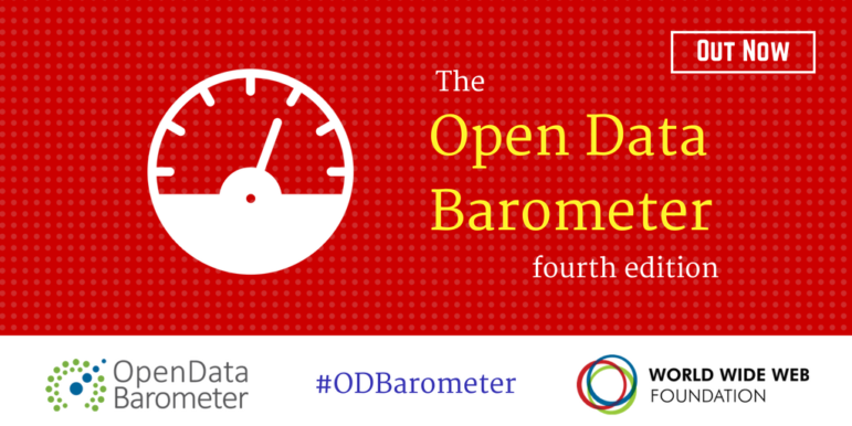
The findings come in the fourth edition of the Open Data Barometer, an annual assessment which was enlarged this year to include 1,725 datasets from 15 different sectors across 115 countries. The report summarizes:
Only seven governments include a statement on open data by default in their current policies. Furthermore, we found that only 7 percent of the data is fully open, only one of every two datasets is machine readable and only one in four datasets has an open license. While more data has become available in a machine-readable format and under an open license since the first edition of the Barometer, the number of global truly open datasets remains at a standstill.
Based on the detailed country-by-country rankings, the report says some countries continue to be leaders on open data, a few have stepped up their game, but some have slipped backwards.
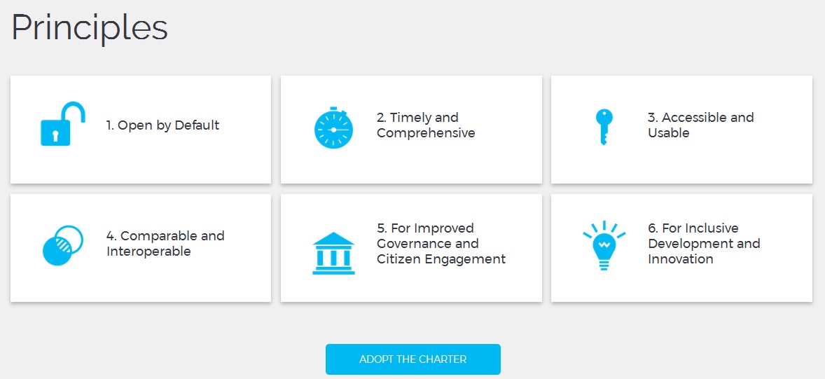 The first of five recommendations, as in years past, advocates making government data “open by default” in conformance with the principles set out in the Open Data Charter.
The first recommendation, which is a more specific proposal than in previous reports, supports buttressing access laws. “Where in place,” it reads, “right to information laws should be revised to provide for proactive disclosure that guarantees non-personal government data will be open by default, available in machine-readable formats and published under open licenses that allow the data to be reused.”
Among other conclusions, the report is critical of open data portals, saying they “often do not contain the data people really want and need” and that the data itself “is usually incomplete, out of date, of low quality and fragmented.” The researchers “found some evidence that open data is contributing to economic growth and the creation of new businesses, but little or no evidence that it is contributing to social inclusion (whether by enhancing excluded groups’ access to public services or increasing their participation in policy decisions).”
(See FreedomInfo.org reports on the third Barometer, the second Barometer and the first Barometer.)
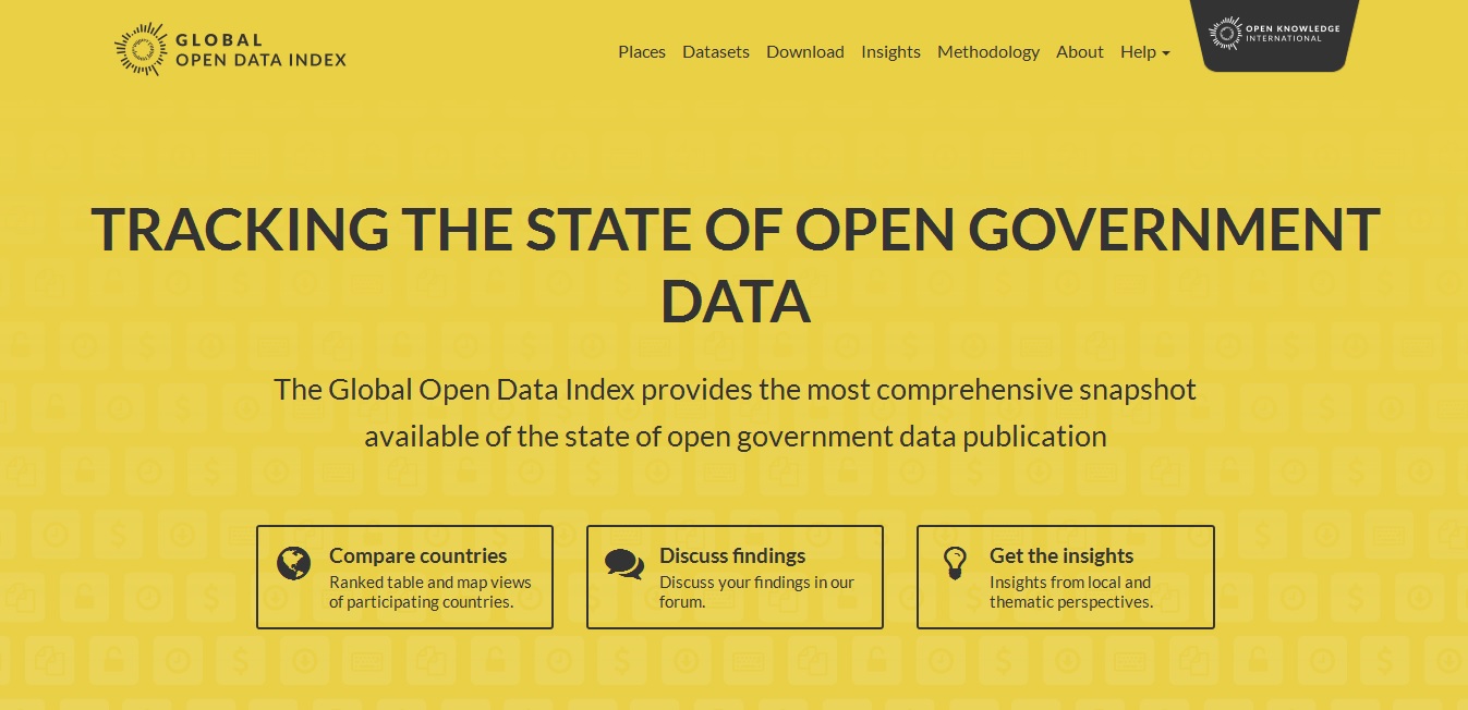 The Barometer findings are broadly consistent with those recently released in the 4th edition of the Global Open Data Index (GODI), conducted by Open Knowledge International. GODI compares national government in 94 places across the 15 key datasets that have been assessed as the most useful for solving social challenges. In the latest edition, 1,410 datasets were evaluated, but only 10 percent of these are open according to the Open Definition.
Follow Up Q & A
FreedomInfo.org asked several follow-up questions to Carlos Iglesias, lead researcher on the Barometer.
Can you indicate any factors that contributed to more successful data production?
- Adopt a solid strategy with specific objectives and expectations and realistic open data targets.
- Work with citizens to understand their priority needs and address those.
- Improve data management practices, build capacity inside and outside of government and support a culture of data innovation.
- Implement strong data protection and FOI legislation, provide proactive disclosure and formatting requirements.
- The most positive examples are countries that have adopted the Open Data Charter; we encourage others to follow suit.
- These all require political commitment to enable the required governmental transformational process, and to guarantee sustainability and achieve long-term success.
Why do the recommendations only exhort governments without encouraging the demand side. In most of these countries, the public could seek access to the data through FOI laws. Why isn’t this happening? Could it happen more? Why not recommend/support this sort of activism?
 We recognize the demand side is very important and we do have some demand side indicators in the research, including degree of engagement between governments and civil society, availability of capacity-building programs and the strength of FOI frameworks.
However, given limited resources, we put the primary focus of the Barometer on the factors that policymakers and government officials oversee in the data management and proactive publication process, given we want to measure the openness of government data specifically.
Outside of the Barometer research, we do engage frequently with the demand side in other projects, for example through our Open Data Lab in Jakarta which conducts capacity building and research for local NGOs, including FOI as part of that. We strongly believe the two go hand-in-hand, and are always quick to point out to governments that having one is no excuse to weaken the other.
This story was originally published on the FreedomInfo.org website and is reprinted with permission. Have an example of enterprising use of FOI/RTI laws around the world? Send us an email.
 Toby McIntosh is the director of GIJN’s resource center and the editor of FreedomInfo.org, a nonprofit website based in Washington, DC that covers international transparency laws. He was with Bloomberg BNA for 39 years and has filed numerous US FOI requests and has written about FOI policies worldwide. He is also a steering committee member of FOIANet, an international network of FOI advocates.

A Call for Debate: Taking Open Data and Government to the Next Level

Guide to Investigating Caste

Gathering Evidence and Documents in Conflict and War Zones — A MENA Case Study

Tipsheet: How Journalists Can Use a UN Process to Evaluate National Human Rights Records

Data Journalism Top 10: Measuring Mask Use, Parental Interruptions, Childbirth Woes, India’s Low Death Rate

Data Journalism Top 10: Bill Gates Conspiracies, COVID-19 Excess Mortality, Home Deaths Spike, Test Kits

Data Journalism Top 10: Viral Dataviz, DIY Masks, Breaking the Wave, China and US Response to COVID

GIJN’s Data Journalism Top 10: Women and the Oscars, February’s Sad Songs, Hollywood’s Franchises, Moscow’s Elite Owners

This work is licensed under a Creative Commons Attribution-NoDerivatives 4.0 International License
Republish our articles for free, online or in print, under a Creative Commons license.
Republish this article
This work is licensed under a Creative Commons Attribution-NoDerivatives 4.0 International License
Read Next
Data Journalism
Data Journalism Top 10: Measuring Mask Use, Parental Interruptions, Childbirth Woes, India’s Low Death Rate
How widespread is mask use in your country? Our NodeXL #ddj mapping from July 13 to 19 finds The New York Times mapping the odds of people encountering other mask wearers in the United States, two university professors quantifying the number of interruptions a parent suffers on average every hour while working from home, the Committee to Protect Journalists talking to data journalists about the struggles of reporting on COVID-19, and openDemocracy documenting cases of mistreatment of women in labor around the world since the pandemic started.
Data Journalism
Data Journalism Top 10: Bill Gates Conspiracies, COVID-19 Excess Mortality, Home Deaths Spike, Test Kits
Misinformation has grown ubiquitous during the COVID-19 pandemic, so much so that World Health Organization Director-General Tedros Adhanom Ghebreyesus proclaimed: “We’re not just fighting an epidemic; we’re fighting an infodemic.” Microsoft co-founder Bill Gates has emerged as a favorite target of disinformation actors, according to The New York Times, that we discovered through our NodeXL #ddj mapping from April 13 to 19. We also found The Economist and ProPublica examining the true impact of the pandemic by looking into “excess mortalities” such as home deaths, the Associated Press releasing and updating a coronavirus public dataset for the United States.
Data Journalism
Data Journalism Top 10: Viral Dataviz, DIY Masks, Breaking the Wave, China and US Response to COVID
From “flattening the curve” to “social distancing,” and now “breaking the wave,” the global data journalism community is using new terminology in its attempts to explain the intricacies of COVID-19 to the masses. Our NodeXL #ddj mapping from April 6 to 12 finds Reuters Graphics explaining their “breaking the wave” chart, The Washington Post helping readers figure out the best material to use to make their own masks, the Financial Times comparing the response of China and the United States in handling the pandemic, and Press Gazette highlighting the huge appetite for data-driven visual journalism about COVID-19.
Data Journalism
GIJN’s Data Journalism Top 10: Women and the Oscars, February’s Sad Songs, Hollywood’s Franchises, Moscow’s Elite Owners
What’s the global data journalism community tweeting about this week? Our NodeXL #ddj mapping from February 3 to 9 finds UOL highlighting the lack of gender equality among Oscar winners and G1 looking into problems of ageism in the Best Actress category. This edition also has The Economist analyzing Spotify data to find the most depressing month for listeners, Proekt Media investigating property owners in a prestigious residential area in Russia, and The Financial Times spotlighting the lack of innovation in the movie industry.