Top Ten #ddj: This Week’s Top Data Journalism
What’s the #ddj community tweeting about? Our NodeXL mapping from May 22 to 28 includes what it’s like to code as a journalist from @CJR, artists and designers visualizing Google search data from @FastCoDesign, the Data Journalism Awards 2017 shortlist from @mberzosa and Austria’s changing job market from @derStandardat.
Thanks, once again, to Marc Smith of Connected Action for gathering the links and graphing them.
Coding as a Journalist
In the first in a series of interviews with those practicing visual journalism, David Yanofsky, a reporter at Quartz, shares insights about his recent visualization efforts and where he gets inspiration for story ideas.
Don’t miss this interview with @YAN0 by @jonkeegan: https://t.co/rrvtFxwL54 Coding as journalism #ddj #dataviz First of a series! Yay! pic.twitter.com/bJh6Vkxvhd
— Alberto Cairo (@albertocairo) May 23, 2017
Pretty Cool: Artists and Google Search Data
Google News Lab is inviting artists and designers to dig into its massive trove of data about what the world Googles.
Data Art! What Happens When Google Turns Artists Loose On Its Search Data https://t.co/nh7fiO4O3z pic.twitter.com/MOwCIwhjma
— steve knight (@snknight) May 29, 2017
Data Journalism Awards Shortlist
Winners will be announced on June 22 at the 7th Global Editors Network Summit in Vienna. Categories include Data Visualization of the Year, Investigation of the Year and Open Data.
Preclasificados, premios de periodismo de datos #DataJournalism Awards, #DJA2017 #shortlist https://t.co/e30uw6ccQy #ddj #medios #periodismo pic.twitter.com/6G7vt8wQZ0
— Millán I. Berzosa (@mberzosa) May 23, 2017
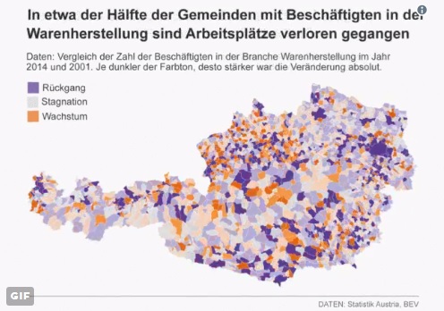
Where the Jobs Are
Der Standard’s analysis of Austria’s census surveys in 2001 and 2014 shows jobs are mostly created in larger urban areas while rural areas experience brain drain.
Wir haben uns angesehen, in welchen Gemeinden seit 2001 in Österreich Jobs entstanden sind https://t.co/GIjbi8Uz3B #ddj pic.twitter.com/Fs4CV3jTLm
— Gerald Gartner (@gerald_gartner) May 25, 2017
How Not To Be Wrong
Your story can be mathematically true but incorrect in context or explanation. This six-point checklist by The New York Times’ Robert Gebeloff will help ensure your data journalism project is not half true or wrong.
YEP. “It’s very well possible that your story is true but wrong.” The great @gebeloffnyt on using data responsibly: https://t.co/DU8RSD3qWZ
— Meghan Hoyer (@MeghanHoyer) May 31, 2017
TidyCensus
A new R package allows users to interface with the US Census Bureau’s decennial Census and five-year American Community APIs and return tidyverse-ready data frames.
Introducing tidycensus: get @uscensusbureau spatial & demographic data in #rstats ready for use w/sf & the tidyverse https://t.co/vZERwEGVOz pic.twitter.com/DJM0eLrLMx
— Kyle Walker (@kyle_e_walker) May 22, 2017
Money Map: Bitcoining it in Real Time
Imperial College London maps in real time the volume and location of bitcoin transactions across 64 screens.
Inside Europe’s biggest data visualisation laboratory @FT https://t.co/yLh3mJ2558 #dataviz pic.twitter.com/hZovHbORoB
— Holition (@Holition) May 25, 2017
Facebook Friends and Right-Wing Networks
Analysis of the Facebook connections of right-wing movements, politicians and the media in Europe reveals overlaps.
Le Pen schenkt HC ein Like: Wie sich Europas Rechte vernetzen https://t.co/BKQZHQ7Uvo #ddj pic.twitter.com/bLo77kkecX
— Gerald Gartner (@gerald_gartner) May 24, 2017
US Presidential Election Map
Results mapped at a county level showing the candidate with the largest vote share in each area for 2016.
weird to think that both of these maps represent the same thing pic.twitter.com/c23d95PKVR
— Nick Veronica (@NickVeronica) May 11, 2017
Game On: FC Köln’s Season Matches
Check out the interactive data on FC Köln’s 2016/17 season’s matches including the goals, concedes, points and cards.

For a look at Marc Smith’s mapping on #ddj on Twitter, check out this map.

Basic Data Journalism Tips for Editors

My Favorite Tools: Venezuela’s Lisseth Boon on Design and Data Visualization

Document of the Day: Visual Vocabulary
How To Create a Data Journalism Team

From Data to Storytelling: Concept and Design Tips from the Financial Times’ John Burn-Murdoch

Data Don’ts: Expert Tips to Avoid Misleading Audiences With Numbers

How The Pudding Used Data Visualizations to Recontextualize the Story of Climate Change

How Data Journalism Is Changing the Face of Africa

This work is licensed under a Creative Commons Attribution-NoDerivatives 4.0 International License
Republish our articles for free, online or in print, under a Creative Commons license.
Republish this article
This work is licensed under a Creative Commons Attribution-NoDerivatives 4.0 International License
Read Next
Data Journalism
From Data to Storytelling: Concept and Design Tips from the Financial Times’ John Burn-Murdoch
The chief data reporter for the Financial Times discusses how he considers the use of text, color, and annotation to aid visual storytelling through charts and graphics.
Data Journalism
Data Don’ts: Expert Tips to Avoid Misleading Audiences With Numbers
At a NICAR 2025 panel, data journalism experts discussed nuanced number errors that watchdog reporters often make that can confuse readers and disrupt story angles.
Climate Data Journalism
How The Pudding Used Data Visualizations to Recontextualize the Story of Climate Change
What does climate change feel like? How will your city’s climate shift, 50 years from now? Data scientist Derek Taylor explains his latest piece.
Africa Focus Data Journalism
How Data Journalism Is Changing the Face of Africa
Data journalism in Africa has made a powerful impact, from holding leaders accountable to refuting myths around domestic violence. But the field faces formidable challenges.