La Nación Maps Pollution on Argentina’s Matanza River
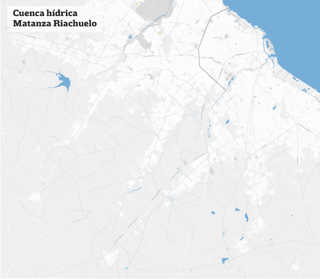
A lot has been said, written, and promised regarding the pollution and potential cleaning of Argentina’s Matanza River (often referred to as River Riachuelo or simply Riachuelo in Spanish). Yet, years pass and the pollution continues to increase without any sign of a slowdown. Diseases multiply and affect thousands of people living in the 15 surrounding districts.
S.O.S. Riachuelo is a special multimedia report using open data to inform Argentinians on the Riachuelo river pollution and related diseases.
Data Source and Data Analysis
 We looked for indicators published by ACUMAR, the authority regulating the Matanza-Riachuelo Geographic Basin, and downloaded the data in order to assess which indicators were relevant for our investigation. As it is a topic that has been discussed a lot in the press, we wanted to find unique data that were new to the audience.
Journalism Focus
After analyzing the various indicators, hand in hand with journalist Laura Rocha, we observed that children were among the most vulnerable populations, with high probabilities of contracting diseases related to pollution. We decided to make it the focus of this special report.
We decided to work with the following indicators:
- Disease rate, the age of the affected population (a majority of which are children), and its evolution over time.
- Location of industrial plants that contaminate the basin: plants generating pollutants, restructured plants and closed plants.
- Evolution of the water oxygen level: its various levels measured over the years.
Data Visualization
1. Disease rate
The goal was to show the number of sick neighbors, and in this way, reveal the true consequences of living in a polluted area. While the volume of data was huge, the main challenge was to simplify the interface so that the audience could easily understand the problem at hand.
In this data visualisation, when you select a disease, the body chart gives you a list of the main symptoms, and the bar chart shows the incidence rate per 100,000 inhabitants by age category. The contrast in the length of the bars uncovers the higher vulnerability of younger ones in terms of incidence.
2. Industrial plant location
The main cause of air and water pollution are the 16,267 industrial plants located within the water basin.
On a single map, we mapped every single plant listed by ACUMAR, rendering both the huge amount of plants along the Matanza River and their exact locations. Then, we used an animated format to show how many of them are generating pollutants, how many of them were restructured or modernized, and how many were closed.
The GIF automatically plays while the reader navigates the report, so that the relevant information appears without the need for mouse interaction.
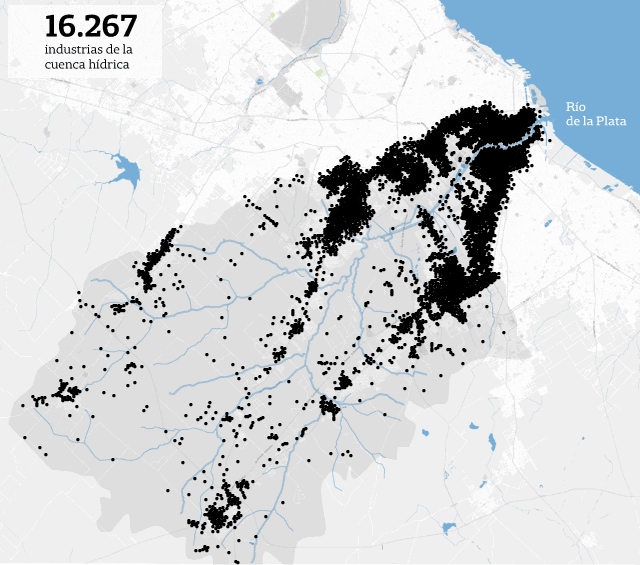
Mapping the industrial plants in the Riachuelo/Matanza Basin
3. Evolution of the water oxygen level
In the last data visualization element, we selected some of the water monitoring stations listed in the ACUMAR dataset to display the evolution of measurements over time. Depending on the oxygen level, the flora and fauna are more or less impacted, and the graphic helps the reader to understand the problems.
This blog post first appeared in Spanish on La Nacion Data’s blog and was also published in English on Tableau Public.
 Gabriela Bouret is a data analyst in the LNData team. She is interested in data mining, data journalism, and open data. She was previously a database marketing services analyst at Rapp Collins and Y&R Group/Wunderman.
 Mariana Trigo Viera is a graphic designer at La Nación.

Step-By-Step Guide for Journalists on the Basics of Google Sheets

Basic Data Journalism Tips for Editors

Investigative Audio: 8 Tips from Podcasting Innovators

My Favorite Tools: Venezuela’s Lisseth Boon on Design and Data Visualization

From Data to Storytelling: Concept and Design Tips from the Financial Times’ John Burn-Murdoch

Data Don’ts: Expert Tips to Avoid Misleading Audiences With Numbers

How The Pudding Used Data Visualizations to Recontextualize the Story of Climate Change

How Data Journalism Is Changing the Face of Africa

This work is licensed under a Creative Commons Attribution-NoDerivatives 4.0 International License
Republish our articles for free, online or in print, under a Creative Commons license.
Republish this article
This work is licensed under a Creative Commons Attribution-NoDerivatives 4.0 International License
Read Next
Data Journalism
From Data to Storytelling: Concept and Design Tips from the Financial Times’ John Burn-Murdoch
The chief data reporter for the Financial Times discusses how he considers the use of text, color, and annotation to aid visual storytelling through charts and graphics.
Data Journalism
Data Don’ts: Expert Tips to Avoid Misleading Audiences With Numbers
At a NICAR 2025 panel, data journalism experts discussed nuanced number errors that watchdog reporters often make that can confuse readers and disrupt story angles.
Climate Data Journalism
How The Pudding Used Data Visualizations to Recontextualize the Story of Climate Change
What does climate change feel like? How will your city’s climate shift, 50 years from now? Data scientist Derek Taylor explains his latest piece.
Africa Focus Data Journalism
How Data Journalism Is Changing the Face of Africa
Data journalism in Africa has made a powerful impact, from holding leaders accountable to refuting myths around domestic violence. But the field faces formidable challenges.