Accessibility Settings

color options

monochrome muted color dark

reading tools

isolation ruler

Tag

infographics

23 posts

News & Analysis

How iFact Is Transforming Investigative Reporting in the Republic of Georgia

When Nino Bakradze was growing up in Georgia in the ’90s, the country was embroiled in a civil war and a post-USSR economic crisis. In a media landscape dominated by state TV, investigative journalism just didn’t happen. The situation hadn’t changed much when she graduated, so she set up iFact to turn the tables. GIJN’s Alexandra Tyan spoke to the team.

Data Journalism

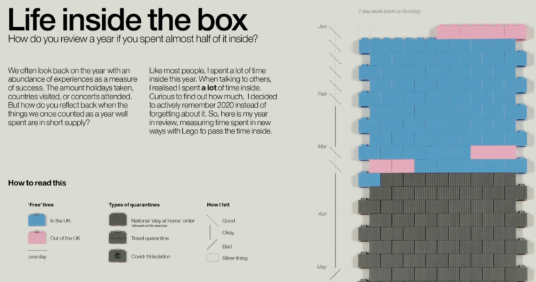
Data Journalism Top 10: Polarized America, Australia’s Pandemic, Poland’s Toxic Air, the Arab Spring, Life as Lego

Our NodeXL #ddj mapping from January 25 to 31 found interactive projects by the Australian Broadcasting Corporation and The Guardian analyzing these events. In this edition, we also feature environmental reporting by The New York Times and The Economist, a Wall Street Journal story on the GameStop Reddit mania that shook stock markets, and a visual representation of 2020 using Lego bricks.

Data Journalism

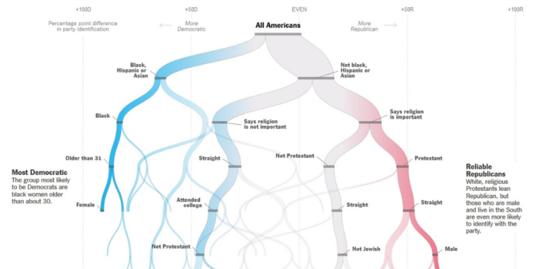
Data Journalism Top 10: A New President, Trump’s Twitter Insults, Germany’s Elections, Flying Green

As Joe Biden was sworn in as the 46th president of the United States, much of the international media coverage was focused on an inauguration like no other. Our NodeXL #ddj mapping from January 18 to 24 found a Washington Post analysis of the president’s first address to the nation and a Bloomberg project visualizing the enhanced measures put in place to deal with concerns about security and the coronavirus.

News & Analysis

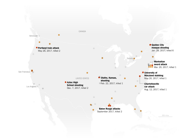
How The New York Times Visualized Global Trends in White Extremist Attacks

Last year The New York Times published an interactive article on white extremist killings from New Zealand to Norway to the United States. Using maps and a timeline to plot the data, the project revealed the troubling frequency and, in some cases, strange connections between the events. Here graphic designer Weiyi Cai explains how they obtained the data for project and the decisions they made about visualizing it.

Reporting Tools & Tips

Multilingual Journalism Could Make a Comeback. Here Are Some Tools That Might Help

New tools and industry trends are making it easier for media organizations to publish translations and localized adaptations of their work, writes Patrick Boehler, executive editor of the Swiss public broadcaster’s international service — and publishing in multiple languages helps newsrooms develop new sources and fact-check. Boehler outlines three new tools for multilingual journalism from a recent “hackathon.”

Data Journalism

GIJN’s Data Journalism Top 10: Data Complexity, Forking Paths, Post-Brexit

What’s the global data journalism community tweeting about this week? Our NodeXL #ddj mapping from August 12 to 18 finds information designer Giorgia Lupi discussing how to embrace data complexity, The New York Times Opinion building a forking path visualization to predict an individual’s political leanings, the Guardian visualizing Brexit’s potential impact on the UK’s food imports, and El Universal Mexico looking at the incidences of crime claiming young victims.

Data Journalism

GIJN’s Data Journalism Top 10: Ring of Fire, Political Dynasties, Data Janitors, Hong Kong Protests

What’s the global data journalism community tweeting about this week? Our NodeXL #ddj mapping from June 10 to 16 finds a gorgeous series of data visualizations by National Geographic on the Ring of Fire, Bloomberg analyzing the influence of dynasties in the Philippines’ politics, RStudio’s Hadley Wickham talking about why you shouldn’t assign data cleaning to a “data janitor,” and BR Recherche looking at the complexity of privacy policies.

Data Journalism

GIJN’s Data Journalism Top 10: History of Infographics, Colorism in Fashion, Weather Trends

What’s the global data journalism community tweeting about this week? Our NodeXL #ddj mapping from April 22 to 28 finds an interesting breakdown of colorism in fashion by @puddingviz, a series of gorgeous maps on natural disasters and extreme weather trends in the United States by @PostGraphics, a preview of a book on the history of infographics by @srendgen, and @UpshotNYT’s recap of its best articles from the past five years.

Resource

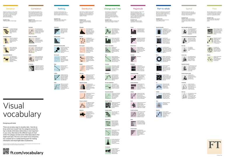
Document of the Day: Visual Vocabulary

Inspired by the Graphic Continuum by Jon Schwabish and Severino Ribeca, the Financial Times graphic team came up with their own neat chart of visualizations. The Visual Vocabulary is a guide to help journalists pick the right type of visualization for their story.

Data Journalism

GIJN’s Data Journalism Top 10: New York’s Luxury Homes, Climate Dangers, Inspiring Data Viz

What’s the global data journalism community tweeting about this week? Our NodeXL #ddj mapping from Oct 8 to 14 finds 25 inspirational data visualizations collated by @VismeApp, a @nytimes op-ed by climate scientists warning of the future dangers of heat and humidity combined, @FT maps of New York’s glut of luxury residences and @ejcnet with veteran data journalists on web scraping.