Accessibility Settings

color options

monochrome muted color dark

reading tools

isolation ruler

Tag

gender

24 posts

Data Journalism

GIJN’s Data Journalism Top 10: El Salvador’s Corpses, Searching for Women, Merging Data

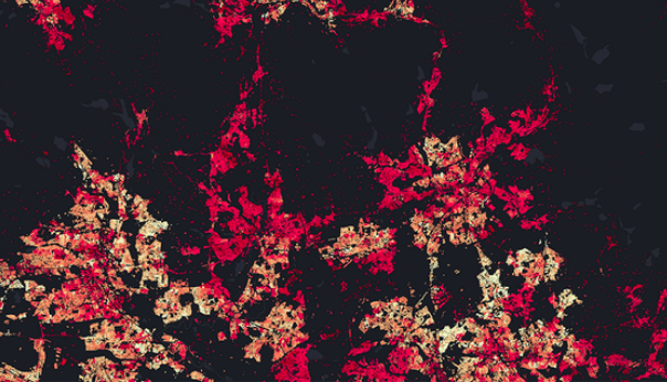
What’s the global data journalism community tweeting about this week? Our NodeXL #ddj mapping from December 31, 2018 to Jan 6, 2019 finds experts sharing their thoughts on machine learning in journalism with @storybench, @funkeinterativ and @webk1d’s useful tool to merge datasets, @pewresearch’s overview of female under-representation in online image searches, and an analysis by @EDNNews on corpses bodies sent back to El Salvador.

Data Journalism

GIJN’s Data Journalism Top 10: Number Jungles, Gender Gaps, Uber Maps, Brexit Woes

What’s the global data journalism community tweeting about this week? Our NodeXL #ddj mapping from November 5 to November 11 finds employment problems in the UK from @FinancialTimes, Polish data counter-narratives with @gazeta_wyborcza, cool geospatial analysis toys from @Uber, plus the launches of new data labs with @AlterEco_, data articles with @fstalph and @eborgesrey and data newsletters with @voydorg_en.

Data Journalism

GIJN’s Data Journalism Top 10: Sad Tunes Algorithm, Fragapane’s Beautiful Dataviz, African Pay Gap, Euro-Xenophobia

What’s the global data journalism community tweeting about this week? Our NodeXL #ddj mapping from Sept 10 to 16 finds @miriamquick analyzing @Spotify data to rank the top five saddest songs, @Code4Africa creates a tool to measure gender pay gap in African countries, @fedfragapane shares beautiful illustrations on Instagram, #edjnet finds Italy, Turkey and Greece topping the list of Europe’s xenophobic countries, and @TaylorMirf highlights the low rates of immunizations in Washington state.

Data Journalism

GIJN’s Data Journalism Top 10: Muslims to Mecca, Women (Not) in Netflix, Inside Airbnb Europe, London’s Foul Air

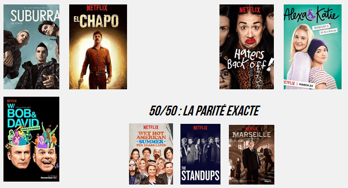
What’s the global data journalism community tweeting about this week? Our NodeXL #ddj mapping from Aug 20 to 26 finds @Numerama analyzing the representation of women in @netflix series and finds it lacking, @AJEnglish creating an interactive explainer on how 2 million Muslims make the pilgrimage to Mecca every year, @FT readers brainstorming air pollution solutions for London, and @Bastamag digging into data of @Airbnb — a cash cow for home renters.

Data Journalism

GIJN’s Data Journalism Top 10: Egyptian Bots, Pocket Inequality, Loner Jobs and Knife Emergencies

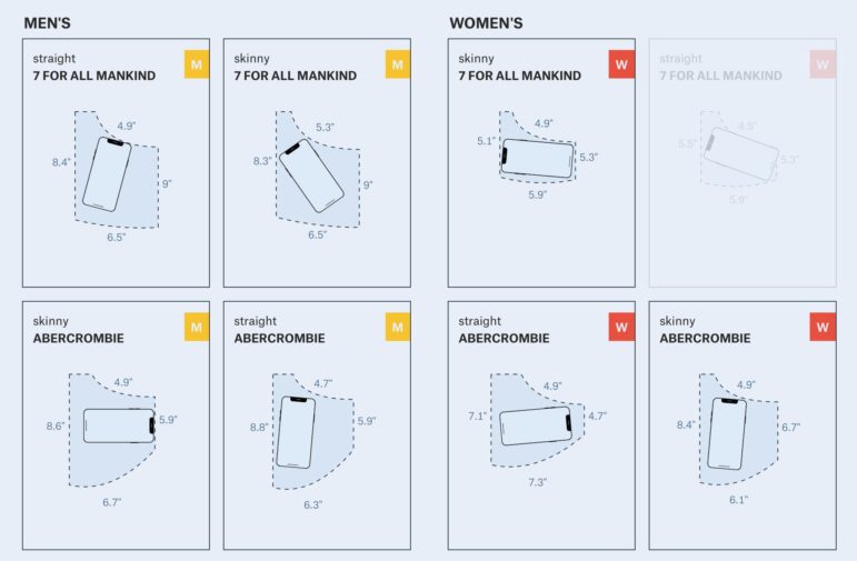
What’s the global data journalism community tweeting about this week? Our NodeXL #ddj mapping from Aug 13 to 19 finds @puddingviz proving that women’s pockets are inferior to men’s once and for all, @vizzuality pondering the impact cartographers have on our understanding of the world by presenting nocturnal activity in daytime maps, @InfoTimes_ discovering the bots behind the political debate in Egypt and @hnrklndbrg’s visualizations on everything from loner jobs to knife emergency room visits.

News & Analysis

Online Harassment of Journalists: RSF’s 25 Recommendations

A new report by Reporters Without Borders is helping to shed light on the latest danger for journalists – threats and insults on social networks that are designed to intimidate them into silence. The organization has put forth these 25 recommendations for governments, international organizations, online platforms, media companies and advertisers to respond to these virulent online campaigns.

Data Journalism

GIJN’s Data Journalism Top 10: Footballers’ Salaries, Google Trends and Gender Bias with Pudding

What’s the global data journalism community tweeting about this week? Our NodeXL #ddj mapping from July 9 to 15 finds @morgenpost’s interactive slider showing how fast a German national footballer earns your monthly salary, tons of interesting Google search data in its @GoogleTrends data store, @durand101 and @puddingvizgender exposing bias in the UK House of Commons and @EdjNet offering a search engine for 800,000 EU datasets.

News & Analysis

Who Maps the World?

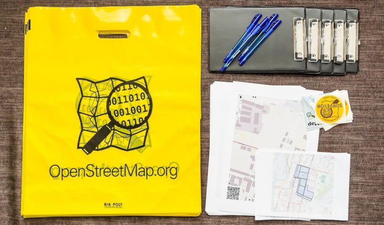
OpenStreetMap is the self-proclaimed Wikipedia of maps. It’s a free and open-source sketch of the globe, created by a volunteer pool that essentially crowdsources the map, tracing parts of the world that haven’t yet been logged. But despite its democratic aims, it’s still much like the mapping world overall — overwhelmingly dominated by male cartographers. That’s starting to change.

Data Journalism

GIJN’s Data Journalism Top 10: Donut Holes, Turkish Data and Cop Shootings

What’s the global data journalism community tweeting about this week? Our NodeXL #ddj mapping from March 26 to April 1 finds @washingtonpost on fatal police shootings, @decodeurs mapping Europe’s terrorist attacks, @DagmedyaVeri’s open data resources for Turkey and an undated chart of shrinking donut holes from the @smithsonian archives.