Accessibility Settings

color options

monochrome muted color dark

reading tools

isolation ruler

Tag

data visualization

215 posts

Data Journalism

GIJN’s Data Journalism Top 10: Plastic Mountains, #SharpieGate, Stopwatch Analysis, Collaborative Software

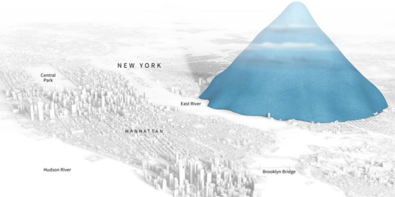
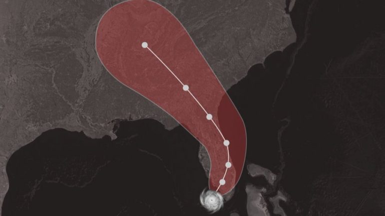
What’s the global data journalism community tweeting about this week? Our NodeXL #ddj mapping from September 9 to 15 finds ProPublica open-sourcing its collaborative reporting software; CityLab interviewing Mark Monmonier, author of “How to Lie With Maps,” on Donald Trump’s deceptive hurricane map; Al Jazeera surveying South Sudan’s citizens on displacement; and Reuters visualizing just how bad the Earth’s problem is in terms of single-use plastics.

Data Journalism

GIJN’s Data Journalism Top 10: 3D Animation, Brexit Borders, Bad Research, NY Subway

What’s the global data journalism community tweeting about this week? Our NodeXL #ddj mapping from September 2 to 8 finds Folha de São Paulo’s beautiful 3D animation of the Brazil National Museum’s restoration efforts, Guardian’s real-time visualization of Irish border crossings, NZZ’s look at China’s bad research impacting scientists worldwide, and The New York Times calculating the variability of New York City’s subway commute times.

Data Journalism

GIJN’s Data Journalism Top 10: Zero Privacy, Hurricane Maps, Water Stress, Russian Judges

What’s the global data journalism community tweeting about this week? Our NodeXL #ddj mapping from August 26 to Sept 1 finds The New York Times examining the massive amount of digital trackers that follow an individual’s web activity, The Washington Post looking at the stress on global water resources, Data Visualization Society announcing the first #VizRisk challenge winners, and Datajournalism.com sharing tips on how journalists can learn to code.

Data Journalism

GIJN’s Data Journalism Top 10: Burning Amazon, Mass Shootings, Hungarian Kings

What’s the global data journalism community tweeting about this week? Our NodeXL #ddj mapping from August 19 to 25 finds Bloomberg mapping the alarming degradation of the Amazon rainforest, Alyssa Fowers discussing variations in visualizing mass shootings and their corresponding impact on readers, Data Carpentry sharing tips for organizing data in spreadsheets, and Atlatszo visualizing the succession of Hungarian kings.

Data Journalism

GIJN’s Data Journalism Top 10: Data Complexity, Forking Paths, Post-Brexit

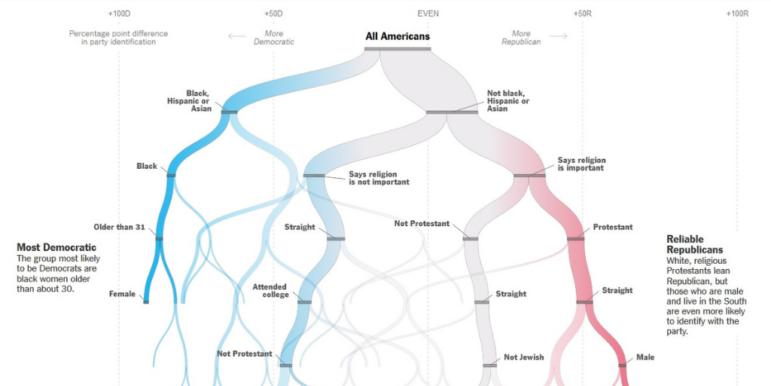
What’s the global data journalism community tweeting about this week? Our NodeXL #ddj mapping from August 12 to 18 finds information designer Giorgia Lupi discussing how to embrace data complexity, The New York Times Opinion building a forking path visualization to predict an individual’s political leanings, the Guardian visualizing Brexit’s potential impact on the UK’s food imports, and El Universal Mexico looking at the incidences of crime claiming young victims.

Data Journalism

GIJN’s Data Journalism Top 10: Tarantino’s Swearing, TheyDrawIt Tool, Climate Crisis

What’s the global data journalism community tweeting about this week? Our NodeXL #ddj mapping from August 5 to 11 finds Spiegel Online analyzing the typical features in Quentin Tarantino’s films, MU Collective releasing an interactive “TheyDrawIt” tool to engage and educate readers, and the conversation on the climate crisis heating up — with 101 East Al Jazeera looking into Cambodia’s deforestation, Neue Zürcher Zeitung analyzing Switzerland’s forest fires, and the Financial Times digging into the impact of jet streams on the climate.

Data Journalism

GIJN’s Data Journalism Top 10: Visualizing Climate Change, Numbers from Phrases, Democratic Donors, Moscow Money

What’s the global data journalism community tweeting about this week? Our NodeXL #ddj mapping from July 29 to August 4 finds a number of articles related to the climate crisis, including the BBC’s piece on tree planting and its interactive tool on temperatures across the world, as well as Alberto Cairo’s blog post on misleading charts created by climate deniers. We also found useful tips and tools: a data GIF maker by Google News Initiative, Datajournalism.com’s strategies for teaching data journalism, and Paul Bradshaw’s tutorial on how to extract numeric data from phrases.

Data Journalism

GIJN’s Data Journalism Top 10: Hong Kong Protests, Migration Waves, Democratizing Dataviz

What’s the global data journalism community tweeting about this week? Our NodeXL #ddj mapping from July 22 to 28 finds The New York Times analyzing the catalyst behind Hong Kong’s recent protests, National Geographic visualizing human migration in the past 50 years, Ellery Studio’s fun and informative renewable energy coloring book, and The Economist’s findings that Hillary Clinton could have won the 2016 US election if all Americans had turned up to vote.

News & Analysis

GIJN’s Data Journalism Top 10: Aging Wimbledon, Must-Read DataViz, Bad Charts, German Opera

What’s the global data journalism community tweeting about this week? Our NodeXL #ddj mapping from July 15 to 21 finds Information Is Beautiful’s sharing its gallery of must-read data visualization books, Datajournalism.com highlighting pitfalls in creating charts, the FT analyzing the age of Wimbledon players, and WDR scrutinizing Germany’s opera repertoire.

Data Journalism

GIJN’s Data Journalism Top 10: Amazon.com, the Menstrual Cycle, Canadian Sex Crimes, Nonsensical Diagrams

What’s the global data journalism community tweeting about this week? Our NodeXL #ddj mapping from July 8 to 14 finds BBC News analyzing Afghan election results as well as graphing the milestones of the 25-year-old Amazon empire, Federica Fragapane visualizing the female menstruation cycle for Scientific American, and Bloomberg taking a closer look at China’s domination of the South China Sea. We also have a fun piece by Alberto Cairo on nonsensical diagrams.