Resource
A Resource Guide for Indigenous Journalists Doing Investigations
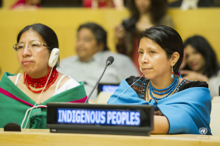
The Global Investigative Journalism Network and the Native American Journalists Association have created a resource to help Indigenous investigative journalists. This unique guide is designed to encourage Indigenous journalists worldwide and to empower them with tips, tools, and sources for information.


