Data Journalism
Data Journalism Top 10: Mapping the Pandemic, Shrinking Japan, Data Recipes, Extreme Temps, Google Election Searches, FinCEN Files
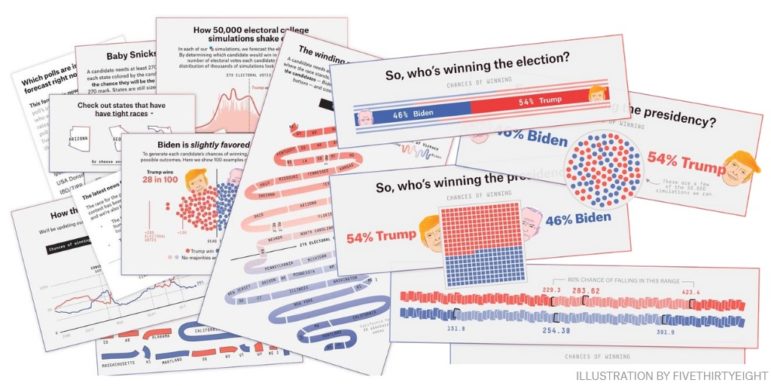
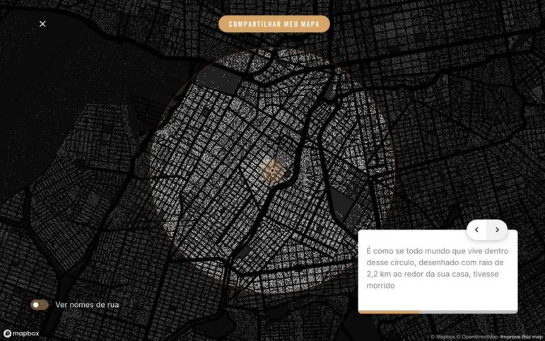
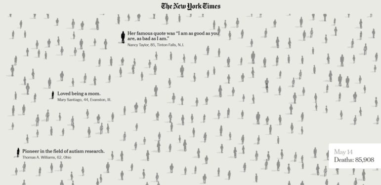
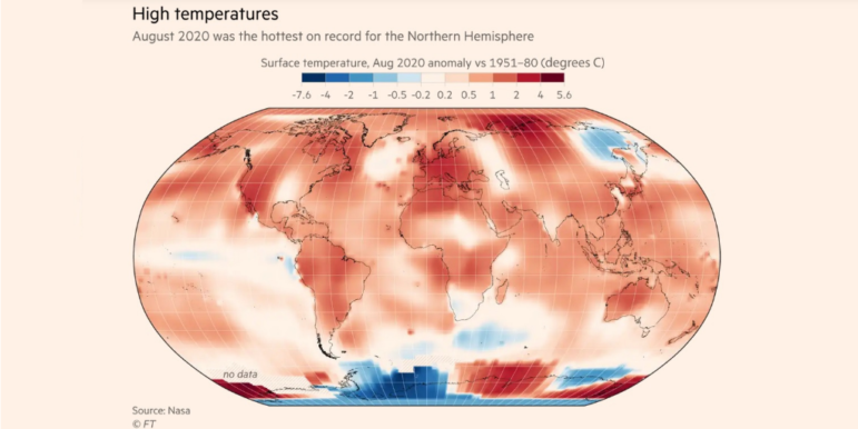
How fast is the coronavirus spreading in countries around the world? Our NodeXL #ddj mapping from September 14 to 20 finds data visualization designer Jan Willem Tulp simulating the speed of COVID-19 infections and German television news program ZDF heute mapping how the pandemic traversed the globe. Meanwhile, Thibi Recipes explores tutoring data journalism as if you’re following a cooking recipe, the Financial Times reports on climate extremes, and ICIJ and Buzzfeed bare suspect financial data.