News & Analysis
From Traditional Journalism to Sustainable Journalism
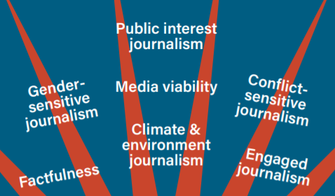
In this chapter for a new book on the role of civil society and journalism in sub-Saharan Africa, the head of policy for Sweden’s Fojo Media Institute argues that sustainable societies require a kind of journalism that addresses the sustainability challenges facing the planet.