

Top Ten #ddj: The Week’s Most Popular Data Journalism Links

What’s the data-driven journalism crowd tweeting? Here are the top ten links for August 26 to September 3: how to think visually (annavitals); beautiful evidence books (EdwardTufte); dating site scam (elespanol); Data Journalism Handbook (ddjournalism); and more.

This work is licensed under a Creative Commons Attribution-NoDerivatives 4.0 International License
Republish our articles for free, online or in print, under a Creative Commons license.
Republish this article
This work is licensed under a Creative Commons Attribution-NoDerivatives 4.0 International License
Read Next
Data Journalism
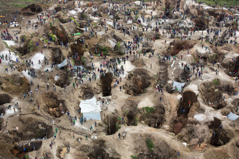
Journalists in Africa and South America Are Mapping the Mines Devouring the World’s Rainforests
Two journalism and technology projects are sharing tools and methods across continents to map where mining is devastating the Amazon and Congo basins.
Data Journalism
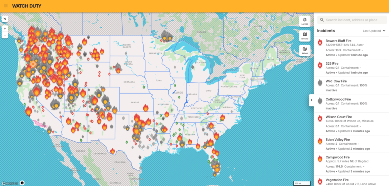
This Nonprofit-Based Data App Could Change How You Cover Wildfires
Watch Duty is a NGO nonprofit and its data is sourced from all over: radio scanners, cameras, satellites, and other public sources, including the agencies actually fighting the fires.
Data Journalism
GIJN Masterclass Round-Up: Data Journalism
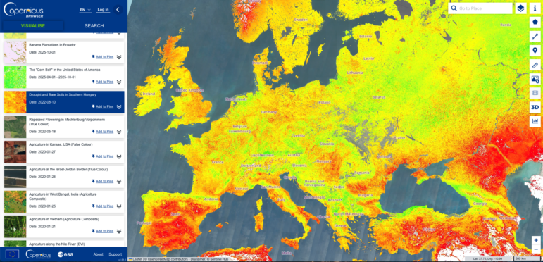
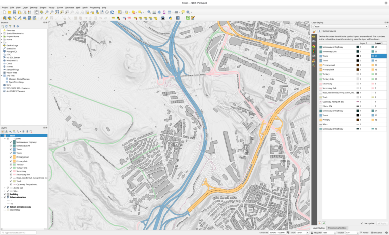
In this round-up of recent GIJN Academy masterclasses on data journalism, we share practical videos on data reporting basics, using spreadsheets, and incorporating satellite imagery.
Data Journalism
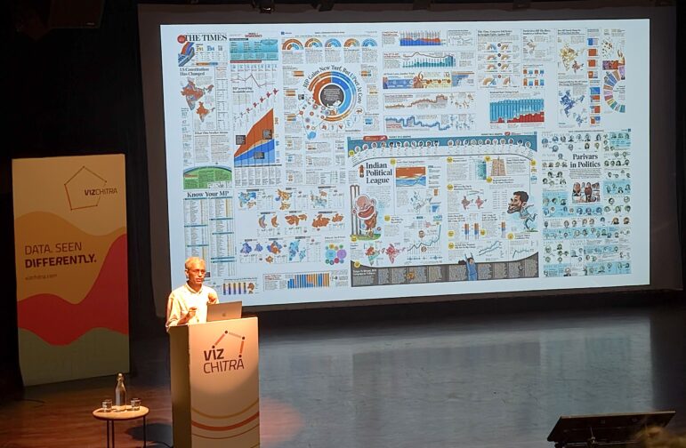
How a WhatsApp Community Is Bringing India’s Data Storytellers Together
Recently, more than 400 people gathered in the Indian city of Bengaluru for VizChitra 2026, a conference on data visualization and storytelling — but that is only a small part of the story.