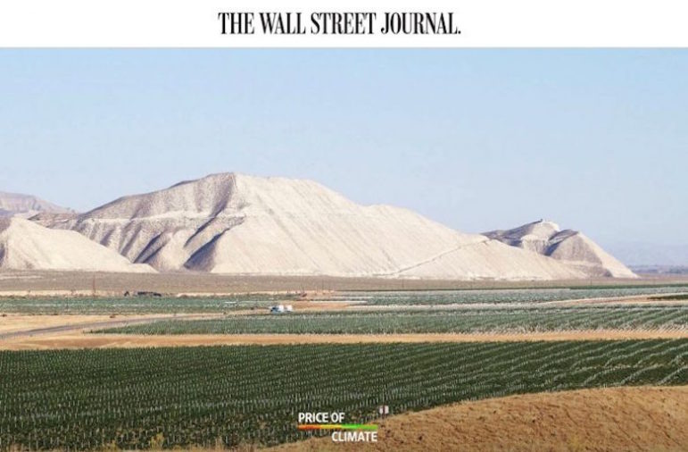

Screenshot from the Wall Street Journal's "Price of Climate" series.
How The Wall Street Journal Reported on “The Price of Climate”
In December 2018, The Wall Street Journal wrapped up a graphic-heavy series called “The Price of Climate” that takes an ambitious look at how financial and economic markers reflect present and future thinking about climate.
Storybench spoke with financial editor Charles Forelle and graphics developer Tyler Paige about the conceptualization and creation of the series. According to Forelle, it was in response to the fact “that a lot of climate change stories feel and look the same.” They wanted to go in a different direction, asking themselves, “How could we find a way to engage with an incredibly important topic in a way that felt fresh and didn’t feel the same way that people had been writing about it and photographing it and displaying it for the last 25 years?”
How did you hit upon the idea for the “Price of Climate” series?
Forelle: The initial spark came from a Wall Street Journal reporter in London, Bradley Hope, a very creative thinker on how to approach topics in new ways. We had known for a while that we wanted to take an ambitious look at climate change and it was something we had seen as business and finance reporters to be a topic of increasing relevance to the people who read us.
In financial markets, you have a pretty clear concept that the prices of things are a reflection of their present value and their values into the future. If you hypothesize that climate change has a long-term effect on the world, you should be able to see that in the asset prices and the cost of insurance and you should see today how the buyers and sellers of assets discount or increase their prices to account for the future effects of climate.
In trying to use the magic of financial markets, we can have a telescope into the future of how people anticipate the effects of climate. It would result in a “great re-pricing,” where climate would change the values of assets all across the world as the climate changed, so the series went from there to try and see where we would see that reflected in prices.

Image: The Wall Street Journal
Did you choose the topic of the series and then the individual stories?
Forelle: We certainly didn’t have all of them. We knew from the beginning that insurance would be an important part of this and some of that came out of Bradley’s conversations with people in the insurance industry. There were one or two others where we had an idea that this would be something that would end up in the series.
Some of the stuff came later – talking to other editors here and thinking, “What about agriculture? Would we see this in agriculture as well?” and that kicked off some conversations that led to a really fantastic story about farmland prices in northern Canada, which have increased due to longer growing seasons and resulted in greater farm outputs.
You chose specific economic sectors such as real estate, agriculture, and insurance to focus on. Why?
Forelle: There’s a lot that’s unknowable and a lot that’s unpredictable. We were looking for things where we really could see evidence in the data. The trend in coastal property values was a great example of that. You literally can see that there is a very clear trend in coastal property, which has historically had more value — that it has been whittled down over the years and particularly in very recent years.
How much did the availability of data impact your choices of what to cover?
Forelle: What we really cared about was reporting and evidence. We wanted to actually see stuff happening and be able to demonstrate that there was movement in the prices of things instead of just talking to people about hypotheses. In some cases, the evidence is a really big dataset like the real estate transactions.
With others, like the story about land in the arctic, there’s not like a giant dataset there. But the evidence is really compelling. We looked at property records, talked to real estate agents, we talked to people who said, “We used to get X for an acre of land, we now have 4X.” We talked to people who were clearing forest to plant more farmland because the price of farmland had gotten so high. So we’re looking for evidence. In some cases that was a big dataset and in other cases it was more traditional shoe-leather reporting.

Image: The Wall Street Journal
How do you decide when a story has too many or too few animations and data visuals?
Paige: For a lot of places, photographs didn’t contribute much to the argument and are more about lending a sense of place. The Harvard story had way more narrative to it – two vineyards reacting to climate change as opposed to a broad view of the entire wine industry. So we could say what we needed to say with less charts and more photos. In some places, we knew we would go all out in the way of graphics and data visuals, such as the insurance article.

Image: The Wall Street Journal
The coastal property article had a super, super rich dataset that was thoroughly researched, so we had material to work with. It had a lot of nuance, so we were sort of inspired to communicate that in a way that a reader would understand. I think particularly on the insurance story, we had a lot of assets and looking at the page now, it’s a bit more crowded than I thought it was at the time. I remember on that one we had to cut some of the visuals.
Forelle: We tried to tell different stories and could sometimes let datasets do the talking. Satellite stuff in the air is pretty compelling as well. You can tell the reader all you want that [Harvard’s] going after these properties that have a lot of water, but you can actually show the reader that their plots are all green with satellite photos.
Did the Journal’s business readership cause any concern in presenting the scientific side of the stories?
Forelle: We tend to think of our readers as pretty omnivorous in terms of topics. [Climate change] is a big deal and a topic that business and finance leaders are talking about since it figures in many conversations about risk.
What advice do you have for digital journalists on how to tackle major issues from a new angle and how to use digital media such as graphics and data visualizations most effectively?
Paige: It is helpful to look at what people are doing outside of journalism for ideas on what you could do, and don’t be constrained by what’s within the industry. Look beyond for inspiration.
Forelle: The primary lesson is that it pays to think out of the box and come up with a different approach. There is a ton of great work out there. The magic is figuring out how to do it differently.
This article first appeared on Storybench and is reproduced here with permission.
 Veer Mudambi is a freelance reporter specializing in environmental news. He has been published on Smithsonian.com and holds a masters of journalism from Northeastern University.

