
Investigating the Pandemic: Visualizing COVID-19 Data — Tips and Traps
Editor’s note: This webinar has now taken place. You can see the recording on GIJN’s YouTube channel.
Getting a grip on data is critical to reporting the pandemic – life and death decisions are being made on the basis of numbers. But working with data, especially in a specialist field like health, is challenging and data – and all those pie charts and graphs that visualize it – can lead us astray: all data needs to be questioned, checked and verified. Data also needs to be communicated and shared with audiences in ways that are clear, compelling – and accurate.
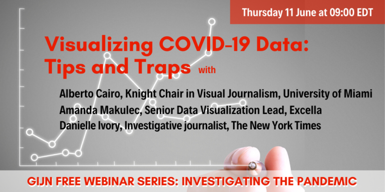
In this webinar, Visualizing COVID-19 Data — Tips and Traps, we bring together three leading experts who share their advice and tips on how to verify and present data.
- Alberto Cairo is a journalist and designer, world renowned for his work on data visualization. He is the Knight Chair in Visual Journalism at the School of Communication of the University of Miami (UM). He also directs the visualization program at UM’s Center for Computational Science and is author of a number of books — his latest is How Charts Lie – Getting Smarter about Visual Information.
- Amanda Makulec is the Senior Data Visualization Lead at tech firm Excella and holds a Masters of Public Health from the Boston University School of Public Health. Bringing together her expertise in public health and data visualization, Amanda writes and speaks about visualizing health data responsibly, including in the current context of COVID-19. She also volunteers as Operations Director for the Data Visualization Society.
- Danielle Ivory is an investigative reporter at the New York Times and is part of the COVID-19 U.S. data collection project, which drives the U.S. tracking pages of the Times. The data has been used by top epidemiologists, government agencies, and news organizations. As part of that effort, she recently published One-Third of All U.S. Coronavirus Deaths Are Nursing Home Residents or Workers.
This one-hour webinar is free and designed for journalists interested in investigating the pandemic. It’s the twelfth in a GIJN series, Investigating the Pandemic. Coming soon: more on data journalism and COVID-19 with acclaimed data journalist Giannina Segnini; investigating pandemic scams with Buzzfeed’s Craig Silverman; and how to survive as a freelance journalist during the pandemic. Watch our Twitter feed @gijn and newsletter for future events.
NOTE: GIJN will offer Russian interpretation for this webinar.


