
John Burn-Murdoch. Image: Courtesy of the Financial Times
From Data to Storytelling: Concept and Design Tips from the Financial Times’ John Burn-Murdoch
Read this article in
Whether or not you’re heavily engaged in the data journalism community, you’ve probably come across the name John Burn-Murdoch, or at the very least scrolled past one of his instantly recognizable salmon-pink Financial Times charts.
Burn-Murdoch, chief data reporter and a columnist at the paper, is simple in his assertion that “charts change minds,” but says that to achieve that level of persuasion, you have to strike the right balance between data, design, and words. You just have to take a peek at his weekly FT column Data Points to understand how he synthesizes statistical analysis into neatly packed graphics, demystifying topics such as why generative AI hasn’t taken over our “task-messy” jobs yet or why some football clubs are failing to recapture past glories.
One thing is evident when scouring through his work — every chart tells a story. In a webinar in conjunction with data visualization platform Flourish, Burn-Murdoch explained that successful data journalism isn’t about a pretty visual or a canvas with a pure data presentation, it’s about appreciating how an audience consumes a chart and tailoring it to communicate a message.
Opening the webinar with the existential question — at least for those working in this field — of ‘Why do we make charts?’ Burn-Murdoch explained that charts tap into something more innate and intuitively trustworthy than a text story can alone. And research suggests that charts communicate better than other forms of media. A 2018 study, for example, tested how people respond to controversial topics such as global warming when presented to them in different formats: a simple sentence on average global temperatures, a statistics-heavy paragraph, and a chart. Among climate change-skeptical groups, the chart presenting the same data as text formats was more persuasive in swaying opinions.
“Providing data in chart form seems to be more persuasive and more effective than providing the same information in text,” noted Burn-Murdoch. “We have this amazing, powerful tool that when we make a chart we are able to cut through people’s pre-existing beliefs in a way that text struggles with.”
So, what makes a chart successful? Here are four takeaways from the webinar.
Minimalism Isn’t Always Best
Despite a widely-held belief that charts should adhere to minimalist principles, it isn’t always true that less is more. While data visualization experts like the US academic Edward Tufte caution against tautology and overly elaborate design, Burn-Murdoch says that “humans like storytelling.” Overly minimal charts, he suggested, can fail to resonate or connect to the reader.
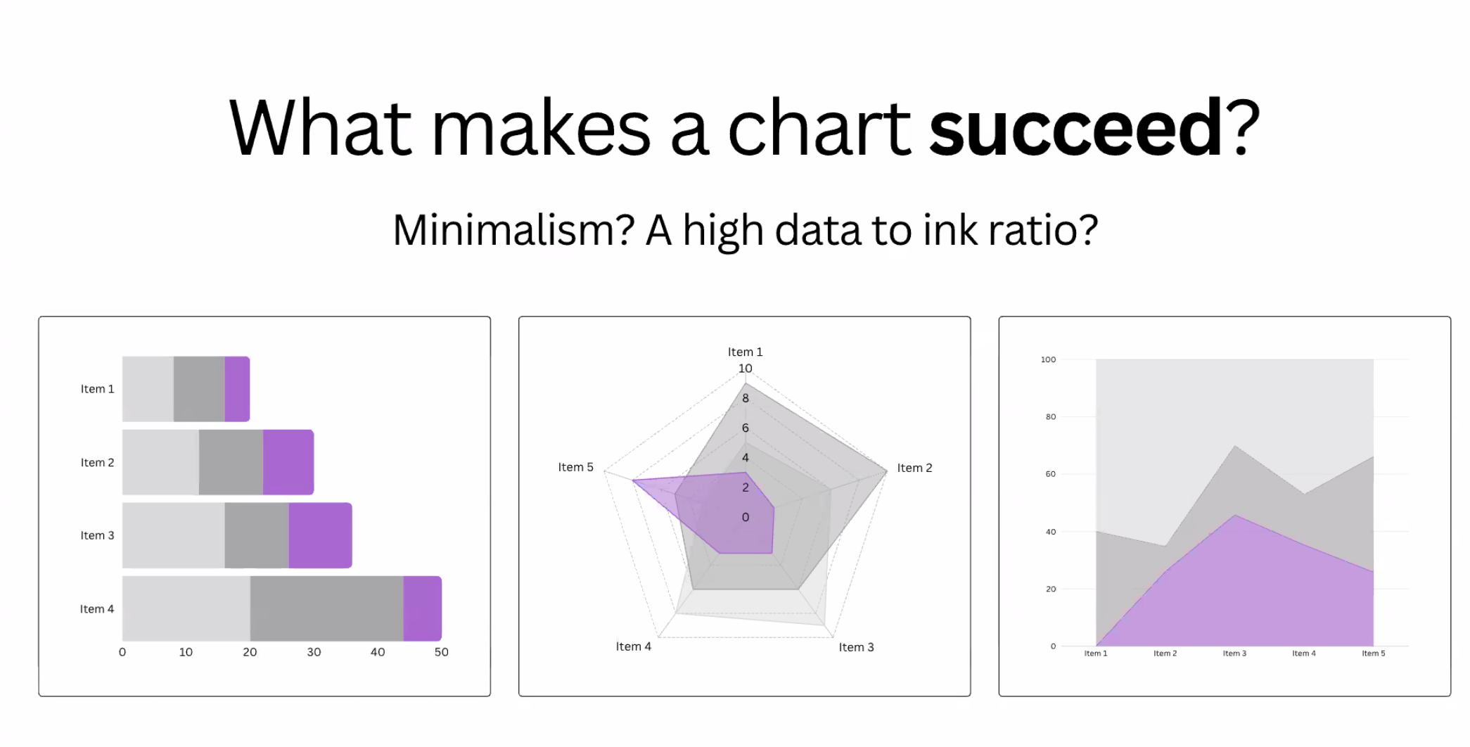
Image: Screenshot
Citing a study that tested public reactions to four types of charts with varying amounts and placement of text — one with only data and axes, another with just a paragraph of text, a titled and lightly annotated chart, and a fully annotated titled chart — Burn-Murdoch said that the minimalist charts had ranked lowest. In fact, participants preferred charts with large numbers of annotations that were well-placed because it was more engaging and helped them to understand the data better, for example using arrows to connect text annotations to particular parts of the line chart. The most successful version was the chart with a strong narrative title and multiple explanatory annotations.
“We like to have a sense of what we’re looking at — the bigger picture — instead of being given something where we then have to do a lot of work ourselves to figure out what’s going on,” said Burn-Murdoch. “For the average person, a consistent finding is that there is something about textual explanations which helps.”
While making something technically sound is the bedrock of a good chart, it’s only the first step, explained Burn-Murdoch. “Storytelling, the idea of explicitly focusing on the act of communication when making charts, is critically important and I would say, underrated in a lot of the resources out there that focus on the technical side.”
The takeaway: A narrative title helps. A bit of text annotation goes a long way. Minimalist charts may impress data experts, but they can alienate the wider audience.
Text Helps Readers Remember
Where do people’s eyes go when they are reading a chart? Another study quoted by Burn-Murdoch used eye-tracking technology to examine how people interact with graphics on screen. It found that people tend to follow a “Z” shape when reading a chart — first they look at the title, then they turn to the axes of the chart, before finally moving to the actual data itself.
Participants in the study were asked how much they could remember of a chart flashed up on a screen for them. Among the findings? More participants were able to recall the title and annotations on the chart, revealing how text helps readers remember.
“Text is where people’s attention goes first,” Burn-Murdoch said. “If we’re not using that, we’re really missing an opportunity.” The same study also found that visual elements like pictures, flags, and related imagery don’t distract readers, but can often help them by serving as “additional anchors” to recall the message of a chart.
The takeaway? Titles, annotations, and labels are essential and often what viewers remember.
Color Contrast Draws You In — But Can Be a Distraction
For Burn-Murdoch, color in charts is just as important as the text choices. Drawing on Colin Ware’s book “Visual Thinking for Design” to explain how the human brain processes visual information, Burn-Murdoch explained how our eyes are wired to detect pre-attentive, or pop-out, attributes like color, shape, size, and motion, which we perceive instantly, often before we’re even aware of it. In an evolutionary sense, we’re wired to spot the difference, whether it’s a slightly larger sized shape or an odd color.
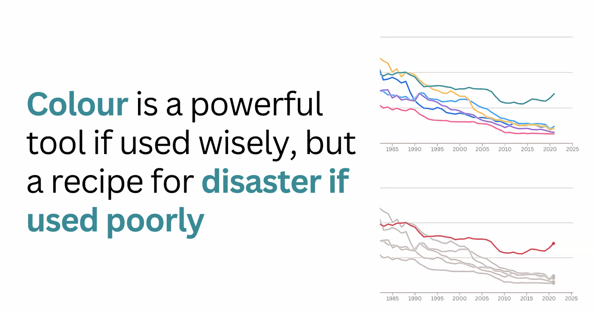
Image: Screenshot
In a chart, this means that a line of red in a sea of grey lines will immediately stand out. But if every line is a different color, nothing stands out at all. Color contrasts are a really powerful tool to direct attention.
In practical terms, this means being intentional about the color palettes being used — down to the very background color of a visualization. It’s better to avoid a rainbow of colors, instead data journalists should group less important information in a more muted tone while drawing attention to the relevant data by employing a more striking or contrasting color.
More broadly, Burn-Murdoch stresses that designing a chart is about guiding a person’s attention through a narrative. “When we’re making a chart, we are not just doing a sort of mathematical task or a design task, we’re trying to communicate something to someone.”
To do that, he works with the “Z” shape to think about where someone’s attention is going to move as they encounter a chart.
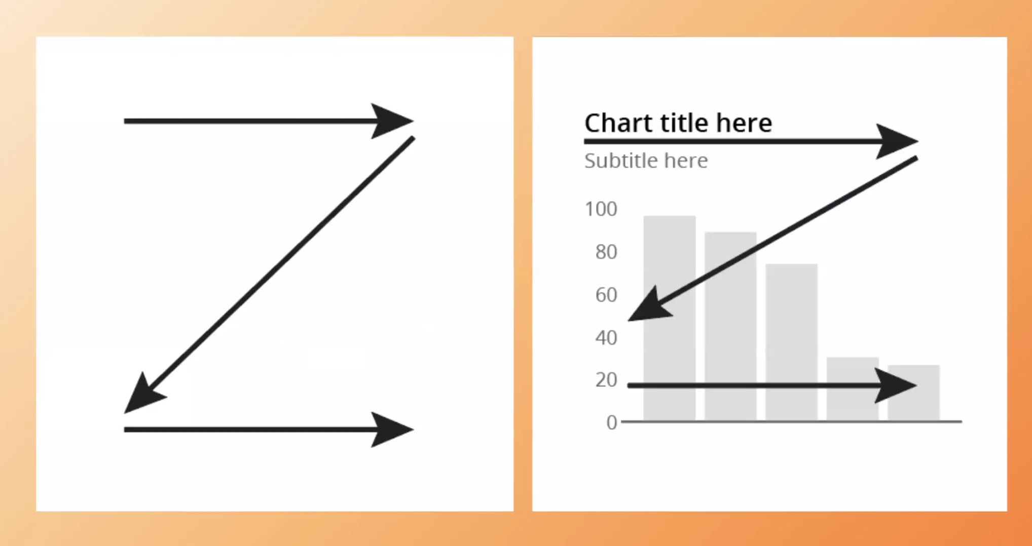
Image: Screenshot
It will move from the title, down through the axes, and across to the data itself. “I put a lot of effort and time into getting that title right,” he noted. “And I’m also thinking about anything I can do in terms of the design to naturally guide someone’s attention through that chart.”
It’s a reminder that successful visual storytelling isn’t about decoration, it should be purposely designed. His key takeaway when it comes to color? “Minimize distraction. Maximize contrast.”
Charts Aren’t Just For Data People
Not everyone finds charts intuitive, and it’s important to adopt the perspective of the end-user as a chart designer or data visualizer. As Burn-Murdoch put it: “You’ve got weirdos like me who spend unhealthy amounts of time making charts, looking at charts… but there are millions and millions of people out there for whom that is not true.”
This is where text, annotations, and thoughtful design come in. By adding clarity, not just stripping things away, charts become more relevant to wider audiences. Burn-Murdoch is clear that this is about strategic design that tells a story. He distinguishes between the technical process of making a chart and how it’s actually experienced.
While analysts may fuss over decimal points and fine-grained accuracy, most viewers are seeking a story. “People are not generally looking in very, very fine detail through a magnifying glass, trying to work out whether that line on your chart is at 4.81 or 4.82.”
Instead, people are scanning charts for meaning. They want to know: What is this showing me? Why does it matter? That’s why, once the data structure is sound, Burn-Murdoch urges designers to “really be focusing on this storytelling task… that is actually a much neater analogy for how people consume charts.”
The key takeaway: “Great chart-making absolutely does still include maths and the arts, but to make sure we’re doing our job as communicators as well as possible, we need to be thinking about this as storytelling,” said Burn-Murdoch.
COVID-19 Case Study: Turning a Piece Of Data Into a Story
To illustrate many of these principles, Burn-Murdoch revisited a chart designed at the beginning of the COVID-19 pandemic, in early March 2020. At the time, public uncertainty about the trajectory of the virus was growing, driven by news of fast-rising cases in Italy and East Asia.
A colleague emailed Burn-Murdoch to ask how other countries compared to Italy — one of the hardest-hit places in Europe at that stage. His first iteration of the chart technically answered that question. Created in R using the data visualization tool ggplot2, it plotted the number of days since each country’s 100th confirmed case on the x-axis, and cumulative case counts on the y-axis.
“This chart technically does answer that question… but this is not something that I think would have really resonated with millions of people,” he said.
Further iterations of the chart transformed the same data into a design that communicated a story.
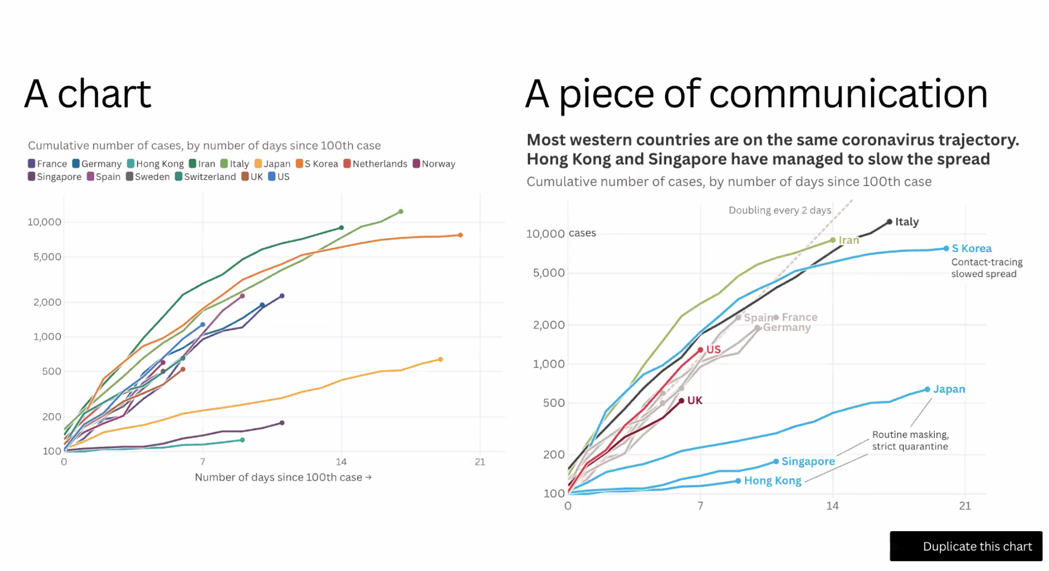
Image: Screenshot
“The title is now answering that,” he said, of the chart on the right with a more dynamic, explanatory title. “It tells us that most of these countries… are actually on the same trajectory, whereas some others have managed to slow the spread.”
Next came the legend problem. In the early version, readers had to constantly flip between a color-coded legend and the lines on the graph.
“You’re asking someone to keep checking back and forth between the legend and the lines,” he said. So, he moved the labels directly onto the lines, allowing readers to instantly see which country each line represented.
Then came strategic use of color. He grouped East Asian countries in blue, showed Italy in black, and highlighted the UK and US in other strong shades. Secondary countries faded into grey.
“We’re making the matching between the data visualization and the message… closer and closer and closer,” he explained, “so that there is less and less head-scratching required.”
Finally, he added annotations with a line showing the trajectory of a virus doubling every two days, and explanatory notes pointing to policy decisions or inflection points in key countries. Importantly, none of the underlying data or structure changed.
“The fundamental geometry of this chart… none of that has changed,” Burn-Murdoch said. “But we’ve significantly improved this chart as a piece of communication by focusing on text, color, labels, and annotations.”
The final takeaway: “Don’t just make charts for chart people. Make stories for all people.”
 Hanna Duggal is a data journalist at AJ Labs, the data, visual storytelling, and experiments team of Al Jazeera and a GIJN contributor. She has reported on issues such as policing, surveillance, and protests using data, and reported for GIJN on data journalism in the Middle East, investigating algorithms onTikTok, and on using data to investigate what tribal lands in the US.
Introduction to Investigative Journalism: Data Journalism

Step-By-Step Guide for Journalists on the Basics of Google Sheets

No Coding Required: A Step-by-Step Guide to Scraping Websites With Data Miner

Tipsheet for Using Ocean Data in Your Investigations

My Favorite Tools: Sigma Award-Winning Data Journalist Leonardo Nicoletti
Looking Back on Five Years: How the Sigma Awards Have Rallied and Inspired Data Journalism Excellence

‘A Quest for Evidence’: What Drew Leading Women Data Journalists to the Field

Using WhatsApp to Crowdsource Data on Ride Hailing Companies’ Labor Lockouts

This work is licensed under a Creative Commons Attribution-NoDerivatives 4.0 International License
Republish our articles for free, online or in print, under a Creative Commons license.
Republish this article
This work is licensed under a Creative Commons Attribution-NoDerivatives 4.0 International License
Read Next
Data Journalism My Favorite Tools
My Favorite Tools: Sigma Award-Winning Data Journalist Leonardo Nicoletti
The data visualization expert and former academic stresses the importance of having an ‘interdisciplinary mindset’ when approaching data-driven stories.
Data Journalism
Looking Back on Five Years: How the Sigma Awards Have Rallied and Inspired Data Journalism Excellence
After five years and 2,875 project entries from more than 100 countries, the Sigma Awards have become a catalyst for innovation and forever changed the face of data journalism.
Data Journalism News & Analysis
‘A Quest for Evidence’: What Drew Leading Women Data Journalists to the Field
For International Women’s Day we spoke to data journalists from Argentina, Kenya, Sweden, and Turkey to find out why they chose this path and what challenges still remain.
Data Journalism How They Did It
Using WhatsApp to Crowdsource Data on Ride Hailing Companies’ Labor Lockouts
We used WhatsApp to crowdsource information from Uber and Lyft drivers in NYC about company lockouts during a local, minimum wage dispute.