
Image: Shutterstock
Data Don’ts: Expert Tips to Avoid Misleading Audiences With Numbers
Read this article in

GIJC23 – Best Practices in Teaching Data Journalism to Professionals and Students

Basic Data Journalism Tips for Editors

GIJC23 – The Future of Data Journalism: New Analytical Tools, Data Visualization, and AI

No Coding Required: A Step-by-Step Guide to Scraping Websites With Data Miner
Even the most diligent data and investigative reporters can sometimes let numbers get the best of them. Avoiding miscalculation and inaccuracy is paramount, but so too is presenting numbers to your readers judiciously, in a way that they can best understand the story the data is telling.
Notorious mistakes that investigative reporters make with numbers include trying to calculate percentages by adding or subtracting from other percentage values. (A drop in successful prosecutions from 12% to 7%, for example, is not a 5% decline; it’s a nearly 42% drop.) This is such a classic error that The Associated Press uses the % symbol for percentages, but asks reporters to write out “percentage point” to measure changes, to promote better accuracy and understanding. Confusing correlation with causation is another major category error. And GIJN offers tipsheets on avoiding major numerical errors in stories such as “10 Common Mistakes in Data Journalism” and “10 Simple Data Errors That Can Ruin an Investigation.”
But a panel at the recent NICAR 2025 data journalism conference warned that there are also many subtle number errors that watchdog reporters make that can disrupt story angles and erode much-needed reader trust. These experts also cautioned that even technically accurate numbers can also mislead or confuse readers due to inappropriate formats, too many digits in the copy, or the failure to simplify and contextualize those numbers for better understanding.
The NICAR session featured data journalist Jennifer LaFleur, who teaches data visualization and research methods at the University of California, Berkeley’s Graduate School of Journalism, and Jaimi Dowdell, an award-winning data reporter at Reuters.
LaFleur and Dowdell offered the following tips to help avoid either misinforming or misleading readers with numbers:
Misleading precision can introduce inaccuracy. Surely, you’d think, statistics such as “25.21% of women” are more accurate than “one in four women.” However, LaFleur warns that precise figures like “25.21%” are not only often less helpful to readers than “one in four,” but can portray an accuracy that the data doesn’t actually support. “I think we like to add decimal points because it makes us seem really smart, but it’s hard for the reader to interpret,” LaFleur noted. “And sometimes — if the data you’re reporting on has a margin of error — that decimal is actually portraying false precision.” Experts also point out that most data is technically out of date the moment it is compiled — and so using many decimal points can generally mislead audiences about the data prowess of both the sources and the story. “Say ‘one in four,’ or ‘nearly half,’ if you can,” she added. “Unless there’s a hugely compelling reason, round your numbers where possible: instead of ‘44,792,’ say ‘nearly 45,000.’” Data experts at Investigative Reporters and Editors (IRE) proved the hazard of precise average whole numbers by calculating inflation-adjusted teacher salaries from government data at $53,234 — and then recalculating that salary average from the same data inputs as $53,226, using a different but equally valid formula. So in the end, it would be clearer, and no less accurate, they concluded, to just round the number to $53,200.
Avoid the phrase “times more” with number increases. Reporters often assert that, for instance, 500 of something is “five times more” than 100 of that thing. In fact, it is only four times more. (Recall that a 100% increase of something means it has doubled or is “two times more.”) Instead, it is more accurate to say the new value is “five times as much as” the original value — and even better to just call the number “five times” the original. “I see this all the time; I suggest not talking about ‘more,’ but just explain how many times [multiples] it is, because ‘more’ is also confusing to readers,” said LaFleur. “Whenever I see ‘X times more,’ I’m guessing they mean five times the rate, not five times more.”
Move the decimal for small numbers. Experts say there is nothing required or magical about using “per 100” (percent) in stories. If it helps reader understanding, then reporters should feel free to move the decimal point to the right for small numbers and their base number — for instance, converting a homicide rate of 0.07% to 70 homicides per 100,000 population.
Keep it simple when comparing relative size. The duo made this point by comparing the weight of their beloved (now-deceased) cats — Dowdell’s cat, Amigo, was 10kg, and LaFleur’s cat, Stanley, was 5kg. Dowdell noted that while it would be technically true to say “Amigo was 100% heavier than Stanley” or “Amigo was 200% of Stanley’s weight,” she warned that either would still be unclear for many readers. Instead, audiences would understand this simpler statement far better: “Amigo was twice Stanley’s weight.”
Round numbers can be red flags. Dowdell warned that even well-presented numbers or rates that are properly calculated from an accurate government dataset can still be wrong, simply because of a website download limit of, say 5,000 records on the site that reporters might not notice. “Make sure you read the fine print — on every dataset there is information on what you can and can’t do with the numbers,” she added. “Beware round numbers in general: too perfect means it’s a red flag.”
Remember that “per capita” simply means per person. Dowdell noted that there is a surprisingly common misunderstanding about the meaning of “per capita,” which just means “per person.” LaFleur added that she occasionally sees stories citing absurd statistics such as “300 murders per capita” in a community. “That’s why, when we have little numbers, like violent crimes, or rare disease infections, you’ll see it reported per 10,000 or 100,000 people, so you can see the whole number,” she added.
Use graphics when numbers don’t show the scale. The statistic that the United States is ‘one of just six countries without national paid maternity leave’ fails to convey the scale of this outlier policy. Even though it is somewhat less informative — because four of those countries are island nations too small to show on a world map — LaFleur said the following graphic by The New York Times put the issue into more meaningful perspective for readers.
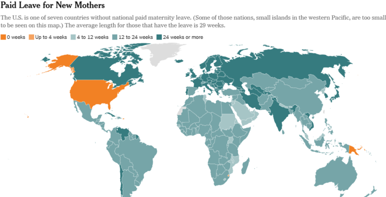
A New York Times graphic on global paid leave policy. Countries in orange offer zero national paid maternity leave. Image: Screenshot, The New York Times
Be careful with billions, and show scale. Experts note that numbers in the billions are used so commonly in the media that both reporters and readers can lose the sense of how vast these figures are. Some perspective: one million seconds represent just 11 days, but one billion seconds equals almost 32 years. It is also surprisingly easy to confuse millions and billions in financial statements. Dowdell cited a recent case in which watchdog reporters noticed that the Trump administration’s DOGE service had saved only $8 million by cancelling one government contract, rather than the $8 billion it had publicly claimed, a massive error. One official had apparently misread “$8,000,000.00” as “$8,000,000,000.”
Ask: “What have I forgotten?” In a fun case from 2021, National Public Radio referenced a Broadway song with a famous numerical lyric — “Five hundred twenty five thousand six hundred minutes: How do you measure; measure a year?” — in a headline reading “13,140,000 Minutes: It’s been 25 years since the first performance of ‘Rent.’” But it turns out that the song posed a good question for data reporters too, because the story’s editors forgot to account for the seven additional days in the intervening leap years, which are 527,040 minutes each. As a result, the headline had to be corrected to cite “13,150,080 Minutes.”
Read your draft aloud. NICAR attendees were told that reading data story drafts aloud holds several benefits. “I always read stories aloud — that’s a good way to understand where you have too many numbers,” explained LaFleur. “When you are doing your analyses, make sure you can explain it in a few sentences. I used to test it by calling my mom and explaining it to her, and quickly figuring out if I had a story.” Dowdell agreed: “The most important thing is to highlight your findings without bogging down your audience with a bunch of numbers.”
Beware of numbers that fit a popular narrative. In February, a prominent data story in the US initially asserted a fire fatality rate of 14.5% for Tesla Cybertrucks, which would translate into one death for every seven of these politically polarizing vehicles on the road — an alarmingly high rate that common sense should flag as dubious. LaFleur pointed to the eventual correction by the publication, which admitted that the actual rate was 1,000 times lower, or 14.5 fatalities per 100,000 vehicles. (In addition, even that number was flawed due to small sample size and “apples and pears” data problems. The data was based on a total of two car crashes, plus the New Year’s Day suicide bombing incident in Las Vegas, and also underestimated the number of controversial vehicles sold.)
Above all, “If something doesn’t feel right, listen to your gut,” LaFleur counseled.
Dowdell summed up her own tips this way: “Go at your stories with questions about your own hypothesis. Maybe it’s not the story you thought. Most of the stories I do never support the original hypothesis, and we end up pivoting to another route, which often ends up as a more interesting and definitely a more accurate story.”
The two data experts also recommended the math refreshers and advice contained in the second edition of IRE’s “Numbers in the Newsroom” guide, written by Sarah Cohen. Tips from this handbook include these:
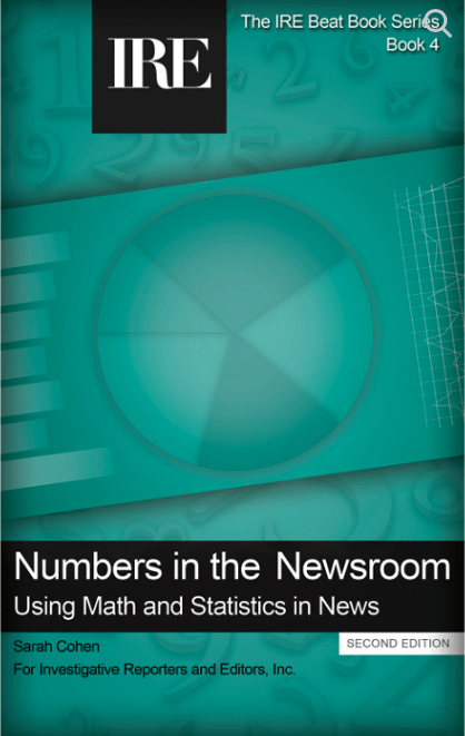
A helpful resource for data journalists is IRE’s ‘Numbers in the Newsroom’ guide. Image: Screenshot, IRE
Try to keep the total number of digits in a paragraph to eight or fewer. As a guideline — though not a rule — experts urge reporters to “choose your numbers as carefully as you choose your quotes” and limit the total number of digits mentioned in any paragraph to eight. This often translates into referencing two separate figures (like percentages) and one year. For instance, the following sentence has a few too many digits, but would at least get close to the guideline without the decimal places: “The Office of Redundancy’s budget rose 48% in 2024, from $700.3 million to $1.03 billion.” Better still, it could even be reduced to a single numerical digit: “Over the past year, the Office of Redundancy’s budget grew by nearly half, to $1 billion.”
Avoid averaging averages. Cohen compares this common newsroom mistake to “overcooking a vegetable medley,” and writes: “Sometimes, reporters take a bunch of percent changes, say, in a budget, and compute an average for the “average percent change.” This treats the 140% increase in a new, small department the same as the 2% increase for education.”
Use a simple method to calculate “one out of” risk probabilities. Calculating and reporting the probability of rare events seems complex, but really isn’t. If 20 people in a city of 4.3 million are struck by lightning annually, dividing those victims by the population will offer a seemingly meaningless number of 0.000005. But Cohen notes that you can simply divide the number one by these tiny amounts to get the sensible “one out of” number — in this case: a one in 200,000 chance of being struck in that city in a year.
 Rowan Philp is GIJN’s senior reporter and impact editor. He was formerly chief reporter for South Africa’s Sunday Times. As a foreign correspondent, he has reported on news, politics, corruption, and conflict from more than two dozen countries around the world.
GIJC23 – Best Practices in Teaching Data Journalism to Professionals and Students
Basic Data Journalism Tips for Editors
GIJC23 – The Future of Data Journalism: New Analytical Tools, Data Visualization, and AI
No Coding Required: A Step-by-Step Guide to Scraping Websites With Data Miner

This work is licensed under a Creative Commons Attribution-NoDerivatives 4.0 International License
Republish our articles for free, online or in print, under a Creative Commons license.
Republish this article
This work is licensed under a Creative Commons Attribution-NoDerivatives 4.0 International License
Read Next

Data Journalism News & Analysis
Lessons Learned: 10 Common Mistakes in Data Journalism
GIJN asked speakers and attendees in the NICAR conference hallways for the data journalism gaps they see and for under-covered topic areas newsrooms can address.

Methodology Reporting Tools & Tips
10 Simple Data Errors That Can Ruin an Investigation
At the 2023 NICAR conference, GIJN talked with several data journalism experts and learned 10 simple data journalism errors to avoid that could ruin your investigation.

Data Journalism Reporting Tools & Tips
Best Practices for Working With Mass Shootings Data
There can be confusion among journalists about “mass shootings” data, which leads to wildly different numbers and deeper confusion among audiences.

Data Journalism Reporting Tools & Tips
Telltale Data Signs of Bogus Scientific Papers and Fraudulent Academic Research
Two scientists and an editor spent six months investigating so-called paper mills, which churn out bogus scientific papers that impede actual research on lifesaving breakthroughs.