Data Journalism Top 10: Elon Musk’s Tweets, Chart-Topping Hits, China’s COVID Toll (by Obit)

Step-By-Step Guide for Journalists on the Basics of Google Sheets

Tipsheet for Using Ocean Data in Your Investigations

No Coding Required: A Step-by-Step Guide to Scraping Websites With Data Miner

GIJC23 – The Future of Data Journalism: New Analytical Tools, Data Visualization, and AI
Twitter owner Elon Musk is no stranger to controversy and backlash: his latest proposed plan to monetize Twitter’s API is yet another idea that stirred discontent among the platform’s users. The New York Times dug into the archive of Musk’s tweets over a decade to analyze how the Twitter chief utilizes the platform he owns. Our weekly NodeXL and human curation of the most popular data journalism stories on Twitter also features Kontinentalist’s piece on the racialized dynamics of rubber’s history in colonial Malaya, The New York Times’ investigation of China’s COVID deaths using obituaries, El Confidencial’s analysis of immigration in Spain, and The Economist’s look into the secret of creating chart-topping hits (shhhh…the key is having short intros.)
Analyzing Elon Musk’s Tweets
The headline says it all: Memes, Rants, Private Parts, and an Echo Chamber. In this analysis of the tweets of the new, and ever-controversial, owner of Twitter, The New York Times reporters found that Elon Musk has a love of memes and satire and that he is fond of posting on topics “popular among political fringes.” He also “regularly sees, likes, and replies to messages that are about him or are posted from accounts that often act as his cheerleaders.” The team reviewed nearly 20,000 of his public tweets, analyzing posts from recent years and images he published over the past decade. Also of note: Institute for Strategic Dialogue’s analysis of Musk’s Twitter interactions pre- and post-acquiring Twitter suggests an increased interaction with right-wing tweeters.
The History of Rubber and Race
Rubber — a natural product used in the wheels of cars, bikes, and airplanes — has a long and complex history in Malaysia. In this story, Singapore-based data storytelling outlet Kontinentalist uses maps, data, beautiful illustrations, and historical records to explore the history of the trade and reveal the “racialized dynamics of the rubber trade.” Among the findings: 75% of colonial Malaya’s large estates — where rubber trees were tapped for their sap — once belonged to Europeans. Also of note, the analysis looked into the ethnic backgrounds of those who were brought to work on the estates, which varied depending on the background of the landowner, and details of how badly some workers were treated.
Creating a Chart-Topping Hit
In music, there are always interesting outliers. In this fascinating and fun data piece by The Economist, the artists with the longest musical intros are pretty famous (Mariah Carey, Janet Jackson, and The Eagles) and all produced songs with intro times hovering just below 60 seconds. However, by listening to every Billboard Hot 100 number-one between 1960 and January 2023, The Economist found bands and musicians have been “shortening instrumental introductions in order to get more quickly to the catchy vocals.” The reason? Streaming culture, the magazine suggests, because musicians are now paid per play — as long as listeners stick around for 30 seconds of a song.
Immigration Segregation in Spain
Immigration statistics are often reported on the national level, but what happens when you break those numbers down to find out where different communities are living? Can it help readers understand integration, or conversely, problems of segregation? A data team at Spain’s El Confidencial published a deep dive on immigration in the country, looking at where the majority of immigrants come from (Morocco, Colombia, Romania, Venezuela, and Ecuador) and where different diasporas settle in the country’s biggest cities. “Almost always, there is a greater concentration [of people] in areas with low rents,” data journalist Marta Ley, wrote in a Tweet thread about the project.
How LeBron Took the NBA Scoring Crown
As sporting records go, holding onto the top spot for over 30 years is pretty remarkable. But records are made to be broken, and by reaching 38,390 points over the length of his career, basketball legend LeBron James has taken top position on the National Basketball Association’s all-time scoring list. “Probably the most sought-after record in the NBA,” James said. (The man he beat, previous record holder and fellow Los Angeles Lakers legend Kareem Abdul-Jabbar, was sanguine: “There’s no envy there.”) The Washington Post graphics team used the occasion to create a colorful data visualization that explores the career histories and records of some of the leading players in the men’s game in the US, with graphics on the number of points top players averaged per game and the teams where James amassed the most points.
What Food Is Better for the Environment?
Trying to opt for an environmentally friendly diet? This piece by The Washington Post examines how different food types impact the environment through greenhouse gas emissions, water use, nutrient pollution, and habitat disturbance. It turns out that the decision is not quite as simple as choosing chicken over beef, or vegetables over fish. Readers can utilize The Post’s handy tool to compare the environmental footprint between two food types. Climate graphics reporter Niko Kommenda summarizes some key findings in this thread.
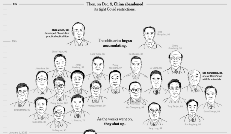
Tracking COVID Deaths by Obituaries
Last December, the Chinese government suddenly lifted its three-year-long zero-COVID policy which involved severe lockdowns and stringent quarantine restrictions. Experts predicted that the move would result in a massive wave of COVID infections and deaths but there has been an absence of credible official data on the actual number of cases and fatalities. So, The New York Times examined official obituaries published over the past four years by state-backed institutions and universities in China and found an abnormal spike in deaths corresponding to the timing of the relaxed COVID-19 measures.
Tracking Asteroids
On Jan 26, a small asteroid, roughly the size of a box truck, flew near the Earth’s surface — one of the closest approaches to Earth ever recorded. (NASA scientists said the asteroid would’ve mostly burned up in our atmosphere before impact had its path actually intersected with Earth.) The flyby prompted the Reuters Graphics team to produce a graphic looking into other similar events that illustrates the speed and scale of asteroids as well as their distance from the Earth both in the past and also those that are predicted in the future. The team also examined the probability of such objects hitting Earth and the potential damage they could cause.
Vaccine Misinformation
In Germany, opponents of the COVID-19 vaccine have been using the hashtag #plötzlichundunerwartet (suddenly and unexpected) to stoke fear among the public. Bavarian public broadcaster Bayerischer Rundfunk analyzed around 30,000 tweets and about 3,400 Telegram messages to spot the trends related to this online misinformation movement. It found that those who employ this hashtag tend to attribute deaths with unclear causes to COVID-19 vaccines without providing actual evidence.
Truth Behind UK Supermarket Price ‘Locks’
As the cost of living crisis worsens with skyrocketing prices of food and energy bills, supermarkets in the UK have responded by “locking” down their prices to help customers. The Sunday Times has been tracking the prices of these “locked” products over the past year and found that many items had in fact increased in price, with some even double the amount customers paid 12 months ago. The Times also looked into data on how people are reducing their expenditures, with most opting to cut back on eating out and buying clothes. Data editor Tom Calver provides snippets of the story in this thread.
Thanks again to Marc Smith and Harald Meier of Connected Action for gathering the links and graphing them. GIJN’s Data Journalism Top 10 list is curated weekly.
 Eunice Au is GIJN’s global team manager. Previously, she was a Malaysia correspondent for Singapore’s The Straits Times, and a journalist at Malaysia’s New Straits Times. She has also written for The Sun, Malaysian Today, and Madam Chair.
 Laura Dixon is an associate editor at GIJN and a freelance journalist from the UK. She has reported from Colombia, the US, and Mexico, and her work has been published by The Times, The Washington Post, and The Atlantic. She has received fellowships from the IWMF and the Pulitzer Center.
For a look at NodeXL’s mapping on #ddj and data journalism on Twitter, check out this map.

Step-By-Step Guide for Journalists on the Basics of Google Sheets
Tipsheet for Using Ocean Data in Your Investigations
No Coding Required: A Step-by-Step Guide to Scraping Websites With Data Miner
GIJC23 – The Future of Data Journalism: New Analytical Tools, Data Visualization, and AI

One Name at a Time: How Die Zeit Built a Searchable Database of Nazi Party Members

Visualizing a Trillion Dollars, India’s Warming Cities, Russian Mercenaries at Sea, and World Cup Player Physiques

Rare Earth Rivalry, Falling Birth Rates, Violence in the Sahel, and 70 Years of Eurovision Lyrics

How the Hindu Is Embedding AI Into Its Data Journalism

This work is licensed under a Creative Commons Attribution-NoDerivatives 4.0 International License
Republish our articles for free, online or in print, under a Creative Commons license.
Republish this article
This work is licensed under a Creative Commons Attribution-NoDerivatives 4.0 International License
Read Next
Data Journalism
One Name at a Time: How Die Zeit Built a Searchable Database of Nazi Party Members
An online tool set up by the German newspaper Die Zeit, in cooperation with archives in Germany and in the United States, allows people to search several million Nazi Party membership cards.
Data Journalism Top 10
Visualizing a Trillion Dollars, India’s Warming Cities, Russian Mercenaries at Sea, and World Cup Player Physiques
Also highlighting how films portray Ukrainians, increasing tree cover in Spain, and how couples meet.
Data Journalism Top 10
Rare Earth Rivalry, Falling Birth Rates, Violence in the Sahel, and 70 Years of Eurovision Lyrics
Also highlighting China’s squid fishing fleet off Argentina, how redistricting is shaping America’s midterms, and why 2.1 billion people still lack safe drinking water.
Data Journalism
How the Hindu Is Embedding AI Into Its Data Journalism
LLMs are quietly reshaping data journalism workflows at The Hindu, helping reporters process vast document sets, write scripts and build interactive tools.