Accessibility Settings

color options

monochrome muted color dark

reading tools

isolation ruler

Series

Top 10 in Data Journalism

430 posts

Data Journalism

GIJN’s Data Journalism Top 10: Forecasting Elections, Counting Fast Food, Kampala’s Swamp City, Gasping for Air

What’s the global data journalism community tweeting about this week? Our NodeXL #ddj mapping from October 22 to 28 finds @NateSilver538 talking about election forecasting, @BBCNews highlighting the prevalence of fast food outlets in the UK, @washingtonpost comparing how tough it is for Americans to vote by state, and @business and @HowWeGetToNext on battling for fresh air in India and Europe.


Data Journalism

GIJN’s Data Journalism Top 10: Stories with Maps, Tools with Charts, Casting for Shakespeare

What’s the global data journalism community tweeting about this week? Our NodeXL #ddj mapping from October 15 to 21 finds @Esri’s @AllenCarroll talking the power of maps in storytelling, @visualizingdata’s catalogue of charts and corresponding tools to help information designers, and @ericwilliamlin’s deep dive into the data of casting decisions in Shakespearean plays since the 1900s.

Data Journalism

GIJN’s Data Journalism Top 10: New York’s Luxury Homes, Climate Dangers, Inspiring Data Viz

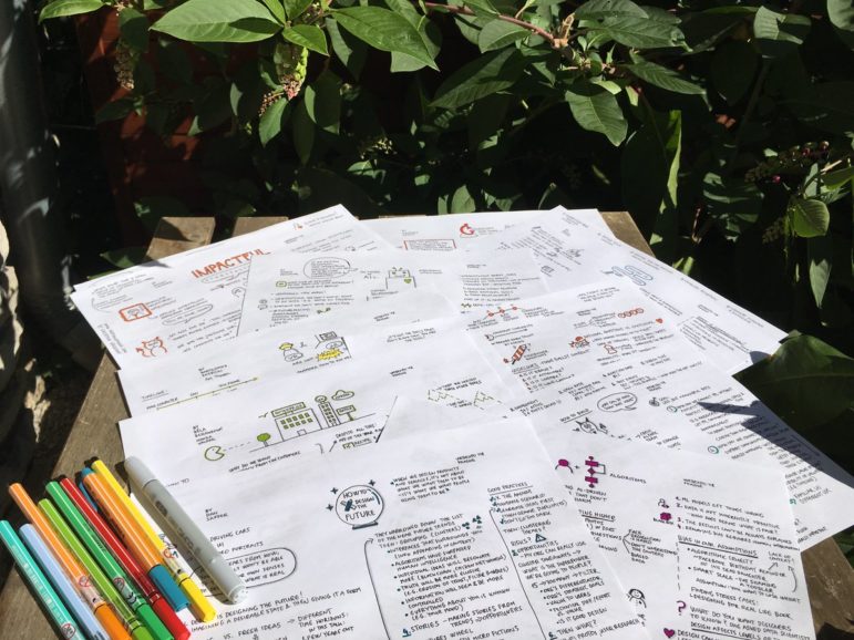
What’s the global data journalism community tweeting about this week? Our NodeXL #ddj mapping from Oct 8 to 14 finds 25 inspirational data visualizations collated by @VismeApp, a @nytimes op-ed by climate scientists warning of the future dangers of heat and humidity combined, @FT maps of New York’s glut of luxury residences and @ejcnet with veteran data journalists on web scraping.

Data Journalism

GIJN’s Data Journalism Top 10: Useful Chatbots, Less-Is-More Tables and Data Mapping Billions of Birds

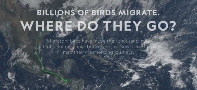
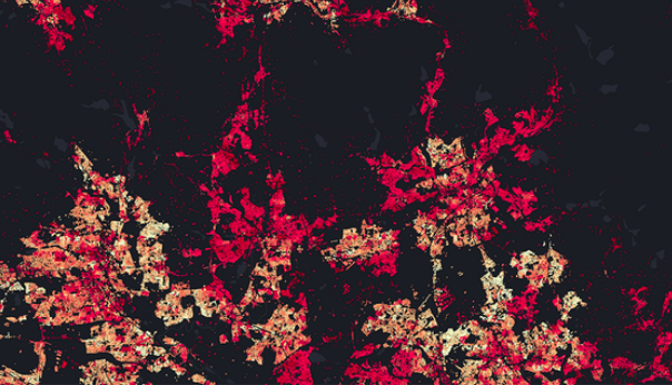
What’s the global data journalism community tweeting about this week? Our NodeXL #ddj mapping from Sept 17 to 23 finds numerous data to map, from @NatGeo’s migration of billions of birds to @morgenpost’s Berlin schools and @A24COM’s internet access in Argentina. There’s also @dhanalytics’ tips on improving data tables and @mcrosasb on two useful chatbots.

Data Journalism

GIJN’s Data Journalism Top 10: Sad Tunes Algorithm, Fragapane’s Beautiful Dataviz, African Pay Gap, Euro-Xenophobia

What’s the global data journalism community tweeting about this week? Our NodeXL #ddj mapping from Sept 10 to 16 finds @miriamquick analyzing @Spotify data to rank the top five saddest songs, @Code4Africa creates a tool to measure gender pay gap in African countries, @fedfragapane shares beautiful illustrations on Instagram, #edjnet finds Italy, Turkey and Greece topping the list of Europe’s xenophobic countries, and @TaylorMirf highlights the low rates of immunizations in Washington state.

Data Journalism

GIJN’s Data Journalism Top 10: German Heat, Austrian Arms, Quebec School Fees and Salvadoran Kidney Disease

What’s the global data journalism community tweeting about this week? Our NodeXL #ddj mapping from Sept 3 to 9 finds @FiveThirtyEight attacked by the green-eyed monster with their equivalent of Bloomberg’s “Jealousy List,” @daswasfehlt breaks down Austria’s export of arms, @GoogleAI announces the beta launch of Google Datasets Search, and @SZ documents how climate change is wreaking havoc on temperatures in Germany but boosting ice-cream sales.

Data Journalism

GIJN’s Data Journalism Top 10: School Shootings, Trains vs Planes, Ukraine-Russia Trade, UK Airport Crimes

What’s the global data journalism community tweeting about this week? Our NodeXL #ddj mapping from Aug 27 to Sept 2 finds @nytclimate personalizing climate change, @npr fact-checking the US Education Department’s school shooting data, @dwnews calculating the cost of travel to the environment, and @junkcharts dissecting the strengths of Thailand cave rescue data visualizations.

Data Journalism

GIJN’s Data Journalism Top 10: Muslims to Mecca, Women (Not) in Netflix, Inside Airbnb Europe, London’s Foul Air

What’s the global data journalism community tweeting about this week? Our NodeXL #ddj mapping from Aug 20 to 26 finds @Numerama analyzing the representation of women in @netflix series and finds it lacking, @AJEnglish creating an interactive explainer on how 2 million Muslims make the pilgrimage to Mecca every year, @FT readers brainstorming air pollution solutions for London, and @Bastamag digging into data of @Airbnb — a cash cow for home renters.

Data Journalism

GIJN’s Data Journalism Top 10: Egyptian Bots, Pocket Inequality, Loner Jobs and Knife Emergencies

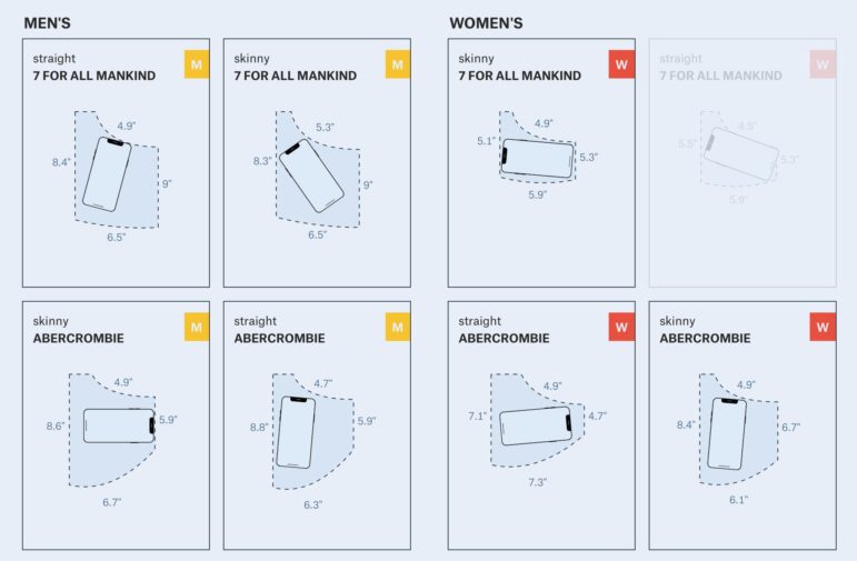
What’s the global data journalism community tweeting about this week? Our NodeXL #ddj mapping from Aug 13 to 19 finds @puddingviz proving that women’s pockets are inferior to men’s once and for all, @vizzuality pondering the impact cartographers have on our understanding of the world by presenting nocturnal activity in daytime maps, @InfoTimes_ discovering the bots behind the political debate in Egypt and @hnrklndbrg’s visualizations on everything from loner jobs to knife emergency room visits.

Data Journalism

GIJN’s Data Journalism Top 10: Faking Climate Change Data and in WEB Du Bois’ Black Americ

What’s the global data journalism community tweeting about this week? Our NodeXL #ddj mapping from Aug 6 to 12 finds @sciam profiling a new color scale for the color blind, @EDudinskij’s fun dissertation on dataviz in science fiction movies, @morgenpost using satellite imagery to show the consequences of droughts, and @gregladen and Grant Foster calling bull on a climate change denier’s flawed graphs.