Accessibility Settings

color options

monochrome muted color dark

reading tools

isolation ruler

Series

Top 10 in Data Journalism

430 posts

Data Journalism

Data Journalism Top 10: Hawaii’s Disappearing Beaches, Stolen Paintings, Investigating Disappearances, Herd Immunity Calculator

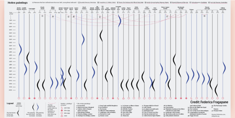
Hawaii’s scenery can be breathtaking, with cliff-rimmed white-sand beaches and surf-worthy waves. But our NodeXL #ddj mapping (Dec. 28-Jan. 3) found ProPublica highlighting dramatic erosion of the island state’s beaches over the past century. Also in this edition, we feature an interactive graphic to calculate the time to achieve COVID-19 herd immunity based on the US vaccination rate, a global vaccine distribution tracker, Federica Fragapane’s visualization of stolen paintings, and a compilation of 2020’s best data visualization lists.

Data Journalism

Data Journalism Top 10 for 2020: COVID-19, Saving the Nile, Shape of Dreams, Visualizations for the Colorblind

For those unfamiliar with GIJN’s Top 10 Data Journalism roundup, each week we select the most popular data journalism items on Twitter. We do this by using NodeXL to map use of the terms #ddj and data journalism, and then add a bit of old-fashioned human curation to highlight the most compelling items. At the end of the year, we survey the entire period and pick the best from hundreds of tweets. This year — the year of the pandemic — in which the coronavirus dominated public conversation and news headlines, our mapping reflects that reality.

Data Journalism

Data Journalism Top 10: Chocolate Box Audit, Vaccine Lineup, COVID-19 Antigen Testing, Scraping Is Not a Crime

As the United Kingdom begins its rollout of the first COVID-19 vaccine this week, the world is watching with bated breath. Our NodeXL #ddj mapping from November 30 to December 6 found Bloomberg tracking the development of nine of the most promising vaccines around the world, The New York Times creating an interactive for Americans to establish where they are in the line before they can get vaccinated, and Spain’s El Pais examining the advantages of using antigen testing for COVID-19 infections. Meanwhile, ITV News’ Stephen Hull did a fun data analysis of the assorted chocolates in a Quality Street tin.

Data Journalism

Data Journalism Top 10: Scented Candles, COVID Risk Simulator, Trump’s Final Regs, Sigma Awards

Are scented candles a casualty of the coronavirus crisis? Our NodeXL #ddj mapping from November 23 to 29 found researcher Kate Petrova’s data analysis revealing that scented candles have suffered a blow in online reviews and a decrease in ratings, possibly linked to the coronavirus’ ability to affect people’s sense of smell. Elsewhere, Germany’s Zeit Online created a COVID-19 infection risk calculator, the COVID Tracking Project explained how holidays and weekends disrupt the recording and publishing of virus data, and Reuters analyzed the shortcomings of the coronavirus contact tracing system in England. Meanwhile, the Sigma Awards, which celebrate the world’s best data journalism, have opened for entries.

Data Journalism

Data Journalism Top 10: Thanksgiving Dangers, Vaccine Tracker, Crosswords Diversity, Golf Swings, Facebook Fact-checks

Around the world, people are toning down their celebrations in a bid to mitigate spread of the coronavirus. The latest casualty: Thanksgiving. Our NodeXL #ddj mapping from November 16 to 22 found FiveThirtyEight’s timely piece explaining the risk of COVID-19 transmission from even small Thanksgiving dinner gatherings. Also popular: The New York Times tracking the status of all vaccine trials in progress, and The Pudding analysis of race and gender in crossword puzzles from five major US news publications.

Data Journalism

Data Journalism Top 10: Simple Google Searches, COVID Contracts, Mining Indigenous Land, Nashville Hot Spots, Blackstone in Berlin

Have you ever noticed how your Google search results now appear with boxes of information extracted from the websites by the search engine? Our NodeXL #ddj mapping from November 9 to 15 found The Markup’s new “Simple Search” browser extension, which allows you to view the best results in the “traditional” Google search format. We also discovered a visualization of the connection between members of the ruling British Conservative Party and COVID-19 contracts, InfoAmazonia’s investigation into mining requests in protected Indigenous land in the Amazon, and German daily Der Tagesspiegel showing that the American private equity group Blackstone is a major private property owner in the German capital, Berlin.

Data Journalism

Data Journalism Top 10: Musical Taste by Politics, Podcasts, Polling Problems, COVID Tweet Analysis

The US presidential election dominated the Twitter chat waves last week. Our NodeXL #ddj mapping from November 2 to 8 found data journalists sharing live election results trackers by Bloomberg, The Washington Post, and The New York Times, while The Atlantic and Slate weighed in on the problems of polling. Elsewhere open source platform Mapbox is organizing an election mapping contest, and Lazer Lab created a dashboard to explore 29 million tweets related to COVID-19 shared by over half a million Americans.

Data Journalism

Data Journalism Top 10: Animating COVID Masks, Mapping US Campaign Cash, Homeless Arrests, Berlin Protests

Research shows that masks are an essential defense against the coronavirus. Our NodeXL #ddj mapping from October 26 to November 1 finds The New York Times using animation and augmented reality to show just how masks work to filter and trap air particles that may carry the virus. This edition also includes several pieces on the United States presidential election: FiveThirtyEight founder Nate Silver talks to Vox about polling errors and uncertainties, freelance journalist Betsy Mason explains common shortcomings of US election maps, and NYT analyzed more than 25 million donations to Trump and Biden’s presidential campaigns.

Data Journalism

Data Journalism Top 10: Ranking Halloween Candy, Formula 1, Canadian Prisons, COVID-19 Indoors

Gearing up for Halloween? You’ll want to refer to our NodeXL #ddj mapping from October 19 to 25. We found FiveThirtyEight’s ultimate Halloween candy ranking from the archives to please the palates of finicky trick-or-treaters. This edition also includes The Economist’s mathematical model to determine whether Formula 1 racing success depends on its driver or the car engineer; The Globe and Mail examines bias in Canada’s prison system; and El Pais looks into how to reduce the probability of COVID-19 transmissions indoors.

Data Journalism

Data Journalism Top 10: Visualizing Hurricanes, Predicting Wildfires, Social Media Algorithms, Trump Loyalty Index

How does climate change increase the likelihood of weather extremes? Our NodeXL #ddj mapping from October 12 to 18 finds ProPublica examining how the warming global climate exacerbates wildfire activity, and designer Will Chase visualizing some of the most destructive hurricanes with an interactive wheel graphic. The Financial Times is summarizing key trends of the pandemic using charts, maps, and graphics, while The Markup announced its latest project looking into the black box algorithms of social media platforms.