
Data Journalism Top 10: Police Shootings, COVID Billionaires, Climate Budget Tetris, Halloween Blizzard
Read this article in

Step-By-Step Guide for Journalists on the Basics of Google Sheets

Tipsheet for Using Ocean Data in Your Investigations

No Coding Required: A Step-by-Step Guide to Scraping Websites With Data Miner

GIJC23 – The Future of Data Journalism: New Analytical Tools, Data Visualization, and AI
Fatal shootings by police officers are tragic and often face scrutiny, but non-fatal shootings deserve attention too. The Washington Post and the Investigative Reporting Program at UC Berkeley’s Graduate School of Journalism examined police shootings in which victims survived, and found that police shoot and injure a disproportionately high amount of Black people. Our weekly NodeXL and human curation of the most popular data journalism stories on Twitter also highlights stories that discovered racial disparities in both internet service and road safety infrastructure.
Digging Into Non-Fatal Police Shootings
Since 2015, The Washington Post has been tracking fatal shootings by on-duty police officers in the United States. The Post and the Investigative Reporting Program at UC Berkeley’s Graduate School of Journalism collaborated to analyze cases in which people were shot by police and survived. Journalists filed public records requests for information on non-fatal shootings from 156 police departments that were involved in five or more deadly shootings between 2015 and 2020. They found that for every five people shot and killed, four others were shot but lived. Wesley Lowery summarized the findings in a tweet thread.
Racial Disparities in Internet Service
How would you feel if you were offered subpar internet connections below the speed of 25Mbps, but had to pay the same price as people nearby who enjoy speeds nearly 10 times faster? The Markup’s investigation revealed that this is exactly what is happening across the US. By gathering and analyzing more than 800,000 internet service offers from four big telecom providers, journalists found that these companies were often marketing worse speeds to lower-income, mostly minority neighborhoods, and faster speeds to higher-income, mostly white areas. The kicker: both paid the same price for vastly different internet speeds.
Racial Disparities in Road Safety, Too
Years ago, Toronto introduced a five-year Vision Zero Road Safety Plan (2017 – 2021) to curb traffic-related fatalities and injuries on the city’s roads. The Local, an independent magazine exploring urban health and social issues in Toronto, examined city-wide speeding data, hundreds of city council meeting minutes, and road safety requests from local residents to determine whether the Vision Zero policy was a success. It found a disparity in the building of road safety infrastructure between wealthy, mostly white neighborhoods and lower-income, more racially diverse areas. Here’s a Twitter summary of the story.
The Fall of COVID Billionaires
From Zoom to Moderna, founders of companies that were particularly relevant and indispensable to the global population during the COVID-19 pandemic saw their business boom and their wealth skyrocket. Bloomberg tracked the net worth of these “COVID billionaires” and found that although their fortunes had more than doubled during the pandemic, these gains have fallen just as quickly since the end of last year.
Liz Truss’ Record Term
British politician Liz Truss recently set a record as the shortest serving prime minister in UK history. She resigned after a chaotic month-and-a-half in office. Tortoise Media graphics editor Katie Riley produced a list of things that last, or have lasted, longer than Truss’s term, including a human pregnancy (280 days), current wait time for National Health Service treatment (96 days), and the life span of a fruit fly (50 days). See also The Guardian’s overview of Truss’s tenure in six charts.
Personal Climate Tetris
To date, 193 states have joined the Paris Agreement and committed to reduce their nation’s greenhouse gas emissions and limit global warming. But how do these promises filter down to the individual? To achieve the target set by the Agreement, every person is only allowed to emit an average of 2.3 tons of carbon dioxide per year by 2030. German newspaper Berliner Morgenpost created a game similar to Tetris, also known as the brick game, for readers to find out whether their way of life emits more than the climate budget allows.
Mapping City Accessibility
Can you easily reach services in your city within a 15-minute walk? City Access Map, an open source app, provides insights into the accessibility of where you live. It takes into consideration a population’s proximity to public services such as public transit stations, parks, and libraries, as well as education and healthcare facilities. The data suggests that Bogota, Colombia, is one of the most accessible cities in the world, while Orlando, Florida, in the US is one of the least accessible. Find out more about the app and its code in this tweet thread.
Local Guide to Governance
Do you know who your city council representatives are and how to contact them? What about information on voting and which senators represent you in Congress? If you live in L.A., you’re in luck! The Los Angeles Times produced a tool for city residents to look up their representatives and their contact details as well as other granular neighborhood information according to where they live.
Following Up on Biden’s Budget Wishlist
The New York Times scrutinized US President Joe Biden’s proposed 2022 budget and the bills that Congress has passed so far during his administration. It found that the government had failed to deliver on proposed spending for initiatives related to families and education. However, officials have approved funding for health and veteran benefits that were not accounted for in the initial budget.
Halloween Blizzard Data Thread
Apparently long-time Minnesota residents love to talk about their experience of an epic blizzard that happened on Halloween in 1991. In this fun tweet thread, data journalist David H. Montgomery examines birth and population data in the state in an attempt to answer the question “When will the legendary ’91 Halloween Blizzard fade from memory to legend?”
Bonus: Intro to Data Journalism Email Series
Want an introduction to data journalism? South African data collective Media Hack has created a free, six-part email series on the basics of data journalism. It will cover data journalism tools, sources of data, tips on cleaning your data, finding stories in a dataset, and how to make a decent chart.
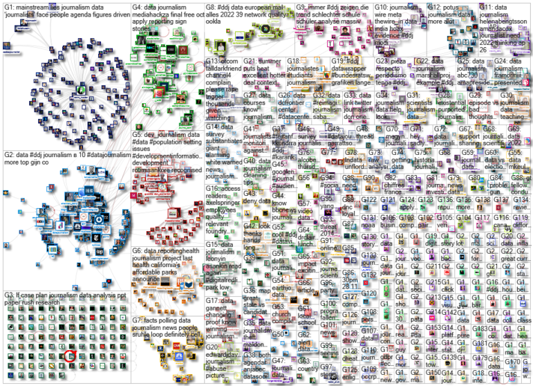
Thanks again to Marc Smith and Harald Meier of Connected Action for gathering the links and graphing them. The Top Ten #ddj list is curated weekly.
 Eunice Au is GIJN’s global team manager. Previously, she was a Malaysia correspondent for Singapore’s The Straits Times, and a journalist at Malaysia’s New Straits Times. She has also written for The Sun, Malaysian Today, and Madam Chair.
For a look at NodeXL’s mapping on #ddj and data journalism on Twitter, check out this map.
Step-By-Step Guide for Journalists on the Basics of Google Sheets
Tipsheet for Using Ocean Data in Your Investigations
No Coding Required: A Step-by-Step Guide to Scraping Websites With Data Miner
GIJC23 – The Future of Data Journalism: New Analytical Tools, Data Visualization, and AI

How a WhatsApp Community Is Bringing India’s Data Storytellers Together

Turning the Threat to a Distant Glacier into a Local Story Through Data Visualization

One Name at a Time: How Die Zeit Built a Searchable Database of Nazi Party Members

Visualizing a Trillion Dollars, India’s Warming Cities, Russian Mercenaries at Sea, and World Cup Player Physiques

This work is licensed under a Creative Commons Attribution-NoDerivatives 4.0 International License
Republish our articles for free, online or in print, under a Creative Commons license.
Republish this article
This work is licensed under a Creative Commons Attribution-NoDerivatives 4.0 International License
Read Next
Data Journalism
How a WhatsApp Community Is Bringing India’s Data Storytellers Together
Recently, more than 400 people gathered in the Indian city of Bengaluru for VizChitra 2026, a conference on data visualization and storytelling — but that is only a small part of the story.
Climate Data Journalism
Turning the Threat to a Distant Glacier into a Local Story Through Data Visualization
New York Times climate and environmental graphics reporter Mira Rojanasakul discusses how her team visualized the sea level rise threat from the melting Thwaites Glacier in Antarctica.
Data Journalism
One Name at a Time: How Die Zeit Built a Searchable Database of Nazi Party Members
An online tool set up by the German newspaper Die Zeit, in cooperation with archives in Germany and in the United States, allows people to search several million Nazi Party membership cards.
Data Journalism Top 10
Visualizing a Trillion Dollars, India’s Warming Cities, Russian Mercenaries at Sea, and World Cup Player Physiques
Also highlighting how films portray Ukrainians, increasing tree cover in Spain, and how couples meet.