
Data Journalism Top 10: Haiti’s Lost Billions, COVID’s Death Toll, Asia’s Inequality, Broken Adoptions
Read this article in
This week, a highlight of data journalism was The New York Times’ deep dive into the history of French colonialism, and how the money that France forcefully extracted from Haiti continues to haunt that Caribbean nation’s economy. Our weekly NodeXL and human curation of the most popular data journalism stories on Twitter also looks at visualizations showing the human cost of the COVID-19 pandemic in the US, an exploration of the growing number of millionaires in Asia, the race to capture trade among Southeast Asian nations, and a data-driven redesign of Australia’s election map to avoid the distorting effect of its vast rural districts.
Haiti’s Crippling Debt to France
In 1825, more than two decades after Haiti won its independence from France, the young country’s government was given a choice by its former ruler: pay 150 million francs or face war. Haiti agreed to pay the money despite the amount being far beyond its means, saddling the nation with debilitating debt for decades. The New York Times put together a stunning, historical investigation of how this debt has crippled Haiti’s economy, using data from academic research, financial reports, government budgets, archival ledgers, and more. The journalists established approximately how much money Haiti paid to the French government, calling it “a debt so large, and so lasting, that it would help cement Haiti’s path to poverty and underdevelopment.” The story also explores the extraordinary amount that lost money would have added to the local economy, had it remained in Haiti.
COVID’s Huge US Death Toll
The Washington Post offered a poignant way to contextualize the horrific one million COVID deaths in the United States. Using information from obituaries and direct submissions to the newspaper, the data team commemorated one victim for each week of the pandemic by describing what those individuals had loved to do in one sentence. Each sentence was then abruptly cut short — like the lives they described– and finished off with the number of people who died due to the coronavirus that week. The piece triggered readers to share memories of their lost loved ones in the same style on Twitter.
Asia’s Growing Wealth Inequality
Asian data site The Kontinentalist used various sources to show the disparate economic impact on people across Asia from the COVID-19 pandemic. The story reports how a demand for pharmaceuticals, safety equipment, and other services helped create 20 new billionaires in Asia. Meanwhile, millions of workers were laid off and millions fell below the poverty line. The story offers a powerful picture of unequal wealth distribution, and states: “In South and Southeast Asia, the top one percent owned 21 percent of the region’s total wealth in 2021, significantly more than the bottom half of the population.” The story also highlights how income inequality impacts young people, women, and minorities differently.
Remembering Lost Ones via Augmented Reality
NJ.com has published a unique augmented reality piece to mark the deaths of more than 33,000 people from COVID-19 in the US state of New Jersey. The piece is made up of clusters of bright dots, placed on a rough map outline of New Jersey, and set to music specially composed for this piece. The music’s pitch corresponds to the numbers, with higher pitches and louder sounds as the numbers of deceased rise. Each dot represents a person who passed away, with their name, age, county, and a link to their obituary displayed.
Mapping Abortion Clinics in the US
Early this month, Politico published a bombshell leaked draft opinion indicating that the US Supreme Court will soon overturn the landmark Roe v. Wade decision — a judicial ruling that for 50 years has guaranteed federal protection of abortion rights. This move, expected to be finalized in June, has resulted in concerns over women’s access to abortion being reversed across half the country. The Cut took a look at current abortion laws in different states, and how access to abortion may change without Roe. It also created a vetted, and regularly updated, database of abortion clinics to help readers find help at a facility nearest to them.
https://twitter.com/andreagonram/status/1528725223012458497?s=20&t=LGzghcytsjS5pVQ4xBZNTg
The Race to Capture Southeast Asia’s Trade
Despite being the largest investor in the ASEAN region (The Association of Southeast Asian Nations), the US has a lot of catching up to do when it comes to trade there. US investments are limited to just a few ASEAN countries, while China has deep economic roots across much of the region. Journalists at The Straits Times, a Singapore daily, examined trade data between countries in Southeast Asia and the US and China, respectively, to determine which of the two superpowers has a greater economic influence.
Greek Ships Exporting Russian Oil
Reporters United, a GIJN member organization, created a database to track Greek ships transporting Russian oil during Russia’s war in Ukraine. It found that 52 percent of the ships carrying fuel from Russian ports between March 9 and April 30 were Greek-owned vessels. The reporters built their dataset by scraping tweets from the Russian Tanker Tracker, a bot Twitter account set up by Greenpeace that tracks marine traffic from Russian ports in real time. The team then used this data to identify which ships were Greek, and their owners. Details about their methodology can be found here.
Redesigning Australia’s Election Map
The unique geography and demographics of Australia – with vast, sparsely populated rural regions and densely-packed coastal cities – creates election results maps that can mislead voters about the true power of parties, and the stakes for upcoming elections. For instance, the parliamentary seat of Durack, in Western Australia, is about 43,000 times larger than Grayndler in Sydney, but both have a similar number of voters, and each elect one representative to parliament. Many urban districts are so small on national election maps that it’s hard even to see color codes denoting incumbent parties. So — ahead of the recent federal election in Australia — data journalists at ABC News redesigned Australia’s election map with parliamentary seats denoted by equal-sized, color-coded hexagons. They also reshuffled states in terms of their real-world voting power, and were able to show the surprisingly even geographic distribution of critical election races.
The Broken US Adoption System
USA Today used federal data from the Adoption and Foster Care Analysis and Reporting System (AFCARS) to track more than 66,000 children from foster homes whose adoptions did not last, and who had to be reassigned to new homes. They obtained this data through a special agreement to protect the identities of the children. Reporters went over the records of 3.4 million children who were placed in foster care from 2008 to 2020 and found that, while over 66,000 children ended up back in the welfare system, there were 400,000 children whose data on previous adoptions had not been recorded. They also used the data to understand the common factors behind broken adoptions. Read more about their methodology.
Forgiving Student Loans — It’s Complicated
What will US President Joe Biden’s plan for student loan forgiveness ultimately look like? This is one of the main questions as the deadline to make a decision approaches in August. While there are currently 43.4 million people in the US impacted by student debt, the severity of this debt differs greatly based on the amount each person owes, their income level, age, and race. This piece by Bloomberg breaks down the total debt, showing who owes how much, and the potential impact of the proposed plans.
Bonus 11th Item: Data Viz Heroes
Tanya Shapiro, a self-professed data geek, asked fellow data practitioners on Twitter about their all-time favorite data visualization heroes. The replies to her question reflects a revered list of experts in the data journalism and data visualization community — perfect for those who are looking for inspiration.
https://twitter.com/tanya_shapiro/status/1526970792470269952
Thanks again to Marc Smith and Harald Meier of Connected Action for gathering the links and graphing them. The Top Ten #ddj list is curated weekly.
 Amel Ghani is the regional editor for Urdu with the Global Investigative Journalism Network. She has worked as a journalist for over eight years and has reported on land rights in urban areas, real estate, environment, and the rise of religious political parties.
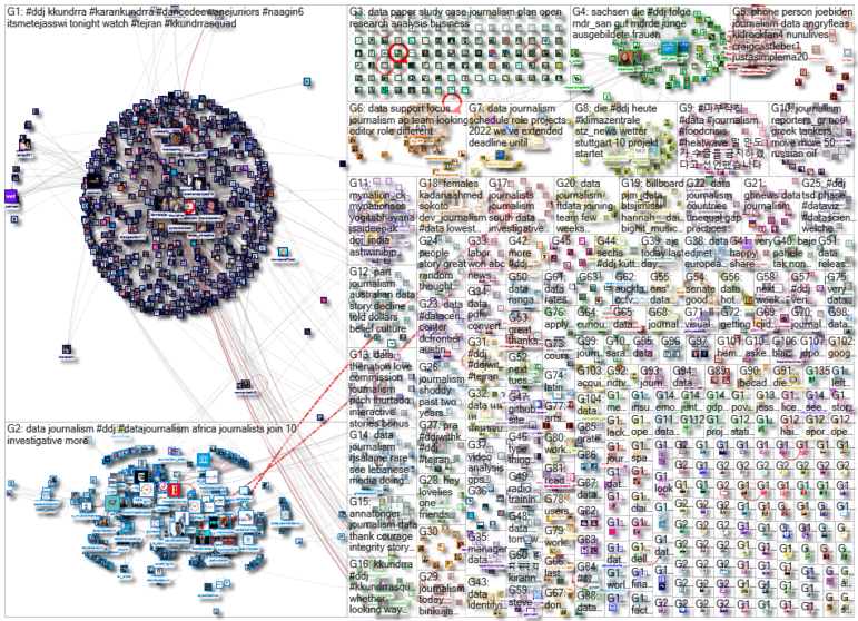
For a look at NodeXL’s mapping on #ddj and data journalism on Twitter, check out this map.

Investigating Latin America’s Global Reach Of Illicit Activities

Step-By-Step Guide for Journalists on the Basics of Google Sheets

Tipsheet for Using Ocean Data in Your Investigations

The Investigative Agenda for Climate Change Journalism

How a WhatsApp Community Is Bringing India’s Data Storytellers Together

Turning the Threat to a Distant Glacier into a Local Story Through Data Visualization

One Name at a Time: How Die Zeit Built a Searchable Database of Nazi Party Members

Making Trillions Make Sense: How Reuters Visualized the AI Economy

This work is licensed under a Creative Commons Attribution-NoDerivatives 4.0 International License
Republish our articles for free, online or in print, under a Creative Commons license.
Republish this article
This work is licensed under a Creative Commons Attribution-NoDerivatives 4.0 International License
Read Next
Data Journalism
How a WhatsApp Community Is Bringing India’s Data Storytellers Together
Recently, more than 400 people gathered in the Indian city of Bengaluru for VizChitra 2026, a conference on data visualization and storytelling — but that is only a small part of the story.
Climate Data Journalism
Turning the Threat to a Distant Glacier into a Local Story Through Data Visualization
New York Times climate and environmental graphics reporter Mira Rojanasakul discusses how her team visualized the sea level rise threat from the melting Thwaites Glacier in Antarctica.
Data Journalism
One Name at a Time: How Die Zeit Built a Searchable Database of Nazi Party Members
An online tool set up by the German newspaper Die Zeit, in cooperation with archives in Germany and in the United States, allows people to search several million Nazi Party membership cards.
Data Journalism
Making Trillions Make Sense: How Reuters Visualized the AI Economy
How do you make a trillion dollars feel real to someone who has never seen that much money? Vineet Khare and Mayank Bhatt faced that very challenge for their data-driven investigation into AI investment.