Data Journalism Top 10: Unhappy Russians, Bad Cops, Women in Data, Korean Elections
Read this article in
Russia’s war on Ukraine is depressing the mood of Russians even worse than the COVID-19 pandemic, according to a piece by The Economist. Our weekly NodeXL curation of the most popular data journalism stories on Twitter also finds stories on costly police misconduct, New York’s bilingual street signs, women in politics, and music school dropouts in Spain. Also, not to be missed: the South Korea election graphics that has Twitter abuzz.
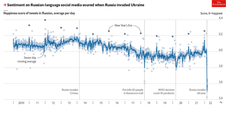
Russians’ Mood Sours Amid War
How do Russians feel about the war their President Vladimir Putin is waging on Ukraine? The Economist analyzed posts on Russian-language Twitter and the Russian social network VK using a sentiment measuring tool built by the University of Vermont. It found that tweets were eight times sadder compared to the start of the COVID-19 pandemic, as mentions of “war,” “scary,” “ashamed,” and “horror” increased sharply. Posts on VK also indicated that the mood is grim compared with 2014 when Russia sent troops into Crimea.
EU Spending On Russian Fossil Fuels
How much money have countries in the European Union spent on Russian coal, oil, and gas since the Kremlin’s war on Ukraine began on February 24? Europe Beyond Coal, an alliance of civil society groups, created a counter that tracks the estimated payments made in real-time since the start of the war. The methodology is stated here.
Costly Police Misconduct
In the United States, lawsuits and police misconduct claims have cost over US$3.2 billion of taxpayer money. And nearly half of that, US$1.5 billion, was used to settle claims against officers who were subject to more than one allegation of misconduct. The Washington Post created an interactive database featuring data collected on nearly 40,000 payments from 25 of the country’s largest police and sheriff’s departments in the last 10 years. Readers can view payments by city, officer, and category (excessive force, false arrest, civil rights).
Manhattan’s Bilingual Street Signs
Take a walk in Manhattan’s Chinatown in New York City, and you are bound to see both Chinese and English street signs. Many of these bilingual signs were erected in the 1960s as part of a program to help non-English-speaking Chinese locals navigate the neighborhood. The New York Times set out to survey which signs remain from this program, and which ones have been removed, by walking and charting every street. The results of their efforts were published in English, traditional Chinese, and simplified Chinese. Journalist Denise Lu offers her thoughts on the project in this tweet thread. And here’s a piece with insights behind-the-scenes.
Women in Data
Lots of resources and stories released last week in conjunction with International Women’s Day on March 8. The Times (UK) looked at the facts and figures of women in politics in Great Britain compared to other countries, and the challenges they face. Read more about the piece via Tweets from journalists Matilda Davies and Venetia Menzies. Spain’s El Confidencial examined data on gender violence in that country and charted the numbers, mapped the deaths, analyzed the victims’ relationship to the aggressors, and much more. More gender data is available on the World Bank and Resource Watch sites. Also, check out Federica Fragapane’s stunning infographics on the representation of women in politics and Visual Capitalist’s visualization of women featured on banknotes worldwide.
Canada’s Urban Sprawl
Urban sprawl — the uncontrolled expansion of single-family housing and low-population zoning — contributes enormously to greenhouse gas emissions. To combat climate change, countries are encouraged to increase population density in existing cities by adding services for residents within walking distance instead of building new neighborhoods. Radio-Canada used artificial intelligence to measure Canada’s urban sprawl and found that the urbanized areas of major Canadian cities have grown by 34 per cent in the past two decades but population density has fallen by six per cent. The story is available in English and in French. Find the code and data here.
Water Safety
Repórter Brasil, a GIJN member organization, mapped the quality of treated water in Brazilian municipalities by using public Ministry of Health data gathered from tests carried out by companies and institutions responsible for the country’s water supply. The resulting, interactive map reveals areas where the water is contaminated with chemical and radioactive substances that are above safety limits. The team also reported, in partnership with Agência Pública (another GIJN member), that tap water was found contaminated in 763 cities, and that water treatment generated carcinogenic substances in 493 Brazilian cities.
Music Education Dropouts in Spain
It takes a minimum of 14 years to complete a regulated music education in Spain: four years of elementary education, six in professional education, and four in higher education. El Confidencial examined data on students studying music from the nation’s Ministry of Culture and Sports. It found that only one in 10 students complete the whole cycle of music education, and that fewer women finish their music studies even though they represent the majority of the student body in elementary and professional courses. Journalist Marta Ley highlights some of their findings here.
Wordle, 15 Million Tweets Analyzed
Robert Lesser, a web editor at Michigan Daily, analyzed 15 million Tweets that mentioned Wordle scores to examine the growth of Wordle. He also used the data to answer questions like “what makes a Wordle hard?” and whether people tended to share only their successes on Wordles. His analysis shows that people usually struggle more with uncommon letters and double letters, and that they were less likely to share poor results.
Filling Data Gaps on Lakes
This is not a data journalism piece per se, but an important look at why and how data gaps should and can be filled. Bengaluru (or Bangalore) is a city in India famed for its many bodies of water, but there is a lack of reliable records on these lakes. Data journalism site Indiaspend, a GIJN member organization, reports on the problem and the negative impact that the lack of data has on lake conservation. It also highlights a crowdmapping project that aims to fill this data gap led by a research institution.
Bonus 11th Item: South Korea Election Graphics
SBS, a major broadcasting company in Korea, is known for its unconventional election graphics. Andrew Peng, editor at The Yappie, uploaded a series of animated election graphics from SBS, and a few other television channels, in a tweet thread that serves as a highlight reel of Korea’s recent election. It features election candidates in a toy claw machine, competing against each other in winter sports, and hanging out around a campfire. Innovative, or just bizarre? Check it out here.
Thanks again to Marc Smith and Harald Meier of Connected Action for gathering the links and graphing them. The Top Ten #ddj list is curated weekly.
 Eunice Au is GIJN’s program manager. Previously, she was a Malaysia correspondent for Singapore’s The Straits Times, and a journalist at the New Straits Times. She has also written for The Sun, Malaysian Today, and Madam Chair.
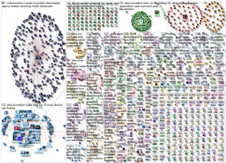
For a look at NodeXL’s mapping on #ddj and data journalism on Twitter, check out this map.

GIJC23 – The Future of Data Journalism: New Analytical Tools, Data Visualization, and AI

GIJC23 – The Basics of Using Google Sheets

GIJC23 – Using Pinpoint to Organize Unstructured Data

GIJC23 – Measuring Impact
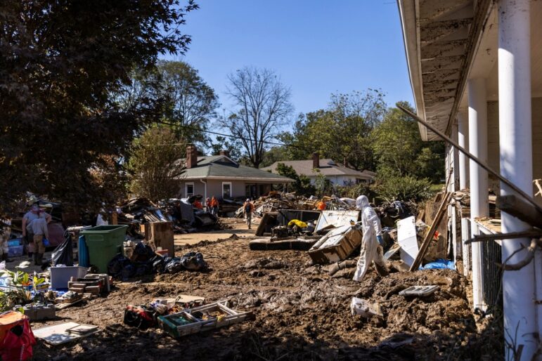
How The Washington Post Combined Data and Human Stories to Cover Hurricane Helene’s Aftermath

Spill-Tracking Data Sources to Help Cover Hazmat Events and Environmental Disasters
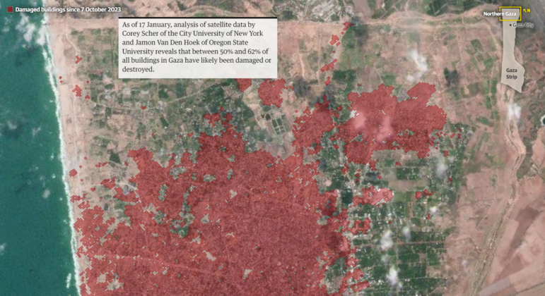
Mapping Conflict: Using Satellite Radar Data to Track the War Damage in Gaza
Airplane Accidents, 2024 Elections, Europe’s Lost Snowfall, and Recycling Movies

This work is licensed under a Creative Commons Attribution-NoDerivatives 4.0 International License
Republish our articles for free, online or in print, under a Creative Commons license.
Republish this article
This work is licensed under a Creative Commons Attribution-NoDerivatives 4.0 International License
Read Next
Data Journalism
How The Washington Post Combined Data and Human Stories to Cover Hurricane Helene’s Aftermath
From Storybench, Washington Post climate reporter Brady Dennis is interviewed about his immersive story on Hurricane Helene and the importance of combining data and human experience.
Data Journalism Reporting Tools & Tips
Spill-Tracking Data Sources to Help Cover Hazmat Events and Environmental Disasters
Environmental journalists should check out the new database tool Spill Tracker, but should also bookmark these other resources for reporting on hazmat events.
Data Journalism Methodology
Mapping Conflict: Using Satellite Radar Data to Track the War Damage in Gaza
Gaza’s urban landscape has changed profoundly since the start of Israel’s military campaign. Researchers Jamon Van Den Hoek and Corey Scher have been mapping the impact.
Data Journalism Data Journalism Top 10
Airplane Accidents, 2024 Elections, Europe’s Lost Snowfall, and Recycling Movies
With pieces on the global campaign landscape, airplane accidents, European snowfall, and the toll of the ongoing Israel-Hamas conflict in Gaza.