
Data Journalism Top 10: Solar-Powered Batmobile, Hungarian Money Abroad, Migrants Dying in Qatar, Open Windows & COVID-19
Read this article in
For decades, environmentalists have dreamed about climate-friendly transportation. The arrival of hybrid and electric vehicles have brought us one step closer to traveling without damaging the planet. And this year, a California start-up promises to push the technology even further by rolling out the first mass-produced solar-powered car. Our NodeXL #ddj mapping from February 22 to 28, which tracks the most popular data journalism stories on Twitter, found a visual explainer by The Washington Post of how the car works and how far it can travel. We also feature a Guardian investigation into deaths of migrant workers in Qatar, a cross-border project revealing Hungarian Prime Minister Viktor Orbán’s influence in Eastern Europe, and a creative infographic about animals in space.
Solar-Powered Batmobile
What would Batman’s car look like if it ran on solar energy? A California company has an answer. Aptera Motors has promised to roll out the first mass-produced solar car this year. If successful, this vehicle could revolutionize climate-friendly transportation. With a series of graphics, The Washington Post explains how the car works and how it compares to gas, hybrid, and electric machines.
Animals in Space
In more than six decades of space exploration, humanity has sent people, robots, and even a car into orbit. But do you know how many live creatures have taken part in space missions? Designer Federica Fragapane made this creative data visualization to explore the numbers of primates, rats, and insects sent into space.
Hungarian Money
Since conservative Hungarian Prime Minister Viktor Orbán took office for the second time in 2010, his government has paid at least 670 million euros ($806 million) in grants to Hungarian organizations abroad, according to findings by the “Greater Hungary” cross-border investigative project. The editorial team includes outlets from Hungary, Romania, Slovakia, Serbia, Slovenia, and Croatia. Their investigation is based on scraped data and documents about the largest Hungarian state fund. You can find an overview of the project and read more about its findings on this platform.
Reporting with Data in Uganda
In 2019, Caleb Okereke, a Nigerian journalist based in Uganda, co-founded Minority Africa with the goal of using data-driven reporting to tell stories from across the continent. The outlet was well-received thanks to its dedication to slow news and in-depth coverage. Still, the team faced a major challenge in finding a sustainable revenue model to keep the outlet going, especially in the middle of a pandemic. In a piece for Poynter, Okereke talks about the lessons he learned while running a newsroom and writes that media companies may benefit from incorporating online courses alongside their journalism.
Open Your Windows
One of the most efficient ways to limit the spread of the coronavirus is quite straightforward — allowing proper ventilation. As authorities in the US and other countries work on plans to safely reopen schools, The New York Times illustrates why opening windows is a crucial measure to protect students and teachers in the classroom. The Times’ comprehensive simulation of airflow demonstrates how ventilation can reduce the level of contamination in closed spaces.
World Cup 2022: Dying in Qatar
When Qatar won the bid to host the 2022 soccer World Cup, there were concerns about an elite sports competition taking place in a country with consistently high temperatures. In an attempt to create more acceptable conditions for athletes, Qatar started building stadiums with comprehensive air-conditioning systems in addition to other major construction projects. But an investigation by The Guardian found that more than 6,500 migrant workers from five South Asian nations have died in the ten years since Qatar won the bid. Its analysis also shows that the total death toll is significantly higher.
Journalists Can Be Vulnerable, Too
For many journalists, working in a fast-paced newsroom environment is exciting. But as the years go by, the endless flow of deadlines, long hours, and high workload inevitably cause stress and can threaten a reporter’s emotional and mental well-being. In this interview, Mar Cabra, former head of the data team at the International Consortium of Investigative Journalists, talks about walking away from journalism despite sharing a Pulitzer Prize. She argues that journalists should be allowed to be vulnerable without fearing that this feeling could undermine their authority and professionalism.
Lessons from Facebook vs. Australia
In mid-February, Facebook blocked Australian users from accessing news on its platform amid a dispute over a new law that would require tech giants to pay publishers for content. The experiment was short-lived and, after a deal with Australian authorities, the company lifted its blockade. The Australian Broadcasting Corporation analyzed data on how the temporary ban affected news sites across the country.
Mapping the US Presidential Election
You have probably looked at more than enough maps depicting the outcome of last year’s US presidential election by now. But this visualization by cartographer Kenneth Field is on another level with its attention to detail. Each dot on Field’s map represents one of the 158 million people who voted.
Data-Driven Instagram Filters
If you enjoy Instagram filters, you may be pleasantly surprised by the ways in which augmented reality can complement data-driven journalism. Inspired by The New York Times’ You Draw It series, German outlet Deutsche Welle built a fun tool enabling users to interact with a chart by moving their head. In this blog post, DW’s team also gives tips on creating a successful filter.
Thanks again to Marc Smith and Harald Meier of Connected Action for gathering the links and graphing them. The Top Ten #ddj list is curated weekly.
 Peter Georgiev is GIJN’s social media and engagement editor. Previously, he was part of NBC News’ investigative unit in New York. He also worked as a correspondent for Bulgarian National Television and his reporting has been published by The Guardian, Deutsche Welle, and other international outlets.
For a look at NodeXL’s mapping on #ddj and data journalism on Twitter, check out this map.


Reporter’s Guide to Investigating Cryptocurrency

Tipsheet on Partnering with Civil Society Organizations and Non-Governmental Organizations

AI Accountability Reporting Guide

Guide to Mapping Analysis Using QGIS

How Data Journalism Is Changing the Face of Africa

Data-Driven Journalism: Roundup of Recent Standout Stories
Data Journalism Top 10: Everest’s Deadly Legacy, Paris Metro Pollution, Migrant Worker Struggles in Singapore
Data Journalism Top 10: Bats and the Next Pandemic, China’s Electric Battery Dominance, and Brazil’s Healthcare ‘Holes’

This work is licensed under a Creative Commons Attribution-NoDerivatives 4.0 International License
Republish our articles for free, online or in print, under a Creative Commons license.
Republish this article
This work is licensed under a Creative Commons Attribution-NoDerivatives 4.0 International License
Read Next
Africa Focus Data Journalism
How Data Journalism Is Changing the Face of Africa
Data journalism in Africa has made a powerful impact, from holding leaders accountable to refuting myths around domestic violence. But the field faces formidable challenges.
Case Studies Data Journalism GIJC23
Data-Driven Journalism: Roundup of Recent Standout Stories
The best of modern data journalism tells powerful stories that test assumptions. At GIJC23, two experts discussed strong recent investigations and what makes them stand out.
Data Journalism Data Journalism Top 10
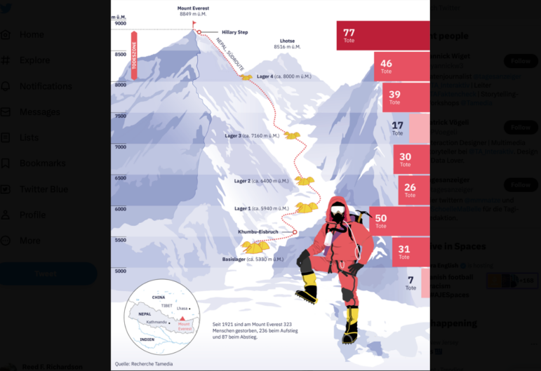
Data Journalism Top 10: Everest’s Deadly Legacy, Paris Metro Pollution, Migrant Worker Struggles in Singapore
This week, GIJN’s Top 10 in Data Journalism examines why the world’s tallest mountain has become increasingly deadly for those trying to climb it, pollution in Paris metro stations, US laws expanding gun access one year after the Uvalde mass shooting, and migrant worker struggles in Singapore.
Data Journalism Data Journalism Top 10
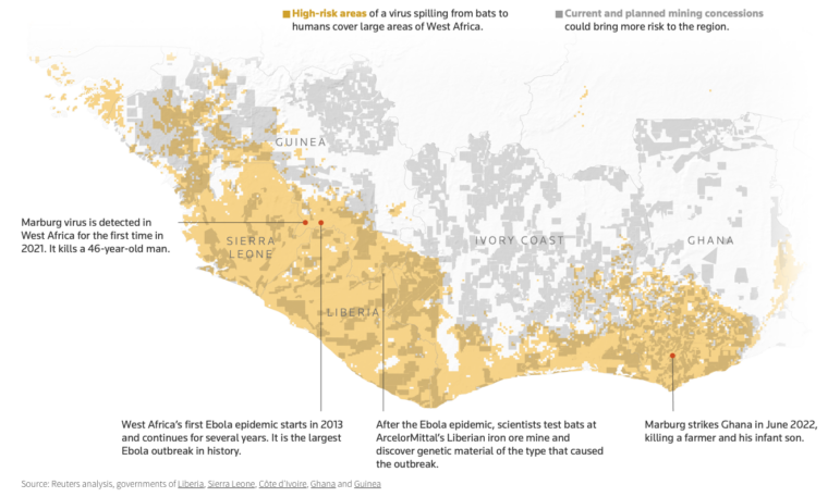
Data Journalism Top 10: Bats and the Next Pandemic, China’s Electric Battery Dominance, and Brazil’s Healthcare ‘Holes’
GIJN’s weekly, curated look at the Top 10 in Data Journalism highlights bats and predicting the location of the next pandemic, China’s electric battery dominance, and mapping out Brazil’s healthcare “holes.”