My Favorite Tools with Al Jazeera’s Mohammed Haddad
Read this article in


For our series on journalists’ favorite tools, we spoke with Mohammed Haddad, who leads Al Jazeera’s interactive team, AJLabs.
The Palestinian-South African data journalist has been with the Doha-based news organization for a decade, having joined during the onset of the Egyptian uprising in 2011. Haddad’s award-winning team is modest — there are just two staff visual storytellers and data journalists — although they frequently work with freelancers. Haddad, who is planning to double the team this year, frequently appears on panels and gives international training sessions in data journalism.
He says that digital tools can play a key role in developing content for an audience that largely accesses and shares news stories through social media.
“We’re in a situation now where we want to be in-depth, but we have to create social media-friendly content,” Haddad said. “These tools are becoming part of the journalism toolbox that you can’t live without anymore.”
RStudio, Tidyverse
RStudio develops free and open tools for the R programming language, tools commonly used for statistical analysis and visualization. Haddad takes that up a notch by using Tidyverse, an interface which uses a series of templates to make R easier and more accessible to use.
Haddad has been using the R programming language for four years, and it has been a key part of his data journalism work. “If [the story] involves data that needs to be analyzed, I go to programming R, specifically RStudio,” he said.

Mohammed Haddad
He has been using both tools for Al Jazeera’s ongoing coverage of the coronavirus pandemic. “We use Johns Hopkins University data for any story on the news desk with immediate turnaround,” Haddad said. “They update their numbers every day, so what we did was plug that into data visualization.” Using a script that collects and runs data from the university’s Coronavirus Resource Center — which has become a data hub for global statistics on COVID-19 — Haddad uses R to filter the data and sort it to use in maps. “You can reformat it, arrange it by time, anything! It really is such an efficient way to process things.”
Mapbox
Maps have become a key component in data journalism, and Al Jazeera is one of many news organizations that have integrated them into their visual work. “Like most news organizations, we use mapping a lot, and Mapbox is what we’ve been using over the past 18 months,” Haddad said.
Mapbox — an open source, “freemium” service, with a scaling price based on monthly activity after an organization reaches 25,000 users — has been used by a variety of platforms both within journalism and in other fields. Haddad has used it to give an additional dimension to his visual storytelling.
“Once you understand the geography, you begin to see how strategic some areas are,” he explains, referring to an Al Jazeera story about tensions between India and China and how they play out in their disputed border region. Using Mapbox and its “scrollytelling” template, this particular story takes readers on a journey across the borders, with integrated 3D modeling, visualized data, photographs, and videos, to tell a story that reveals the region’s history of battles over borders and territory.
“We’re using geography as a journey, and [creating] infographics wherever needed, to help a social media audience understand these events,” he said.
Web Stories by AMP
AMP (Accelerated Mobile Pictures) and its Web Stories feature have been a key tool for story presentation, especially where a growing amount of material is digested using a mobile device through social media channels. “For us, data stories are always looking at the human side. How are people impacted? What is their story?” Haddad said. “This is built for a mobile experience; easy to consume, and data-driven.”
Web Stories, which is an open source and free service, was used to create Al Jazeera’s story “Know Their Names,” about Black victims of police violence in the United States.
“We used data from the website Mapping Police Violence [which is publicly available]. They have a database of everyone killed by the police in the US,” Haddad explains. “We downloaded the full database as an Excel file, ran that through R, and filtered out the cases and circumstances.” Then, with an illustrator and in consultation with their US editor, they created a graphic detailing more than a dozen stories of victims like George Floyd and Breonna Taylor.
Nivo
Nivo, which is open-source and free, is one of several tools Haddad uses for data visualization. It puts together “predetermined templates that we can use wherever we have more complicated data sets,” he says. One story where this tool was crucial was How Has My Country Voted at the UN? where the Al Jazeera team analyzed over 6,000 United Nations General Assembly votes from 1946 to 2018.
“We wanted to understand how countries voted at the UN, and how it evolved,” Haddad said. “How countries voted on the Israeli-Palestinian conflict, nuclear weapons, human rights, economic development.”
Created with Nivo, the story is a huge interactive with the topic broken down by region and decade; it uncovers the different positions that UN member states took on a wide variety of issues. There is further categorization to reveal the issues that have been most discussed and mentioned at the Assembly, like human rights.

Image: Courtesy Mohammed Haddad
Chartbeat
Chartbeat is an analytics tool with features that Haddad says can be key for newsrooms and journalists, revealing data points such as scroll depth (how far readers scroll down a page) and presenting analytics in real time.
While data journalists often “don’t necessarily try to understand our users’ consumption habits,” Haddad says such information can be important and revealing. On the UN vote story, for example, “Journalists told me there was way too much there, but with analytics I found out that many people were [engaged] for six or more minutes,” he said. Most stories, Haddad added, would have an approximately three-minute engagement period.
Analytics is crucial for Haddad and his team at AJLabs to gauge the impact and timeliness of their stories.
“Whenever we publish a story, the first thing I do after it’s published is I open Chartbeat and see how it’s being picked up by news outlets and different people on social media,” Haddad said. “Back in the day, newspaper publishers would publish whatever they felt, with newspaper sales as their metric. In our case, we use real-time second-by-second updates to see how our audience is engaging.”
Chartbeat is a paid-for service.
What’s Next?
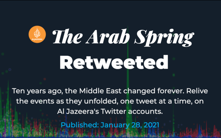
Haddad and his team have rolled out a commemorative on the Arab Spring, the series of popular uprisings in the Middle East and North Africa that began in December 2010 and swept through the region. They’ve used Twitter to document the events as they unfolded — a data-based approach compared to having to rely heavily on anecdotal memory.
“Our job as journalists is to inform the people,” he explained. “If we are oblivious to entire sections of the story then we’ve done our readers a disservice.”
Additional Reading
My Favorite Tools 2020: Top Investigative Journalists Tell Us What They’re Using
Al Jazeera Analyzed 6,500 Homepage Images. Here’s What They Learned
Editor’s Pick: 2020’s Best Investigative Stories from the Arab World
 Kareem Chehayeb is a journalist and researcher in Beirut, Lebanon. He writes for independent media organization The Public Source and has been published by The New York Times, Middle East Eye, and Business Insider.

This work is licensed under a Creative Commons Attribution-NoDerivatives 4.0 International License
Republish our articles for free, online or in print, under a Creative Commons license.
Republish this article
This work is licensed under a Creative Commons Attribution-NoDerivatives 4.0 International License
Read Next
Data Journalism My Favorite Tools
My Favorite Tools: Alberto Cairo on Data Visualization
For our series on journalists’ favorite tools, we spoke to Alberto Cairo, head of visualization at the University of Miami’s Institute for Data Science and Computing. Cairo shared several user-friendly tools and core principles to help investigative reporters shape their data visually to create new insights for audiences.

Data Journalism
GIJN’s Data Journalism Top 10: What to Ask Google, Gerrymandering California and Dwindling Doctors
What’s the global data journalism community tweeting about this week? Our NodeXL #ddj mapping from June 18 to 25 finds a visual story about fixing household stuff by @xocasgv and @GoogleNewsInit, another about fixing political stuff by @Washingtonpost and @paulbradshaw on teaching data journalism.
Data Journalism
This Week’s Top Ten in Data Journalism
What’s the global data journalism community tweeting about this week? Our NodeXL #ddj mapping from October 9 to 15 has @RTSinfo looking into flight sharing platform @Wingly_UK, while @srfdata finds millions of fake @instagram followers, @jwyg charts the growth of all Internet sites, and @nytimes collaborates with @AmstatNews to promote critical thinking and data literacy.

Data Journalism
Data Journalism’s Top Ten
What’s the global data journalism community tweeting about this week? Our NodeXL #ddj mapping from August 14 to 20 has @Forbes mapping six years of American television news, the looming Kantar @infobeautyaward’s submission deadline and @sarahslo’s list of women in the field of data visualization.