Data Journalism Top 10: Visualizing Hurricanes, Predicting Wildfires, Social Media Algorithms, Trump Loyalty Index
Read this article in
How does climate change increase the likelihood of weather extremes? Our NodeXL #ddj mapping from October 12 to 18 finds ProPublica examining how the warming global climate exacerbates wildfire activity, and designer Will Chase visualizing some of the most destructive hurricanes with an interactive wheel graphic. The Financial Times is summarizing key trends of the pandemic using charts, maps, and graphics, while The Markup announced its latest project looking into the black box algorithms of social media platforms.
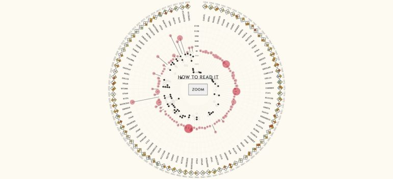
Visualizing the Worst Hurricanes
Will Chase, a developer, designer, and artist, examined the history of naming hurricanes in the Atlantic, and particularly the practice of retiring hurricane names after an event causing severe damage or a large number of casualties. He created an interesting wheel-interactive that displays the death toll, resulting damage, and previous occurrences of each retired hurricane name. Tip: Scroll right to turn the wheel. Discover how he designed the interactive here.
COVID-19 Summarized
To understand the scale and impact of the coronavirus pandemic, the Financial Times used charts, maps, and graphics to summarize chronologically everything that data has shown us about the virus so far. From its emergence in Wuhan, China, to the second wave of the pandemic in Europe, this comprehensive piece includes a look at the consequences of differing approaches to the health crisis, the complexities of counting the death toll, and the dilemma of easing restrictions.
California Fires
New research suggests that climate change is increasing the likelihood of extreme autumn wildfire conditions — days with high temperatures and wind speeds, as well as low humidity — across the state of California. ProPublica examines just how climate change plays a role in exacerbating wildfire activity, and how many fires residents in different areas in the state may see by 2050.
Auditing Social Media Algorithms
The Markup, a nonprofit focused on data-driven investigations of technology and how it influences society, recently announced its new initiative. The Citizen Browser Project is designed to audit the algorithms that social media platforms use to distribute news and narratives to different communities. Get updates by signing up for its newsletter. Also, the organization is hiring a temporary data reporter to work on the initiative. Apply by October 31.
Visual Data Bias
Freelance journalist Nahal Sheikh writes about an online exhibition at the Boston Public Library called “Bending Lines: Maps and Data from Distortion to Deception.” She reflects on how easily cartography can be manipulated according to the map maker’s motivations, and how the history of persuasive cartography can teach us to spot biases in visual data now. For more, check out this Reuters Institute for the Study of Journalism seminar on data bias and why journalists should pay attention to it.
Bypassing COVID Restrictions with Private Jets
By analyzing flight data from March 17 to June 1 in 50 of the main French business airports and some 15 foreign equivalents, French daily Le Monde found that the wealthy have bypassed COVID-19 travel restrictions. Turns out the one percent flew to their beach homes in private jets while most of France was locked down.
Trump Loyalty Index
Donald Trump’s ability to command loyalty from fellow Republicans — through a combination of fear and power politics — is notorious. But can we measure that loyalty? Perhaps so. Using voter data from FiveThirtyEight, Axios created a “Trump Loyalty Index” to gauge Congressional support for Trump in the wake of seven of his most controversial moments. It found that more than 85% of the elected Republicans in Congress through Trump’s term largely stood by him through the seven crises that they say “would have crushed most politicians.” Read a summary in this tweet thread.
The President’s Patrons
An investigation by The New York Times found that over 200 companies, special-interest groups, and foreign governments had patronized properties owned by Donald Trump, while “reaping benefits from him and his administration.” By reviewing hundreds of social media posts by his patrons, interviewing nearly 250 people, and analyzing public records and other data, the NYT was able to underscore that the businessman-president not only failed to end Washington’s insider culture of lobbying and favor-seeking, but has reinvented and profited off it, by mixing public governance and private business in his hotels and resorts.
Data Viz Conference
The Data Visualization Society is organizing its first conference virtually for February 4 and 5, 2021. The Outlier event will consist of two parts: a conference section with a curated speaker lineup and talks, and a second section that allows anyone in attendance to create a session. Apply to be a speaker here.
Data Training for Female African Reporters
CENOZO, a nonprofit investigative journalism network in West Africa, is offering data journalism and data analysis training for female journalists with at least three years of experience from Burkina Faso, Mali, and Niger. The deadline for the application — which is in French — is October 31. Meanwhile, the Zimbabwe Centre for Media and Information Literacy in collaboration with Code for Africa’s Data Academy is calling for applicants for a week-long data journalism training. It is open to practicing journalists based in Zimbabwe. Deadline: October 27.
Thanks again to Marc Smith and Harald Meier of Connected Action for gathering the links and graphing them. The Top Ten #ddj list is curated weekly.
 Eunice Au is GIJN’s program manager. Previously, she was a Malaysia correspondent for Singapore’s The Straits Times, and a journalist at the New Straits Times. She has also written for The Sun, Malaysian Today, and Madam Chair.
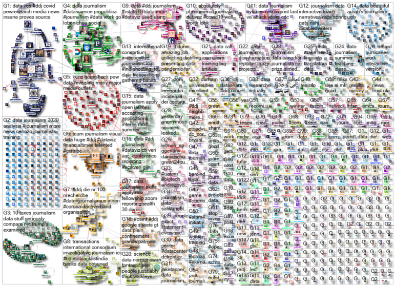
For a look at NodeXL’s mapping on #ddj and data journalism on Twitter, check out this map.

My Favorite Tools: Venezuela’s Lisseth Boon on Design and Data Visualization

Document of the Day: Algorithms for Journalists

Tipsheet: Latest Tools for Investigating with Telegram

Investigating Elections: Threat from AI Audio Deepfakes
Airplane Accidents, 2024 Elections, Europe’s Lost Snowfall, and Recycling Movies

Data-Driven Journalism: Roundup of Recent Standout Stories
Data Journalism Top 10: US Wage Theft, Russia’s Brain Drain, and the Great Kantō Earthquake
Data Journalism Top 10: Global Water Stress, Fentanyl Proliferation, Maui Fires

This work is licensed under a Creative Commons Attribution-NoDerivatives 4.0 International License
Republish our articles for free, online or in print, under a Creative Commons license.
Republish this article
This work is licensed under a Creative Commons Attribution-NoDerivatives 4.0 International License
Read Next
Data Journalism Data Journalism Top 10
Airplane Accidents, 2024 Elections, Europe’s Lost Snowfall, and Recycling Movies
With pieces on the global campaign landscape, airplane accidents, European snowfall, and the toll of the ongoing Israel-Hamas conflict in Gaza.
Case Studies Data Journalism GIJC23
Data-Driven Journalism: Roundup of Recent Standout Stories
The best of modern data journalism tells powerful stories that test assumptions. At GIJC23, two experts discussed strong recent investigations and what makes them stand out.
Data Journalism Data Journalism Top 10
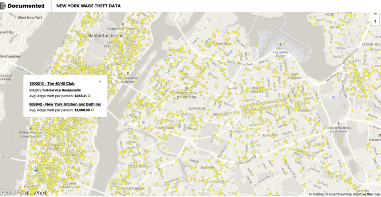
Data Journalism Top 10: US Wage Theft, Russia’s Brain Drain, and the Great Kantō Earthquake
Featuring wage theft mapping in New York, the alarming rise in US airliner near misses, Russia’s brain drain, and a historical analysis of the Great Kantō earthquake in Japan 100 years ago.
Data Journalism Data Journalism Top 10
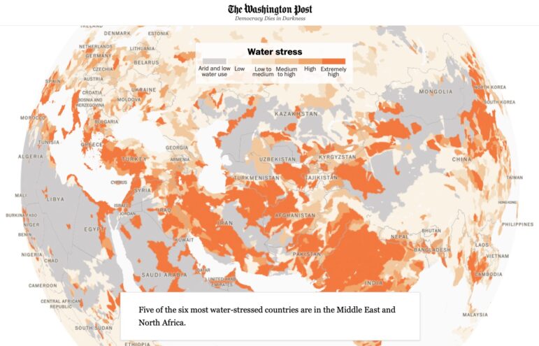
Data Journalism Top 10: Global Water Stress, Fentanyl Proliferation, Maui Fires
With stories about global water stress, the boom in fentanyl trafficking at the US-Mexico border, the devastating fires in Maui, and strategies for taking penalty kicks.