Data Journalism Top 10: Social Distancing Interactive, Epidemic Modeling, Germany’s Low Death Rate, and Zuckerburg TikTok Video
The coronavirus pandemic has sparked an array of interactives, charts, and simulations by data journalists and citizens around the world. This week’s NodeXL #ddj mapping from March 23 to 29 finds The New York Times warning of the dangers of ending social distancing measures by Easter, Germany’s Der Spiegel and Der Tagesspiegel measuring traffic levels and COVID-19 cases respectively, the Tampa Bay Times monitoring Florida’s growing peril, Kevin Simler making an interactive simulation to explain how general epidemics unfold, and Mona Chalabi creating a viral TikTok video on Mark Zuckerberg’s donation to advance coronavirus research.
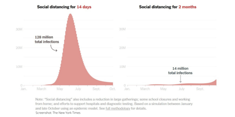
Dangers of Ending Social Distancing
US President Donald Trump alarmed health experts by saying he hoped to end social distancing measures by Easter. The New York Times developed an interactive model with epidemiologists to show why returning to normal routines too quickly could lead to an explosion of infections, hospitalizations, and deaths. The Times is also attempting to track every coronavirus case in the country, and released its dataset of coronavirus cases to the public. Looking for more COVID-19 datasets? Try Google’s Dataset Search.
German Traffic in the Time of Corona
Political leaders in Germany have not enacted curfews like many other nations, but they have imposed extensive nationwide exit restrictions and strict limits on social gatherings. Der Spiegel analyzed data from Hystreet’s laser scanners, the TomTom Traffic Index, and Eco Counter to measure pedestrian, vehicle, and bicycle traffic.
Florida’s Worrying Progression
As of March 31, Florida remained one of the few US states with a large outbreak without a statewide order keeping residents at home. According to a Tampa Bay Times analysis, the rate of increase in the number of confirmed coronavirus cases in the state puts it on a trajectory to see tens of thousands of infections in coming weeks. Experts say the number of cases is already past the point of easy containment.
How Epidemics Unfold
Kevin Simler, co-author of “The Elephant in the Brain: Hidden Motives in Everyday Life,” tried his hand at creating an interactive simulation of a disease outbreak. His caveat: The grid simulations are not an attempt to model COVID-19, but a simplified model of how general epidemics unfold.
Tracking Coronavirus Cases in Germany
Der Tagesspiegel is tracking all confirmed coronavirus infections in Germany by county and state. It notes that large cities are particularly affected, probably due to their population density.
Why Germany’s COVID-19 Death Rate Is Low
Sky News published a piece on March 26 comparing the fatality rates of coronavirus cases in different countries. Although Germany had already logged more than 37,000 confirmed infections by then, its fatality rate stood out as the lowest figure among the most affected countries. The piece offers several reasons why: adequate and rigorous testing, fewer elderly infected, and a high number of acute care hospital beds available.
https://twitter.com/PippaCrerar/status/1243276044142022666
COVID-19 Lessons for Australia
Australia’s ABC News put together a piece to help readers understand how quickly coronavirus is spreading in different countries; where Australia fits into the global picture; and what Aussies can learn from countries that appear to have curbed the rise of COVID-19.
Zuckerberg’s Research Donation
Data journalist Mona Chalabi, who is known for her fun data illustrations and innovative ways of presenting data, created a video on TikTok that sparked a lot of discussion on wealth and charity. Using two cups and green liquid in the video, she showed what the proportion of Mark Zuckerberg’s $25 million donation for coronavirus research looks like in relation to his $81 billion fortune. Insider has the story here.
Pie Chart Fail
With the abundance of COVID-19 related graphics being churned out, it was inevitable that bad charts would be generated. In particular, an erroneous pie chart produced by WCVB is making the rounds on social media.
https://twitter.com/lportnoy/status/1243293652899807235
Make a Cartoon Sketch
This isn’t new, but just in case you missed it: Tim Qian, a full-stack JavaScript hacker and open source activist, created Chart.xkcd — a chart library that plots “sketchy,” “cartoony,” or “hand-drawn” styled charts. More details on Github.
Thanks again to Marc Smith of Connected Action for gathering the links and graphing them. The Top Ten #ddj list is curated weekly.
 Eunice Au is GIJN’s program coordinator. Previously, she was a Malaysia correspondent for Singapore’s The Straits Times, and a journalist at the New Straits Times. She has also written for The Sun, Malaysian Today, and Madam Chair.
For a look at NodeXL’s mapping on #ddj and data journalism on Twitter, check out this map.

Tipsheet on Partnering with Civil Society Organizations and Non-Governmental Organizations

AI Accountability Reporting Guide

Guide to Mapping Analysis Using QGIS

Open Source Databases by Country

How Data Journalism Is Changing the Face of Africa

Using Data Sources to Track Harmful Climate Crisis-Fueled Algal Blooms

Data-Driven Journalism: Roundup of Recent Standout Stories

Data Journalism Top 10: Wagner’s Corporate Network, Barbie’s Career History, and Spain’s Election Results

This work is licensed under a Creative Commons Attribution-NoDerivatives 4.0 International License
Republish our articles for free, online or in print, under a Creative Commons license.
Republish this article
This work is licensed under a Creative Commons Attribution-NoDerivatives 4.0 International License
Read Next
Africa Focus Data Journalism
How Data Journalism Is Changing the Face of Africa
Data journalism in Africa has made a powerful impact, from holding leaders accountable to refuting myths around domestic violence. But the field faces formidable challenges.
Data Journalism Reporting Tools & Tips
Using Data Sources to Track Harmful Climate Crisis-Fueled Algal Blooms
For the SEJ’s Reporter’s Toolbox: datasets and sources useful for tracking the harmful impact of climate change-fueled algal blooms.
Case Studies Data Journalism GIJC23
Data-Driven Journalism: Roundup of Recent Standout Stories
The best of modern data journalism tells powerful stories that test assumptions. At GIJC23, two experts discussed strong recent investigations and what makes them stand out.
Data Journalism Data Journalism Top 10
Data Journalism Top 10: Wagner’s Corporate Network, Barbie’s Career History, and Spain’s Election Results
GIJN’s weekly round-up of the Top 10 in Data Journalism looks at the Wagner Group’s vast corporate network in Russia, the many careers of Barbie, and Spain’s surprising election results.