GIJN’s Data Journalism Top 10: Fall Foliage, Housing Data, Knife Crimes, Charts vs. Text
What’s the global data journalism community tweeting about this week? Our NodeXL #ddj mapping from October 7 to 13 finds The New York Times tackling the topic of auto emissions as a significant climate problem, The Washington Post mapping the colors of America’s fall foliage, the St. Louis Post-Dispatch sharing its newsroom process in data transparency, and Nicholas Strayer offering a tutorial to build your own cool resume using R.
Fantastic Fall Foliage
Using forest species data from the US Department of Agriculture, The Washington Post mapped forest type, leaf type, and fall foliage colors across the United States, ranging from mostly evergreen to yellow, red, and even places that are unlikely to be colorful during autumn.
Climate Problem: Auto Emissions
Auto emissions are a huge contributor to planet-warming greenhouse gases. The New York Times mapped in detail a year’s worth of carbon dioxide emissions from passenger and freight traffic on every road in the United States. Americans — find out the percentage increase of total emissions in your region since 1990.
https://twitter.com/HirokoTabuchi/status/1182270456717627393
Data Transparency
Sharing data and reproducible data analysis behind data-driven stories is one way to open up a newsroom’s reporting process and improve transparency. The St. Louis Post-Dispatch’s Janelle O’Dea details her newsroom’s process in sharing the data behind the scenes.
https://twitter.com/aleszubajak/status/1182652477457489921
Building a Resume in R
Want to know how you can build your resume using R? Nicholas Strayer, a PhD candidate in biostatistics at Vanderbilt University, shared his script and process for building a data-driven resume.
History of Dataviz: Dreams, Snakes, and Hexagons
Graphical thinkers Michael Friendly and Howard Wainer highlight some origin stories of visual thinking, including the story of German chemist August Kekulé’s discovery of the hexagonal chemical structure of the organic compound benzene around 1862 through a dream about snakes.
https://twitter.com/AlbertoCairo/status/1181344085849907200
Sneak Peek into ‘How Charts Lie’
Here’s a sneak peek of the first 20+ pages of “How Charts Lie,” the latest book by data visualization expert Alberto Cairo. In his introduction, he quickly dives in to dissect how a “Citizens for Trump” graphic showing that a majority of citizens had purportedly voted for Trump is misleading.
Housing Data
The London-based Bureau of Investigative Journalism looked into how people get pushed into homelessness. Their work included an analysis of 62,000 rental adverts which showed that 94% of rented homes are too expensive for families on housing benefits. See the data and code behind the investigation here.
Knife Crimes
BBC News analyzed police statistics of knife attacks across England and Wales. Although London remains the most dangerous hotspot, such offenses have risen sharply in areas outside of the capital. Manchester, Liverpool, Slough, and Nottingham are all in the top 25 most dangerous places for serious knife crime.
Charts vs. Text
There’s a discussion on Twitter on whether charts can reduce audience’s misconceptions significantly, compared to chunks of text or headlines.
CODA BR 2019 Conference
Registration is open for the fourth edition of the CODA BR conference, to be held on November 23 and 24 in Paulo, Brazil. The data journalism conference will feature dozens of workshops to enhance one’s techniques in handling data. Keynote speakers are Aron Pilhofer, Cheryl Phillips, Jonathan Phillips, and Matt Kiefer.
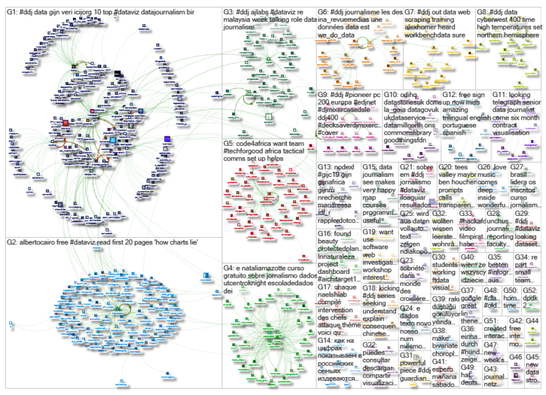
Thanks, once again, to Marc Smith of Connected Action for gathering the links and graphing them. The Top Ten #ddj list is curated weekly.
 Eunice Au is GIJN’s program coordinator. Previously, she was a Malaysia correspondent for Singapore’s The Straits Times, and a journalist at the New Straits Times. She has also written for The Sun, Malaysian Today and Madam Chair.
For a look at Marc Smith’s mapping on #ddj on Twitter, check out this map.

GIJC23 – The Future of Data Journalism: New Analytical Tools, Data Visualization, and AI

GIJC23 – The Basics of Using Google Sheets

GIJC23 – Using Pinpoint to Organize Unstructured Data

GIJC23 – Measuring Impact

From Data to Storytelling: Concept and Design Tips from the Financial Times’ John Burn-Murdoch

Data Don’ts: Expert Tips to Avoid Misleading Audiences With Numbers

How The Pudding Used Data Visualizations to Recontextualize the Story of Climate Change

How Data Journalism Is Changing the Face of Africa

This work is licensed under a Creative Commons Attribution-NoDerivatives 4.0 International License
Republish our articles for free, online or in print, under a Creative Commons license.
Republish this article
This work is licensed under a Creative Commons Attribution-NoDerivatives 4.0 International License
Read Next
Data Journalism
From Data to Storytelling: Concept and Design Tips from the Financial Times’ John Burn-Murdoch
The chief data reporter for the Financial Times discusses how he considers the use of text, color, and annotation to aid visual storytelling through charts and graphics.
Data Journalism
Data Don’ts: Expert Tips to Avoid Misleading Audiences With Numbers
At a NICAR 2025 panel, data journalism experts discussed nuanced number errors that watchdog reporters often make that can confuse readers and disrupt story angles.
Climate Data Journalism
How The Pudding Used Data Visualizations to Recontextualize the Story of Climate Change
What does climate change feel like? How will your city’s climate shift, 50 years from now? Data scientist Derek Taylor explains his latest piece.
Africa Focus Data Journalism
How Data Journalism Is Changing the Face of Africa
Data journalism in Africa has made a powerful impact, from holding leaders accountable to refuting myths around domestic violence. But the field faces formidable challenges.