GIJN’s Data Journalism Top 10: Early Voting Data, News Deserts, Next Gen Network Analysis
What’s the global data journalism community tweeting about this week? Our NodeXL #ddj mapping from October 29 to November 4 finds Google search voting predictions from @datavized, hurricane maps reimagined by @_KarenHao, and interactive commuter data from @WDR in Germany.
Early Data on Early Voting
Americans broke records with early voting in the 2018 midterm elections, casting 33 million votes as of morning Election Day Nov. 6, compared with 22 million in 2014. Before we had that data, however, @datavized used #WebXR to visualize Google search interest in “early voting” around the country.
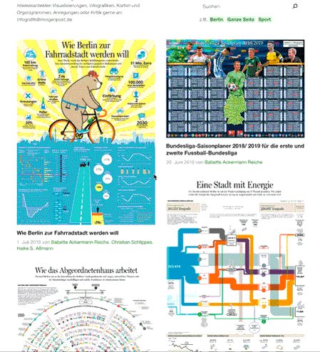
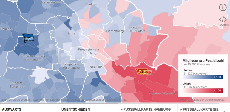
Berlin, Visualized
Berlin-based @morgenpost has created cool infographics about everything from drug routes, profits and addiction to the daily use of the German capital’s public transport.
Reimagining Hurricane Maps
Despite progress in predicting hurricanes, forecasters are still producing visualizations that are difficult to interpret. Researchers, including @univmiami‘s @albertocairo, and media organizations, including @nytimes and @washingtonpost, have been developing alternative methods of visualization to make it easier for the public to understand hurricane paths and threat levels. MIT’s @techreview artificial intelligence reporter @_KarenHao takes a look at the redesign efforts.
https://twitter.com/gmcdonne/status/1058503624446304256
America’s Growing News Deserts
Increasingly, communities around the US are left with no local newspaper outlets—in both rural and urban areas. A map visualizing this trend—created by @CJR last year using @openstreetmap and @CARTO—has made a comeback on social media.
Dataviz Tools Compared
Dataviz wiz @lisacrost created a bubble chart with 24 charting apps and libraries/frameworks, with reviews of new tools and updates for old ones. Check out her thoughts on Infogram, Flourish, Data Illustrator, Plotly, Google Sheets, Datawrapper (her employer), Tableau Public, RAW & Adobe Illustrator.
Fact Checkers Meet In Turkey
Turkey’s fact-checking organization @dogrulukpayicom hosted journalists from around the world in Antalya. More than 30 organizations from 17 countries met to learn, connect and collaborate, according to the event website. More information on #fcst18 is available here. (In Turkish)
R-Ladies Teach Mapping
A while back @d4tagirl mapped all the chapters of R-Ladies meet-up groups, using Twitter followers to estimate sizes and visualize growth. Helpfully, she included tutorials on fetching Twitter users with R, dealing with #plotly mapping, and plotting animated maps with #gganimate. No wonder it’s made a resurgence on social media.

Commuter Country
Germany media outlet @WDR mapped interactive local commuter data for North Rhine-Westphalia cities and municipalities, including stats on where the commuters are coming from. More people commute to Cologne (328,938) daily than any other city. Story here, in German.
https://twitter.com/uzlev/status/1056824745814097920
Thematic Mapping In 3 Steps
@medialab_ScPo’s Khartis #dataviz made a splash in Turkey when GIJN member @DagmedyaVeri promoted the free, open source tool designed to create thematic maps with a simple 3-step process. Here‘s the popular post (in Turkish).
Next Generation Network Analysis
Visual Network Analysis can simplify exploration of large relational datasets, but current VNA tools are complicated or fall short, according to @PublicDataLab. A new tool under development, miniVan, is being designed for users with minimum knowledge of mathematics or coding, and drawing upon existing open sources and research projects. A workshop looking at “networks and their publics” will inform the development of the tool, which is slated for release in early 2019.
Thanks, once again, to Marc Smith of Connected Action for gathering the links and graphing them.
 Kira Zalan is a location-independent freelance journalist, whose work has been published by PRI, Christian Science Monitor, US News & World Report, Atlas Obscura, GIJN, and others. She has reported on politics, policy, security, and money laundering — as well as fun topics such as food, travel and culture.

Basic Data Journalism Tips for Editors

My Favorite Tools: Venezuela’s Lisseth Boon on Design and Data Visualization

Document of the Day: Visual Vocabulary
Top Ten #ddj: The Week’s Most Popular Data Journalism Links

From Data to Storytelling: Concept and Design Tips from the Financial Times’ John Burn-Murdoch

Data Don’ts: Expert Tips to Avoid Misleading Audiences With Numbers

How The Pudding Used Data Visualizations to Recontextualize the Story of Climate Change

How Data Journalism Is Changing the Face of Africa

This work is licensed under a Creative Commons Attribution-NoDerivatives 4.0 International License
Republish our articles for free, online or in print, under a Creative Commons license.
Republish this article
This work is licensed under a Creative Commons Attribution-NoDerivatives 4.0 International License
Read Next
Data Journalism
From Data to Storytelling: Concept and Design Tips from the Financial Times’ John Burn-Murdoch
The chief data reporter for the Financial Times discusses how he considers the use of text, color, and annotation to aid visual storytelling through charts and graphics.
Data Journalism
Data Don’ts: Expert Tips to Avoid Misleading Audiences With Numbers
At a NICAR 2025 panel, data journalism experts discussed nuanced number errors that watchdog reporters often make that can confuse readers and disrupt story angles.
Climate Data Journalism
How The Pudding Used Data Visualizations to Recontextualize the Story of Climate Change
What does climate change feel like? How will your city’s climate shift, 50 years from now? Data scientist Derek Taylor explains his latest piece.
Africa Focus Data Journalism
How Data Journalism Is Changing the Face of Africa
Data journalism in Africa has made a powerful impact, from holding leaders accountable to refuting myths around domestic violence. But the field faces formidable challenges.