GIJN’s Data Journalism Top 10: Lying Maps, Foul Mouthed Moms and Geek Sauce
 What’s the global data journalism community tweeting about this week? Our NodeXL #ddj mapping from April 30 to May 6 finds @theboysmithy talking to @MarkMonmonier about the influence a cartographer can exert over a naive map reader, @OCCRP‘s data visualization platform to map complex crime networks and @PostGraphics‘ mapping of diversity in America’s neighborhoods.
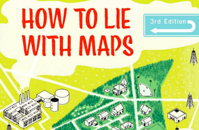
Even Good Maps Lie
Financial Times data visualization editor speaks to Mark Monmonier about the launch of the third edition of his book, How to Lie With Maps. In the book, Monmonier expresses concern about the general ability of readers to know what a good map looks like, and he attempts to introduce a healthy skepticism in the way people read and create maps.
How to lie with maps – https://t.co/EGHBAZ4jVv sarà da spunto per molti confronti con @aborruso @puntofisso e tutti gli amici a cui queste cose piacciono @twanto Una anteprima da @ft https://t.co/XO6GLfKXXH pic.twitter.com/TnGGKecCm5
— Maurizio Napolitano (@napo) May 2, 2018
Visualization for Investigations
VIS is a data visualization platform designed to assist investigative journalists, activists and others in mapping complex business or crime networks.
Can you help us visualise data in investigations? For the next generation of OCCRP’s VIS (https://t.co/TMBDzOc9yR) we’re looking for JavaScript visualisation nerds. #dataviz #ddj #d3 #networks Please RT, DMs are open.
— Friedrich Lindenberg (@pudo) May 2, 2018
Mapping Diversity
America is more racially and ethnically diverse than ever but segregation remains persistent. In The Washington Post’s visualization of the level of diversity in American cities, you can check out the racial makeup of your neighbohood by clicking “Jump to explore your city.”
Wow
Stunning, complex, insightful interactive visual analysis of racial diversity and segregation in America and its cities
– by @aboutaaron in @washingtonpost
https://t.co/0VjonidIpY
HT @incognitosum pic.twitter.com/snwnEiZGox— Ross Dawson (@rossdawson) May 3, 2018
Driving Subscriptions with Foul-Mouthed Moms
The Economist has a 22-year history of creating charts online and 90 years in print, but it only started focusing on creating charts for social media at the end of 2017. Digiday takes a look at how the 12-person data team have been tweaking their charts and sharing engaging charts, like a recent one on foul-mouthed mothers, to drive subscriptions.
“Data journalism is important to us, and it’s getting more prevalent in general, driven by better and quicker access to data.” @Digiday takes a peek behind the curtain at @TheEconomist‘s 12-person #data #journalism team https://t.co/DbcURxzCxX @AlexSelbyB #martech
— MarTechExec (@MarTechExec) May 6, 2018
Analyzing Kenya’s Water Woes
Purity Mukami crunches the numbers behind the rainfall and surface runoff during Kenya’s rainy season — and discovers it adds up to a lot. She opines that building sustainable water harvesting systems to utilize the deluge of rainwater could be the answer to Kenya’s water problems.
Nairobians and Mombasa city dwellers will access one tenth of their water requirement. Simply put; if you will need 100 litres a day, you will only be able to access 10 litres via @AfUncensoredhttps://t.co/9LwyPDYi6C
— doing my best (@indeadline) April 30, 2018
Madeira: The EU-Approved Tax Haven
Rbb24 interviews Ulrike Köppen, the head of the BR Data team, about its investigation into Madeira — a tax haven approved by the European Commission (in German).
Durfte dem #RBBtalklab bei der #rp18 was zu investigativem #ddj bei @br_data erzählen https://t.co/ktc1yEQZLo – Danke @cluychaz @monoxyd fürs Fragen!
— uli koeppen (@zehnzehen) May 4, 2018
Economics and Data Literacy
Quaid-i-Azam University’s Dr Zahid Asghar discusses how opposing points of views on economic numbers can both be valid and correct. He thinks there is lack of understanding that both “better” and “bad” can co-exist and suggested that data journalists help society and policy makers to better understand the numbers through data literacy.
#Numbers are very important but you can’t just tell a story with numbers. Explains @Zahedasghar #ddj #datajournalism https://t.co/ntTYRWzXh9 pic.twitter.com/hoTzYSjaFX
— Data Stories (@datastoriespk1) May 4, 2018
Peace in Colombia Platform
Last week, ICFJ Knight Fellow Fabiola Torres’ and Rutas del Conflicto’s investigation platform into Colombia’s peace efforts made the Top 10 #ddj. This week, Torres’ explanatory piece on how they put the project together made the cut.
Reporters behind #PazEnElTerreno – or “Peace in the Field” – help break through “the fog” of peace using data. Check out their #ddj project helping inform Colombians about their country’s peace process. https://t.co/kiAJMFvBzp @fabiolatorres @rutasconflicto @eecolombia2020 pic.twitter.com/u04VukCTrL
— ICFJ (@ICFJ) April 30, 2018
Google Data Studio Course
Learn how to build dashboards and reports in Google Data Studio with Benjamin Mangold from Loves Data, a digital analytics and online advertising agency, using Google Analytics and Google Sheets. The course costs USD$89.
Our popular Google Data Studio online course makes reporting easier with greater impact and better results https://t.co/iioLPyAtO9 #dataviz pic.twitter.com/9tVXI9L9fN
— Loves Data (@LovesData) April 30, 2018
And Now for Some Geek Sauce
In his own words, technologist Giuseppe Sollazzo’s newsletter offers “Data. Data visualization. Data Journalism. Open Data. Design. Code. Literature. Films. Music. Books. Language. Everything else. In a geeky sauce.” Subscribe if you’d like.
Trying a slightly different format for my #newsletter today. I hope you’ll like it.https://t.co/1DSNfMTKQA#ddj #OpenData #Datavisualization pic.twitter.com/qzelxSoX3d
— (((Giuseppe Sollazzo))) (@puntofisso) May 1, 2018
Thanks, once again, to Marc Smith of Connected Action for gathering the links and graphing them.
 Eunice Au is GIJN’s program coordinator. Previously, she was a Malaysia correspondent for Singapore’s The Straits Times, and a journalist at the New Straits Times. She has also written for The Sun, Malaysian Today and Madam Chair.
For a look at Marc Smith’s mapping on #ddj on Twitter, check out this map.


Basic Data Journalism Tips for Editors

My Favorite Tools: Venezuela’s Lisseth Boon on Design and Data Visualization

Document of the Day: Visual Vocabulary

Three “Musts” for Today’s Investigative Journalist

From Data to Storytelling: Concept and Design Tips from the Financial Times’ John Burn-Murdoch

Data Don’ts: Expert Tips to Avoid Misleading Audiences With Numbers

How The Pudding Used Data Visualizations to Recontextualize the Story of Climate Change

‘A Quest for Evidence’: What Drew Leading Women Data Journalists to the Field

This work is licensed under a Creative Commons Attribution-NoDerivatives 4.0 International License
Republish our articles for free, online or in print, under a Creative Commons license.
Republish this article
This work is licensed under a Creative Commons Attribution-NoDerivatives 4.0 International License
Read Next
Data Journalism
From Data to Storytelling: Concept and Design Tips from the Financial Times’ John Burn-Murdoch
The chief data reporter for the Financial Times discusses how he considers the use of text, color, and annotation to aid visual storytelling through charts and graphics.
Data Journalism
Data Don’ts: Expert Tips to Avoid Misleading Audiences With Numbers
At a NICAR 2025 panel, data journalism experts discussed nuanced number errors that watchdog reporters often make that can confuse readers and disrupt story angles.
Climate Data Journalism
How The Pudding Used Data Visualizations to Recontextualize the Story of Climate Change
What does climate change feel like? How will your city’s climate shift, 50 years from now? Data scientist Derek Taylor explains his latest piece.
Data Journalism News & Analysis
‘A Quest for Evidence’: What Drew Leading Women Data Journalists to the Field
For International Women’s Day we spoke to data journalists from Argentina, Kenya, Sweden, and Turkey to find out why they chose this path and what challenges still remain.