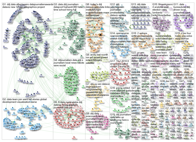
This Week’s Top 10 in Data Journalism
 What’s the global data journalism community tweeting about this week? Our NodeXL #ddj mapping from March 12 to 18 finds disturbing news from @NASAEarth about low Arctic sea ice and temperature anomalies in the North Pole, @seeingtheory ‘s redesigned educational website on probability and statistics and top ten ways to clean your data by @Microsoft.
Warming Earth, Melting Ice
NASA’s Earth Observatory site shows the Arctic sea ice concentration in February 2018, which was the lowest of any February on record. It also visualized air temperature anomalies. At times, the North Pole saw temperatures climb above freezing, soaring 20 to 30 degrees Celsius (36 to 54 degrees Fahrenheit) above the norm.
Arctic Ocean looks more like the Red Sea. Check out these maps of statistical hot spots. https://t.co/ZvEPmIQ7qQ
— First Base Solutions (@FirstBaseSol) March 17, 2018
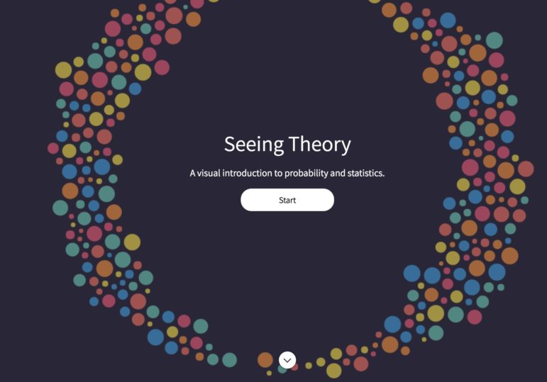
Seeing Theory
Seeing Theory was created by Daniel Kunin while an undergraduate at Brown University. This educational website teaches the fundamental concepts of statistics through use of interactive visualizations.
A beautiful, visual statistics textbook: “Seeing Theory – A visual introduction to probability and statistics.”https://t.co/JoSw4LznVM
I shared this a year ago, when it was already very cool.
But the page now got a major upgrade by the authors and is now just incredibly cool!— Max Roser (@MaxCRoser) March 15, 2018
Clean Your Data
Misspelled words, stubborn trailing spaces, unwanted prefixes, improper cases and nonprinting characters are just some of the ways your data can get dirty. Here are top ten ways to clean it up.
Veri Gazetecileri için Verileri Temizlemenin On Yolu #dağınıkveri #messydata #ddj #vg https://t.co/sbxxobAK2L pic.twitter.com/LR2ZQbkIok
— Veri Gazeteciliği Platformu (@DagmedyaVeri) March 15, 2018
Challenging Fines
BBC News found that in the past five years, almost half of the drivers who challenged parking and bus lane fines issued by UK authorities were successful, figures obtained by the BBC suggest. The story was based on figures released under the Freedom of Information Act.
Data available for this story at https://t.co/XkPYZ70eeM #ddj https://t.co/BOT5kHYdKs
— Paul Bradshaw (@paulbradshaw) March 15, 2018
Data Analysis with R
A step-by-step tutorial by Peter Aldhous at NICAR18 on analyzing data with R.
Step-by-step tutorial on analyzing opioid prescription data with R, by Buzzfeed’s @paldhous https://t.co/WzseKfC2tk#NICAR18 #rstats #ddj pic.twitter.com/LNDhl3Kk9x
— Sharon Machlis (@sharon000) March 12, 2018
Data Journalism Awards
The Global Editors Network Data Journalism Awards website displays an impressive list of past winners for data visualization of the year, investigation of the year, best team portfolio and many more. Take a shot at joining this cohort by submitting your entry by March 26.
Have your name featured on this page: https://t.co/nVoHHjs73F
➡ Submit your #ddj project today to this year’s edition of the #DataJournalismAwards, and you may join @WSJ, @RutasConflicto, @morgenpost, or @ProPublica on the list of former winners.
⚠ Deadline: 26 March 2018! pic.twitter.com/qR15JYV9Kh— Global Editors Network (@GENinnovate) March 19, 2018
Data Journalism Studio
University College Dublin recently launched its UCD Data Journalism website, a studio run by students and participants of the UCD Data Journalism programme. It already lists data-driven investigations into healthcare, domestic violence and tax defaulters.
Our Data Journalism Studio website was launched recently, and is evolving fast. Check it out here: https://t.co/zTfAxMhel0, and stay tuned for more #DataJournalism from @datanewslab @UCD_iSchool. #ddj pic.twitter.com/0Tf8cNNchx
— Bahareh Heravi (@Bahareh360) March 14, 2018
Robot Journalism
Journalist Alexander Fanta discusses the impact of automation on journalism and the need for a new level of scrutiny in holding robot journalism to account.
A great example highlighted by @FantaAlexx is an AI-generated story based on government birth statistics. Read the story here: https://t.co/QZ2AaL5h2E pic.twitter.com/3aYGcQOcbU
— Bob Berwyn (@bberwyn) March 19, 2018
Data Journalism Today
Google News Lab partnered with Policy Viz to conduct a series of interviews and an online survey to better understand the state of data journalism today and the challenges moving forward. The study involved 56 in-depth interviews in the US, UK, France and Germany as well as a large-scale survey of over 900 newsrooms in those four countries.
Descarga “Data Journalism in 2017” https://t.co/1RC8lBpzfC #ddj #periodismodedatos pic.twitter.com/Mi6UMjB8bY
— Gerardo Albarrán de Alba (@saladeprensa) March 14, 2018
Gender Pay Gap in Africa
GenderGap.AFRICA is a tool designed by Code for Africa to help users calculate the gender pay gap in any African country. The tool uses estimated earned income data from the World Economic Forum’s Global Gender Gap Report 2017.
#Gender is not a qualification for pay, stop the disparity in pay with gender see how deeply this has eaten into #Nigeria and #Africa at Large. https://t.co/ohJl0D83pq #gendergap #WinifredOyoIta #data source- #wef17 pic.twitter.com/WMny86IkWe
— Code for Nigeria (@CodeForNigeria_) March 14, 2018
Thanks, once again, to Marc Smith of Connected Action for gathering the links and graphing them.
For a look at Marc Smith’s mapping on #ddj on Twitter, check out this map.

Step-By-Step Guide for Journalists on the Basics of Google Sheets

GIJC23 – When the Data Aren’t There: Building Your Own Datasets

Basic Data Journalism Tips for Editors

My Favorite Tools: Venezuela’s Lisseth Boon on Design and Data Visualization

From Data to Storytelling: Concept and Design Tips from the Financial Times’ John Burn-Murdoch

Tracking US Migrant Detention Data: What Journalists Need to Understand

Data Don’ts: Expert Tips to Avoid Misleading Audiences With Numbers

How The Pudding Used Data Visualizations to Recontextualize the Story of Climate Change

This work is licensed under a Creative Commons Attribution-NoDerivatives 4.0 International License
Republish our articles for free, online or in print, under a Creative Commons license.
Republish this article
This work is licensed under a Creative Commons Attribution-NoDerivatives 4.0 International License
Read Next
Data Journalism
From Data to Storytelling: Concept and Design Tips from the Financial Times’ John Burn-Murdoch
The chief data reporter for the Financial Times discusses how he considers the use of text, color, and annotation to aid visual storytelling through charts and graphics.
Data Journalism News & Analysis
Tracking US Migrant Detention Data: What Journalists Need to Understand
The US government’s detained immigrant population flatlined in April, but there’s more to the numbers than meets the eye. Here’s what journalists need to know about the data.
Data Journalism
Data Don’ts: Expert Tips to Avoid Misleading Audiences With Numbers
At a NICAR 2025 panel, data journalism experts discussed nuanced number errors that watchdog reporters often make that can confuse readers and disrupt story angles.
Climate Data Journalism
How The Pudding Used Data Visualizations to Recontextualize the Story of Climate Change
What does climate change feel like? How will your city’s climate shift, 50 years from now? Data scientist Derek Taylor explains his latest piece.