
This Week’s Top 10 in Data Journalism
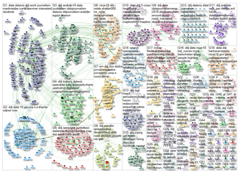
 What’s the global data journalism community tweeting about this week? Our NodeXL #ddj mapping from March 5 to 11 finds everyone keenly sharing data tipsheets from @IRE_NICAR‘s NICAR18 conference, @texifter discussing how to identify bots versus humans online, and @EdjNet talking to @culukaya about the shocking rates of femicide in Turkey.
NICAR18 Data Tipsheets
Missed out on the NICAR18 conference? This one’s the mother of all data journalism conferences and is worth checking out. Investigative Reporters and Editors is collecting session materials from panels, demos and hands-on classes all on one page — a data geek’s paradise.
If you missed the best of data journalism #NICAR18 last week in Chicago, just bookmark these two pages: @MacDiva‘s slides & tutorials https://t.co/w5Zavlgh8w and @IRE_NICAR‘s tipsheets & links https://t.co/QrKTYfAziu Enjoy! pic.twitter.com/BX16WpJrJw
— Djordje Padejski (@djordjepadejski) March 12, 2018
Bots or Humans?
In this second part of a three-part series, the Texifter team discusses their findings on how to distinguish between bots and humans. For example, humans and bots tend to use emojis, hashtags, images and rhetorical devices like humor and sarcasm differently.
Shocking Numbers: Femicide in Turkey
Journalist Ceyda Ulukaya talks to the European Data Journalism Network about her project mapping femicides in Turkey. The project, a finalist for the 2016 Data Journalism Awards, covers the period between 2010 and 2017, in which at least 1,964 women were killed. It even details the relationship victims had with their murderers, the “pretext” of the murder and the outcome for the murderer.
Mapping femicides in #Turkey is no easy task. Thanks to @culukaya now we have data about it https://t.co/2QEpAYS5pR #ddj pic.twitter.com/lWtrTn3Gld
— European Data Journalism Network (@EdjNet) March 9, 2018
Gender Pay Gap in Africa
GenderGap.AFRICA is a tool designed by Code for Africa to help users calculate the gender pay gap in any African country. The tool uses estimated earned income data from the World Economic Forum’s Global Gender Gap Report 2017.
Thrilled to see https://t.co/9RietpxYZ5 – Code for Africa’s @wef-based pay gap calculator for African audiences – being embedded on https://t.co/iW4F4pK2YQ https://t.co/uBpuhtHvhB #IWD2018 #InternationalWomensDay #PressforProgress| Read the full report on https://t.co/eUY0oS8eO5 pic.twitter.com/hA5p4RqO82
— Jacopo Ottaviani (@JacopoOttaviani) March 9, 2018
Mental Healthcare Failures in UK
A Guardian investigation revealed that at least 271 highly vulnerable mental health patients died between 2012 and 2017 after 706 failings by health bodies in the UK.
Hundreds of deaths have occurred as a result of #mentalhealth care failings. At least 271 people in acute hospitals, mental health trusts and #ambulance services have died. What do you think needs to change in mental healthcare to prevent these deaths? https://t.co/pCkRTjd5zS
— Paramedic Practice (@Para_Practice) March 6, 2018
Ride with German Commuters
Spiegel Online created this beautiful interactive commuter map of Germany. It tells you where commuters are going, how many fellow commuters take the same crazy long route you take to work and the most important shuttle destinations from a certain town.
There are more than 10.000 versions of our newest @SPIEGEL_Data story on commuting in Germany. Loads of dynamic text, maps and graphics. #ddjhttps://t.co/qEpRls2PNK pic.twitter.com/loyhXXhgb0
— Patrick Stotz (@PatrickStotz) March 8, 2018
2018 Data Journalism Awards
The Data Journalism Awards competition celebrates outstanding work in the field of data journalism worldwide. Did you work on an exceptional data project between April 10, 2017 and March 26, 2018? Submit your entry!
✨⌛D -17 til the #datajournalismawards 2018 deadline. ? Calling all #ddj teams around the world to submit their best #datajournalism projects of the past year.? Direct link to apply: https://t.co/MsKz2X5W05 #NICAR18 pic.twitter.com/jluG1OxTAD
— Marianne Bouchart (@Maid_Marianne) March 9, 2018
Newsroom Skills Survey Data
Explore the International Center For Journalists’ global survey data on newsroom technology. Filter the data by region, newsroom, position and more, and use the data to inform new strategies and research.
Our global survey reached across 8 regions of the world. What did we find? Explore the new interactive data platform – built by @googlenewslab @albertocairo & @polygraphing – that uses our data. https://t.co/75A8ot1YhA #dataviz #ICFJtechsurvey pic.twitter.com/IxOjDecPcS
— ICFJ (@ICFJ) March 6, 2018
Mapping with Mapbox
Here are five examples of mapping and data visualization using Mapbox, by Parallel, a company of design-led web application developers specializing in mapping and data visualization for clients within the UK healthcare sector. Their data explorations include a heatmap, flood risk planning and an atmospheric emissions inventory.
Love at first sight, “5 data visualizations from Parallel” by @Mapbox https://t.co/uYDsJBg4yk
— Erin Quinn (@EqMapbox) March 6, 2018
Small Team, Big Impact
Turns out you don’t need a big newsroom to do award-winning data journalism. Mediashift interviews the heads of data teams from Berliner Morgenpost, Dossier and The Bureau Local and found that small newsrooms can often adapt to change faster and has more permeability between departments.
El mejor periodismo de datos lo hacen las redacciones pequeñas, según explica aquí @MediaShiftOrg https://t.co/T7P6pfZB86 vía @saladeprensa
— José Luis Rojas (@rojastorrijos) March 11, 2018
Thanks, once again, to Marc Smith of Connected Action for gathering the links and graphing them.
For a look at Marc Smith’s mapping on #ddj on Twitter, check out this map.

Basic Data Journalism Tips for Editors

My Favorite Tools: Venezuela’s Lisseth Boon on Design and Data Visualization

Document of the Day: Visual Vocabulary
How To Create a Data Journalism Team

From Data to Storytelling: Concept and Design Tips from the Financial Times’ John Burn-Murdoch

Data Don’ts: Expert Tips to Avoid Misleading Audiences With Numbers

How The Pudding Used Data Visualizations to Recontextualize the Story of Climate Change

How Data Journalism Is Changing the Face of Africa

This work is licensed under a Creative Commons Attribution-NoDerivatives 4.0 International License
Republish our articles for free, online or in print, under a Creative Commons license.
Republish this article
This work is licensed under a Creative Commons Attribution-NoDerivatives 4.0 International License
Read Next
Data Journalism
From Data to Storytelling: Concept and Design Tips from the Financial Times’ John Burn-Murdoch
The chief data reporter for the Financial Times discusses how he considers the use of text, color, and annotation to aid visual storytelling through charts and graphics.
Data Journalism
Data Don’ts: Expert Tips to Avoid Misleading Audiences With Numbers
At a NICAR 2025 panel, data journalism experts discussed nuanced number errors that watchdog reporters often make that can confuse readers and disrupt story angles.
Climate Data Journalism
How The Pudding Used Data Visualizations to Recontextualize the Story of Climate Change
What does climate change feel like? How will your city’s climate shift, 50 years from now? Data scientist Derek Taylor explains his latest piece.
Africa Focus Data Journalism
How Data Journalism Is Changing the Face of Africa
Data journalism in Africa has made a powerful impact, from holding leaders accountable to refuting myths around domestic violence. But the field faces formidable challenges.