
Feast Your Eyes on 15 Stunning DataViz


 We’re drowning in data. Everyday, 2.5 quintillion bytes of data are created. This is the equivalent of 90 percent of the world’s information — created in the last two years alone. Now this is what we call “big data.”
But where does it come from? Everywhere, from sensors and social media sites to digital images and videos. We have more data than we know what to do with, so it’s time now to organize and make sense of it all.
This is where data visualization comes into the picture. In the seismic shift awaiting us, referred to by some as the Industrial Revolution of Data, we have to get better and more efficient at creating innovative data visualization that make the complex easy to understand.
In the hopes of inspiring your own work, we’ve compiled 15 data visualizations that will not only blow your mind, they will also give you a clearer understanding of what makes a good visualization–and what makes a bad one.
1. It Is Interactive
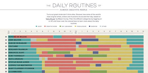
The interactive piece “The Daily Routines of Famous Creative People” is a perfect example of a data visualization that combines all the necessary ingredients of an effective and engaging piece: It combines reams of data into a single page; it uses color to easily distinguish trends; it allows the viewer to get a global sense of the data; it engages users by allowing them to interact with the piece; and it is surprisingly simple to understand in a single glance.
2. It Reveals Trends
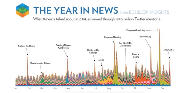
“The Year in News” is a good example of how an expertly executed data visualization can reveal patterns and trends hiding beneath the surface of mountains of data. By analyzing 184.5 million Twitter mentions, Echelon Insights was able to provide a bird’s eye view of what America was talking about in 2014.
3. It Uses Animation
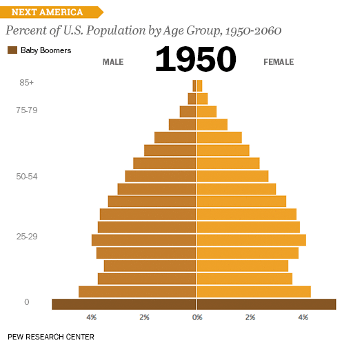
This US age pyramid created by the Pew Research Center is a noteworthy example of how shifts and trends over time can be effectively communicated through the use of well-executed animation. Not only does this type of data visualization pack a whole lot of information into a single visual — 23 bar charts were combined into a single GIF composite — it can be easily shared on social media and embedded anywhere.
4. It Uses Real Images

With so many data visualizations out there nowadays, it can be hard to find a unique angle that hasn’t been explored already. Not the case, though, with this wonderfully imaginative series of infographics created by designer Marion Luttenberger.
Using real-life images as the basis of his infographics, Luttenberger was able to craft an entire annual report for an organization that provides aid to drug addicts in Austria — and still communicate the organization’s mission clearly and effectively.
5. It Uses Metaphors
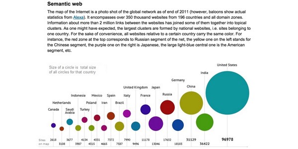
An effective way to communicate complex ideas is by using symbols and metaphors. Take, for example, this ambitious data visualization of the Internet created by Ruslan Enikeev. By using the metaphor of planets in a solar system, Enikeev is able to create a “Map of the Internet” that helps users visualize the relative reach and influence of every site out there. The amount of website traffic, for example, is represented by the size of the circle on the map.
6. It Puts Data into Context
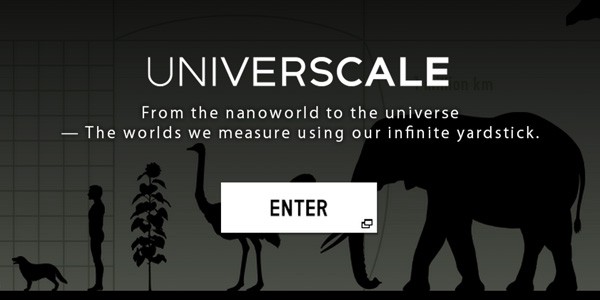
One of the great strengths of data visualizations is their unsurpassed ability to put isolated pieces of information into a bigger context. The goal of this insightful interactive piece by Nikon is to give users a sense of the size of objects, both big and small, by using comparisons. Next to the Milky way, for example, a common object such as a ball or a car seem smaller than we ever imagined.
7. It Saves You Time
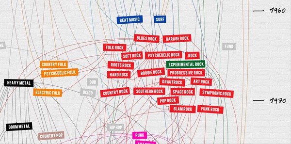
Another hallmark of an effective data visualization is its ability to summarize a ton of information and, in the process, save you time and effort. This data visualization, for instance, represents 100 years of the evolution of rock in a single page. Not only does it simplify information for you — condensing a century’s worth of information into a piece that can be viewed in less than a minute — it also provides actual audio samples for each genre, from electronic blues to dark metal.
8. It Gives You Perspective
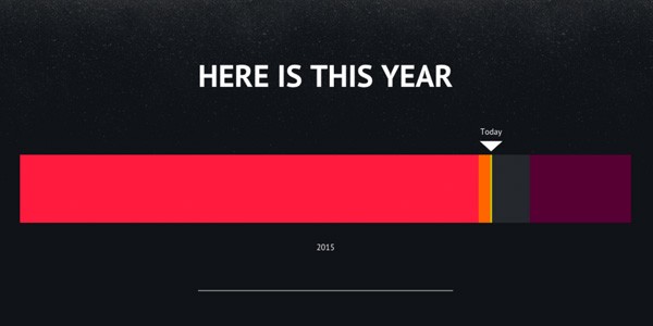
As humans, we cannot help but see the universe and life from our own self-centered and completely unique point-of-view. This data visualization, however, gives us some perspective on our own lives — and the events of the current day — by placing them in the larger context of time, from the current year to the current millennium.
9. It Explains a Process
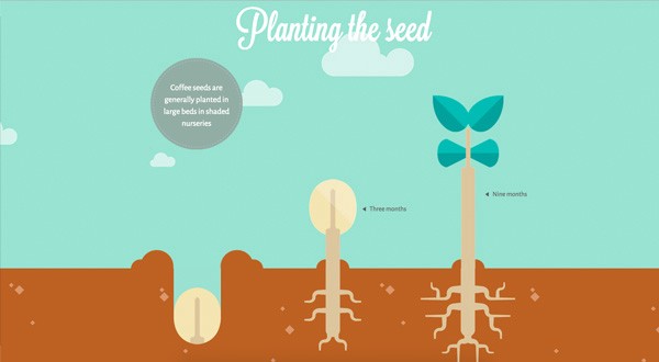
In line with the objective of making the complex easy to understand, this infographic provides a visual representation of a coffee bean’s journey, from bean to cup. By breaking the process down into parts, this data visualization does its job of giving the reader bite-sized pieces of information that are easily digestible.
10. It Stimulates the User’s Imagination
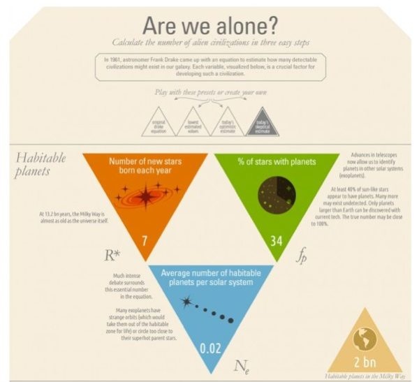
A good infographic will not only do the hard work of digesting complex data, it may also stimulate readers’ imagination by allowing them to conjure up different hypothetical situations and possibilities, as is done in this example. By presenting an interactive, game-like experience, this infographic quickly engages the user and keeps them interested from beginning to end.
11. It Presents Data Beautifully
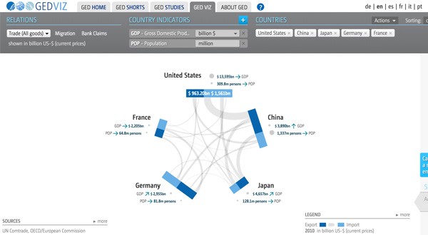
This infographic takes dense material, such as indicators and figures, and presents it in a beautiful, clean and captivating format. Not only is the design deceptively simple and functional, it also provides the user with many options for interacting with the graphic, such as adding countries, indicators and type of relation.
12. It Tells a Story
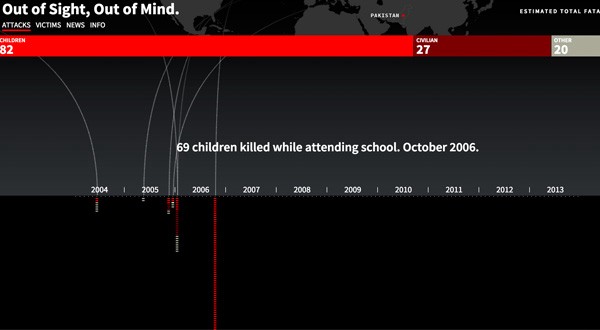
An effective data visualization not only conveys information in a convincing manner, it also narrates a story worth telling. This piece, for example, tells the story of every known drone strike and victim in Pakistan. By distilling information into an easily understandable visual format, this infographic dramatically brings to light disturbing facts that should not go unnoticed.
13. It Provides Access to Raw Data
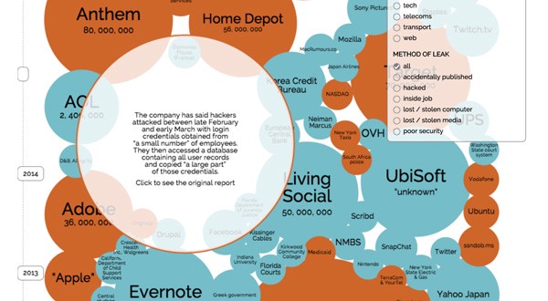
This data visualization not only has all of the previous qualities mentioned, it also allows the user to have direct access to all the original raw data (view link on bottom right corner). Also, by using bubbles shaped in accordance with the size of the data breach, the viewer can get a solid overview of the data breach “landscape.” And if viewers want to get into the details of the information, they can also go as deep or as superficially as they want by navigating the different filters and raw data.
14. It Empowers the User
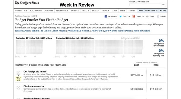
In line with the global trend of democratizing access to information and empowering users, this data visualization does an excellent job of demystifying the process of balancing the national budget. By placing budget balancing in the hands of everyday users, this project taps into the power of collective thinking to solve big problems.
15. It Is Educational
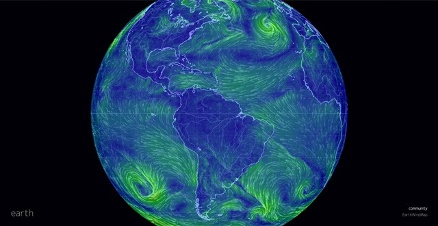
This piece goes beyond a common data visualization to become an educational and interactive minisite. By combining enough data and information to fill an encyclopedia into a single interactive application, this data visualization becomes a useful classroom tool for students learning about wind, ocean and weather conditions.
Your Turn
Interactive data visualizations are unique in that they appeal to several of the five senses: to the sense of hearing through audio, the sense of sight through stunning visuals and the sense of touch through the interactive experience of clicking, hovering and scrolling through content.
While you may think that data visualizations are too costly and time consuming to produce on your own, you can explore several free tools out there that allow non-designers and non-programmers to create their own interactive content.
Visme, for example, is an online tool that allows you to create interactive charts, graphs and maps. You can try it for free here.
 The original version of this post first appeared on Visme’s Visual Learning Center and is cross-posted with permission.
Payman Taei is an entrepreneur and designer. He founded Visme and HindSite Interactive.

This work is licensed under a Creative Commons Attribution-NoDerivatives 4.0 International License
Republish our articles for free, online or in print, under a Creative Commons license.
Republish this article
This work is licensed under a Creative Commons Attribution-NoDerivatives 4.0 International License
Read Next

Data Journalism News & Analysis
Tracking US Migrant Detention Data: What Journalists Need to Understand
The US government’s detained immigrant population flatlined in April, but there’s more to the numbers than meets the eye. Here’s what journalists need to know about the data.

Data Journalism Reporting Tools & Tips
Best Practices for Working With Mass Shootings Data
There can be confusion among journalists about “mass shootings” data, which leads to wildly different numbers and deeper confusion among audiences.

Case Studies Data Journalism GIJC23
Data-Driven Journalism: Roundup of Recent Standout Stories
The best of modern data journalism tells powerful stories that test assumptions. At GIJC23, two experts discussed strong recent investigations and what makes them stand out.
Data Journalism GIJC23
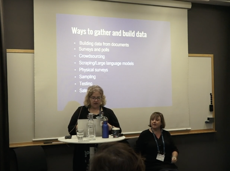
Expert Tips for Journalists on Building Your Own Datasets
What do you do when you don’t get the dataset you need from authorities, or it doesn’t exist? Two experts provided tips at GIJC23.