Accessibility Settings

color options

monochrome muted color dark

reading tools

isolation ruler

Tag

health reporting

36 posts

Data Journalism

Data Journalism Top 10: COVID-19 Data Viz, Brazil President’s Tweets, Beach Erosion, India’s Influencers, London by Bike, Syllabi

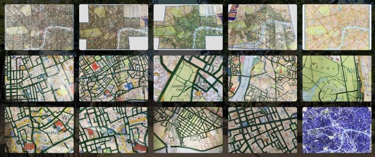
What’s the global data journalism community tweeting about this week? Our NodeXL #ddj mapping from March 2 to 8 finds a list of COVID-19 related data visualizations selected by health activist Joel Selanikio, Folha De S. Paulo analyzing Brazilian President Jair Bolsonaro’s tweets, VoxEurop highlighting the potential disappearance of the world’s beaches due to climate change, and Davis Vilums mapping every central London street over four years by cycling.

News & Analysis

What Investigative Reporters Around the World Need to Be Asking About COVID-19

As coronavirus spreads globally, investigative journalists around the world are working to hold powers to account as they respond to the crisis. Veteran health journalist and expert on infectious disease and global health security, Thomas Abraham talks to GIJN about the questions investigative reporters need to ask in a rapidly changing environment. 

Data Journalism

GIJN’s Data Journalism Top 10: Coronavirus Outbreak, Misleading Graphs, Smartphone Tracking, Trash Can Banging, Mexico Murders

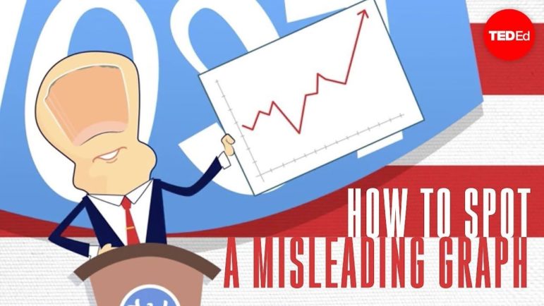
What’s the global data journalism community tweeting about this week? Our NodeXL #ddj mapping from January 27 to February 2 finds The New York Times and Der Tagesspiegel tracking the spread of the Wuhan coronavirus, TED-Ed educating viewers about how graphs can be manipulated to mislead readers, and a baseball fan watching every Houston Astros home game in 2017 to log each time they banged a trash can as part of a sign-stealing scandal.

Data Journalism

GIJN’s Data Journalism Top 10: Mapping Coronavirus, Saving the Nile, Protests in Hungary, Annotating Visualizations

What’s the global data journalism community tweeting about this week? Our NodeXL #ddj mapping from January 20 to 26 finds the Johns Hopkins Center for Systems Science and Engineering mapping the Wuhan coronavirus outbreak, Al Jazeera analyzing the impact that Ethiopia’s mega-dam project will have on the Nile river and its surroundings, Der Tagesspiegel outlining the changes in America over the course of Donald Trump’s presidency, and Alberto Cairo highlighting the importance of annotating data visualizations.

Data Journalism

GIJN’s Data Journalism Top 10: Your Health Data for Sale, Music & Politics, Predictive Journalism, AI Accountability, Data Women

What’s the global data journalism community tweeting about this week? Our NodeXL #ddj mapping from November 11 to 17 finds an investigation by The Financial Times uncovering how private health information is being traded online by health sites to big advertisers, The Economist looking at the correlation between Americans’ music preferences and political leanings, The Bureau of Investigative Journalism investigating the government’s algorithmic decision-making, and the data community coming together to highlight excellent female data journalists.

Data Journalism

GIJN’s Data Journalism Top 10: Hong Kong Protests, Migration Waves, Democratizing Dataviz

What’s the global data journalism community tweeting about this week? Our NodeXL #ddj mapping from July 22 to 28 finds The New York Times analyzing the catalyst behind Hong Kong’s recent protests, National Geographic visualizing human migration in the past 50 years, Ellery Studio’s fun and informative renewable energy coloring book, and The Economist’s findings that Hillary Clinton could have won the 2016 US election if all Americans had turned up to vote.

Data Journalism Reporting Tools & Tips

Six Lessons From Reporting “Heartbroken”

Every investigative journalist encounters moments of doubt. Neil Bedi, an investigative reporter at the Tampa Bay Times, shares the set of rules his team followed to survive the toughest reporting challenges while reporting their Pulitzer-nominated series “Heartbroken.”

Data Journalism

GIJN’s Data Journalism Top 10: Lying Charts, Flu Tracker, Soaring Alcohol Costs, Taxing Football

What’s the global data journalism community tweeting about this week? Our NodeXL #ddj mapping from February 25 to March 3 finds a @nytimes profile of its much admired data editor @amandacox; a flu tracker by @morgenpost; and a double dose of skepticism in @amandabee’s roundup of bad data interpretations and @albertocairo’s “How Charts Lie” book.

Data Journalism

GIJN’s Data Journalism Top 10: FT’s Chart Quiz, 65 Years of Human Rights Data, Build a Brexit Voter

What’s the global data journalism community tweeting about this week? Our NodeXL #ddj mapping from February 18 to 24 finds a fun @FinancialTimes quiz that tests your ability to read charts, the creation of a @DataVizSociety to foster engagement in the data visualization community and data viz designer @fedfragapane’s analysis of Human Rights Protection data from 1950 to 2014.

Reporting Tools & Tips

Where Do ProPublica’s Investigative Reporters Find Their Story Ideas?

A reader asked ProPublica Illinois how the media organization finds new story ideas. Reporter Jodi S. Cohen, who was just as curious as the reader, spoke to her colleagues to find out where they got their inspiration. From fleshing out ideas found in other colleagues’ stories to digging into data anomalies, and even paying extra attention to an idle truck parked at an abandoned gas station, their answers show that there are a myriad of ways in which inspiration for your next big story could strike.