Top Ten #ddj: The Week’s Most Popular Data Journalism Links
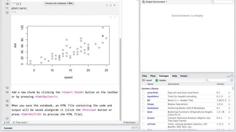
 What’s the data-driven journalism crowd tweeting? Here are top links for Oct 17-22: challenging dataviz assumptions (@eagereyes); Clinton/Trump facial analysis (@TheEconomist); R & RStudio (@mjfrigaard); pharma money (@srfdata); code database (@srfdata); German lobbyists (@tagesspiegel); & more.
<!–
–>

2025 Conference Resources
Guide to Investigating Food Insecurity

Open Source Guide to Investigating Chinese Companies

Reporter’s Guide to Detecting AI-Generated Content

My Favorite Tools: Indian Journalist and Data Designer Gurman Bhatia
My Favorite Tools: Alberto Cairo on Data Visualization
Data Journalism Top 10: Pace of Global COVID-19 Deaths, Who Can Work from Home, Visualizations for the Colorblind, Skin Tone and Sports
Data Journalism Top 10: Social Distancing, Coronavirus Clusters, Flattening the Curve, Trump Cherry-Picks Data

This work is licensed under a Creative Commons Attribution-NoDerivatives 4.0 International License
Republish our articles for free, online or in print, under a Creative Commons license.
Republish this article
This work is licensed under a Creative Commons Attribution-NoDerivatives 4.0 International License
Read Next
Data Journalism My Favorite Tools
My Favorite Tools: Indian Journalist and Data Designer Gurman Bhatia
For GIJN’s My Favourite Tools series, we spoke with Indian journalist and information designer Gurman Bhatia. She has worked at the Hindustan Times in Delhi and been a part of the award-winning team at Reuters Graphics, where she worked on visualizations for topics as diverse as election fraud in India, use of force during protests in Hong Kong, and bushfires in Australia.
Data Journalism My Favorite Tools
My Favorite Tools: Alberto Cairo on Data Visualization
For our series on journalists’ favorite tools, we spoke to Alberto Cairo, head of visualization at the University of Miami’s Institute for Data Science and Computing. Cairo shared several user-friendly tools and core principles to help investigative reporters shape their data visually to create new insights for audiences.
Data Journalism
Data Journalism Top 10: Pace of Global COVID-19 Deaths, Who Can Work from Home, Visualizations for the Colorblind, Skin Tone and Sports
It is hard to comprehend the true impact of COVID-19 around the world. Our NodeXL #ddj mapping from June 29 to July 5 finds Reuters trying to visualize the alarming rate of deaths related to the coronavirus pandemic, Datawrapper examining which employees can actually afford to work from home, and data journalist Carmen Aguilar García writing about using R programming language and automating repetitive data processes in order to keep up with the demand for pandemic news.
Data Journalism
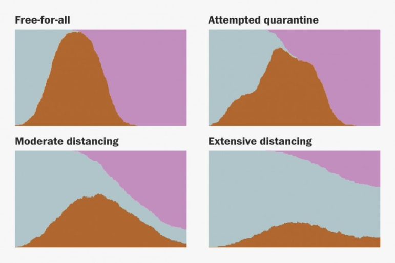
Data Journalism Top 10: Social Distancing, Coronavirus Clusters, Flattening the Curve, Trump Cherry-Picks Data
The novel coronavirus is very much dominating the Twitter chatter among the global data journalism community this week. Our NodeXL #ddj mapping from March 9 to 15 finds The Washington Post simulating different social distancing scenarios and their effects on slowing the spread of COVID-19, South China Morning Post highlighting research into a cluster case, Süddeutsche Zeitung charting the exponential growth in countries with high infection rates, and The New York Times spotlighting the jobs which put workers at the greatest risk of contracting the virus.