
Image: Shutterstock
Tracking US Migrant Detention Data: What Journalists Need to Understand
The number of people held in immigration detention by US Immigration and Customs Enforcement (ICE) essentially flatlined this month. The total detained population — counted as beds occupied at midnight on a single day — barely increased from 47,892 to 47,928 between March 23 and April 16, an increase of 36. There’s more than meets the eye, however. Journalists should not interpret this as evidence that ICE is not arresting and detaining people.
In fact, this gives us an opportunity to level up our understanding of detention data. Let’s dive into it.
While the decline in detention growth is a significant departure from the recent weeks of growth, it should not come as a huge surprise. The graph below shows comparative growth between each ICE detention data release, which emphasizes growth or decline.
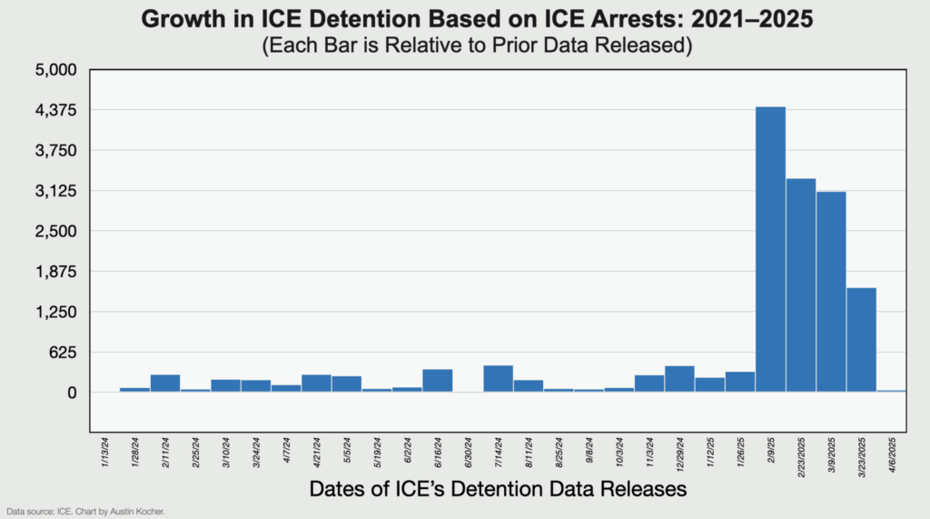
So why is detention growth flat?
One reason is that there are two interrelated trends right now: ICE arrests are going up, while US Customs and Border Protection arrests are going down. They don’t always offset each other exactly and they can increase or decrease independently. But right now, the increase in border militarization and the increase in interior enforcement combine to result in fewer people coming across the border (leading to fewer CBP detentions) and more ICE arrests.
But this doesn’t explain the entire story.
I usually report the total detained population on a single day. But two other numbers are relevant to how we understand the total detained population: book-ins and length of stay.
Think about detention as a flow process: people enter the system, remain in it for some period of time, then are released (either back into the country or through deportation). Total detained population only represents a snapshot of a dynamic system on a single date at midnight. That doesn’t tell us much about the entire flow through the system. To understand that, we would need to know how many people enter the system and how long they stay.
We don’t have perfect data on this, but we do have monthly book-ins and average length of stay. Since January, ICE has definitely increased the number of people it books into detention facilities, and CBP has decreased. This reflects and reaffirms what we already know.
At the same time, the overall average length of stay has decreased since January from around 52 days to around 46 days — and it’s even less for people arrested by ICE who tend to remain in detention for around 40 days. That’s not a huge change, but it is notable.
What this all means is that, yes, ICE might not be able to keep up the pace of its initial surge in arrests and detention. But it also means that people are moving through the detention system more quickly — including due to faster deportations. It is an opportunity to remember that the total detained population statistic is only one way of looking at detention data. In reality, the total number of people detained over a period of time is always higher than the number of detained people on a single day.
To be consistent with my previous posts, here’s one last note about the data. While the initial surge in detention led to a predictable rise in the total and fractional number of non-immigrant violators, the compositional changes seemed to have settled out for the moment. Nothing new to report here, with the proportions of the three levels of criminality remaining steady since late February.
You can find the ICE’s detention data sheet here or download the raw file here. Please get into the data yourself and let me know what you find — or if you have questions about how to make sense of the data. The more the merrier.
An earlier version of this commentary first appeared on Austin Kocher’s Substack page. This post was published by the Journalist’s Resource and is reprinted here with permission.
 Austin Kocher is a professor at Syracuse University who studies the US immigration enforcement system. He can be reached at ackocher@syr.edu.
Data Journalism

Investigating Immigration: Q&A with Caitlin Dickerson

‘Smoke and Lies’: How Visual Forensics Disproved Official Accounts of a Deadly Migrant Center Fire

GIJC23 – When the Data Aren’t There: Building Your Own Datasets

Why Dynamic Data Visualization Is Key to Covering Climate Change

Mapping Data Journalism on Twitter

Finding US Records to Pursue Cross-Border Investigations

Deadly Gaza Aid Sites, Damascus Dossier, Exploiting Sudanese Refugees: 2025’s Best Investigative Stories from the Middle East and North Africa

This work is licensed under a Creative Commons Attribution-NoDerivatives 4.0 International License
Republish our articles for free, online or in print, under a Creative Commons license.
Republish this article
This work is licensed under a Creative Commons Attribution-NoDerivatives 4.0 International License
Read Next
Data Journalism
Why Dynamic Data Visualization Is Key to Covering Climate Change
As calls for change grow louder in light of the latest IPCC (Intergovernmental Panel on Climate Change) report and in the run up to COP26 conference in Glasgow this November, it’s time to focus on how data visualization can help people grasp the challenges that lie ahead.
Data Journalism
Mapping Data Journalism on Twitter
This intriguing graph depicts a network of 989 Twitter users whose tweets from January 13 to 24 contained the hashtag “#ddj” (data-driven journalism). We’re pleased to see that our site gijn.org was among the top domains and our data journalism resource page among the top URLs that appeared. This work is the brainchild of Marc Smith (@marc_smith), a sociologist of “computer-mediated collective action” who, among his varied activities, maps social media networks that reveal “the key people, groups, and topics discussed in a public conversation.”
Investigative Techniques Reporting Tools & Tips
Finding US Records to Pursue Cross-Border Investigations
A guide to some US government data sources that can help foreign and US journalists covering US wars, arms sales, and the impact of US foreign policy.
Editor's Picks News & Analysis
Deadly Gaza Aid Sites, Damascus Dossier, Exploiting Sudanese Refugees: 2025’s Best Investigative Stories from the Middle East and North Africa
Also featuring exposés on sex-trafficking of workers in Dubai, secret mass deportations of Tunisians from the EU, and unlicensed addiction treatment centers in Egypt.