
Reporters for Texty explored what happened inside a 17-story Soviet-era apartment block in Kyiv after a Russian strike cut off heat and electricity. Image: Screenshot, Texty
AI Healthcare Bias, Air Crash Analysis, Cocaine Seizures in Latin America, and Surviving Winter in a Ukraine Apartment Block
Kenya’s public health insurance system promised to make healthcare fairer by using AI to calculate what households could actually afford, but an investigation by Africa Uncensored, Lighthouse Reports, and the Guardian found it was doing the opposite, systematically overcharging the poorest Kenyans while letting the wealthy off lightly. Our roundup of the Top 10 in Data Journalism considers stories from April 20 to May 6, with a New York Times investigation reconstructing the final four minutes of the 2024 Jeju Air disaster — the biggest crash on South Korean soil — that killed 179 people. Bloomberg mapped the physical makeup of US-Israeli strikes on Tehran using radar satellite imagery, Texty followed a single Kyiv apartment block through 37 days without heat or light during the coldest months of the war, and Il Sole 24 Ore charted how Italy now has more pets than children.
How Kenya’s Health Insurance AI Got It Wrong

Image: Screenshot, Africa Uncensored
Kenya’s public health insurance overhaul promised a fairer system, where AI would calculate contributions based on what households could actually afford. Africa Uncensored, Lighthouse Reports, and the Guardian investigated why the poorest Kenyans were being charged more, not less, submitting freedom of information requests to obtain a previously unreported 10-page document detailing the system’s indicators and regression formula, which included floor material, marital status, owning a radio, and 40 other things intended to capture how people live. The team also acquired the 2021 Kenyan Continuous Households Survey — the dataset the model was trained on — from the Kenya National Bureau of Statistics and rebuilt and stress-tested the system, running simulations comparing its income predictions against actual survey data, with independent academic experts reviewing the reconstruction. A dot matrix chart plots 100 real Kenyan households by actual versus AI-predicted income, making the scale of the misclassification visible at a glance. The finding was stark, with the formula containing an in-built bias that systematically over-predicted poor people’s incomes, pushing their contributions higher than they should be, while under-predicting wealthy ones.
Surviving Winter in Ukraine
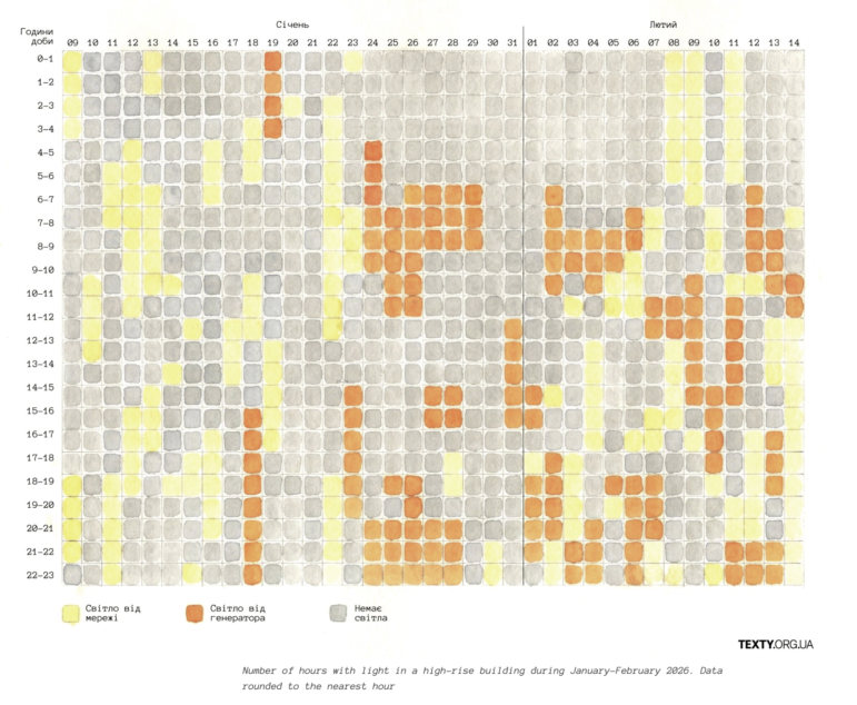
Image: Screenshot, Texty
Russian missile strikes on Ukrainian energy infrastructure plunged millions of people into darkness and sub-zero temperatures during the winter. Texty followed a single 17-story Soviet-era apartment block in Kyiv’s Rusanivka district for 37 days after a strike at a power plant cut off heat, electricity, and water, with temperatures as low as -20 degrees Celsius C (-4 degrees Fahrenheit). Drawing on residents’ group chat logs, photographs, and daily testimony, the team rebuilt the ordeal day by day, scrolling through all 37 days of the crisis, each one illustrated with what went wrong that day, from burnt-out cables to burst pipes and a Shahed drone strike that blew out windows across apartments. An illustrated heat map also plots every hour of electricity the building received across January and February, and interviews describe how residents found improvised solutions to survive, including heating bricks on gas stoves and placing them around their apartments.
Building a British Voter
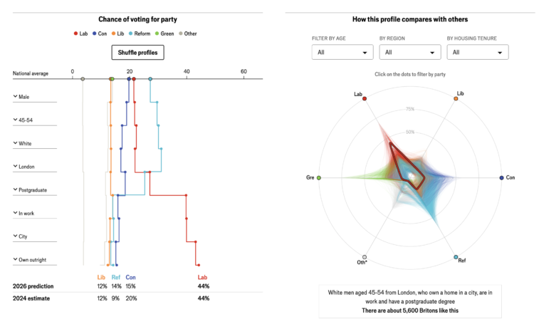
Image: Screenshot, The Economist
UK politics is more fragmented than it has been in a generation, with voters splitting their choices more evenly across parties than at any point in modern political history. The Economist built a statistical model of the British electorate to map exactly who is voting for whom, drawing on around 45,500 individual survey responses collected by pollster More In Common between January and May 2026. The model estimates the probability of any individual voting for one of Britain’s main parties based on eight characteristics: sex, age, ethnicity, region, education, employment, housing type, and urban-rural setting, yielding 275,000 distinct voter profiles in different combinations. An interactive waterfall tool lets readers build their own demographic combination and see projected vote shares, while a radar chart shows how that profile compares against others across the electorate. Updated weekly, the model automatically absorbs new polling averages.
Analyzing Damage of US-Israeli Strikes on Iran
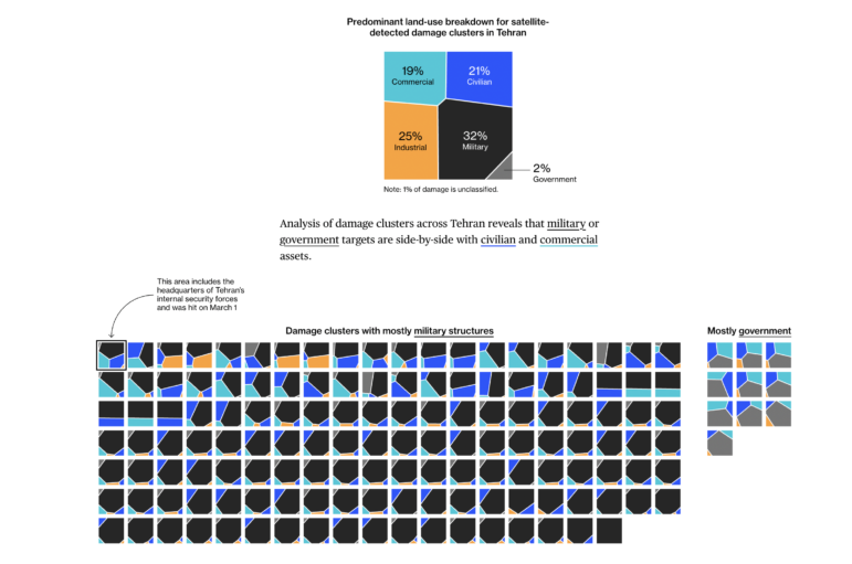
Image: Screenshot, Bloomberg
Bloomberg mapped the makeup of US-Israeli strikes on Iran using radar satellite imagery, cross-referencing damage locations with open source land-use data to determine what kinds of areas were hit. Oregon State University researchers analyzed Copernicus Sentinel-1 radar imagery to identify 4,262 distinct areas of likely structural damage across the country. At least 7,645 buildings in total, including 60 education and 12 health facilities, were damaged. Bloomberg then overlaid four independent land-use datasets, including OpenStreetMap and Overture Maps. A map of Tehran plots damage clusters city-wide, color-coded by predominant land use, while mini treemaps reveal that 32% of the 2,816 buildings hit were linked to the military, but 21% were civilian, with the two routinely sitting side by side.
The Last Moments of Jeju Air Flight 2216
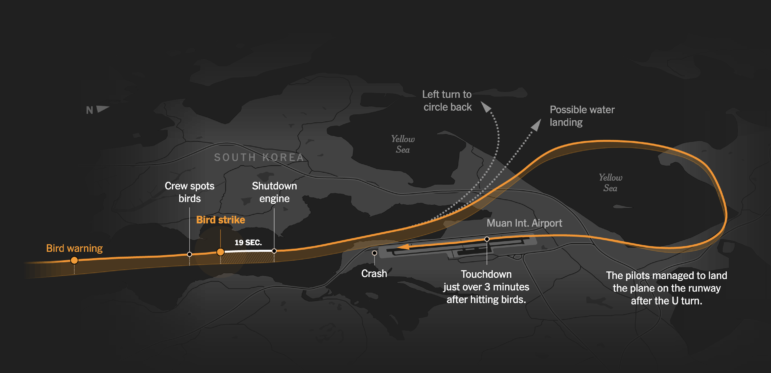
Image: Screenshot, The New York Times
In December 2024, Jeju Air Flight 2216 crashed in South Korea, killing 179 people after a bird strike disabled both engines on final approach — one of the deadliest aviation disasters in years. A New York Times investigation reconstructed the final four-and-a-half minutes of the flight using flight data recorder readings, pilot interviews, and geolocated CCTV and witness footage, traveling to the crash site to measure landmarks on the ground and triangulate the plane’s path where the data recorder cut out. The team then modeled the interior of the Boeing 737 cockpit, annotating instrument readings in real time as the bird strike hit, while annotated flight path diagrams traced each critical decision: the go-around initiated nine seconds after spotting the flock, the engine shutdown was completed without the required call-and-response confirmation, and the belly landing with gear undeployed, which sent the plane into a concrete wall.
In Italy, There Are More Pets Than Children
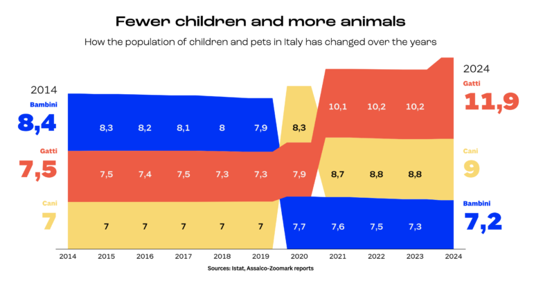
Image: Screenshot, Lab 24 Il Sole 24 Ore
Italy now has more pets than children, with cats and dogs alone outnumbering the country’s under-14 population for the first time. Il Sole 24 Ore’s Lab 24 team visualized what that shift means economically and demographically, drawing on data from Assalco-Zoomark, Eurispes, Istat, and Federconsumatori. A streamgraph tracks the crossover at the heart of the story: as the child population has fallen steadily from 8.4 million in 2014 to 7.2 million in 2024, the number of cats (“gatti” on the chart above) has surged from 7.5 million to 11.9 million, overtaking children (bambini) entirely by 2021. A series of comparative visuals then shows what that shift costs, with the pet food market reaching €3 billion (US$3.3 billion) in 2024, nearly triple the value of the baby food market, while a bubble matrix chart maps how spending on pets has shifted upward over the decade, with the share of owners spending over €200 (US$220) a month growing 10-fold since 2015. The premiumization of pet care now mirrors human medicine, with veterinary specialisms in oncology, cardiology, and geriatrics driving a pharmaceutical market worth over €560 million (US$620 million).
Tracking Cocaine Seizures in Latin America
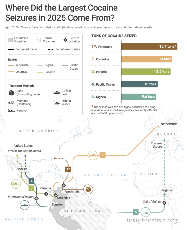
Image: Screenshot, Insight Crime
Cocaine production across Latin America has been climbing steadily in recent years, even as enforcement agencies have ramped up interdiction efforts. InSight Crime tracked official seizure data across every country in Latin America and the Caribbean in 2025, filing public information requests to obtain the most recent government figures available. Reporters broke the analysis into three chapters: production countries, transit zones, and consumer markets. They visualized seizure volumes over three years using line charts, alongside maps plotting how trafficking routes are evolving. The data reveals a trade in flux, where less than half of countries saw seizures rise, as criminal organizations pivot to liquid cocaine to evade modern scanners. While seizure figures alone cannot capture the full scale of the trade, given the lack of data in some countries, the analysis points to a cocaine market that is becoming more innovative and geographically dispersed.
Leaving OPEC
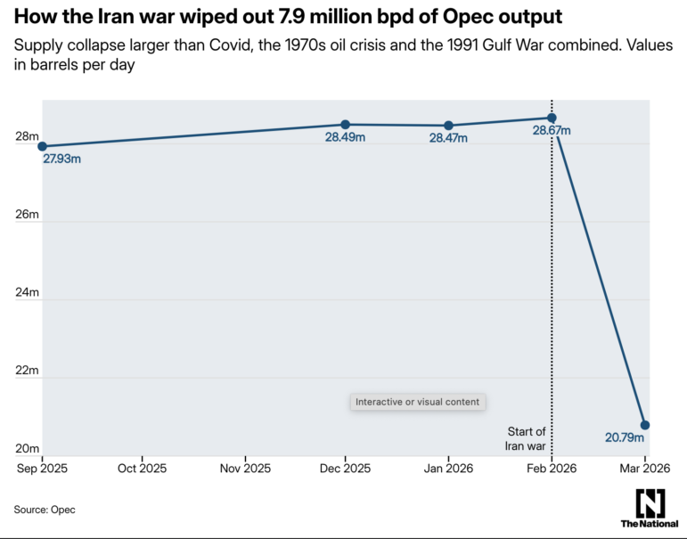
Image: Screenshot, The National
The United Arab Emirates (UAE) has left OPEC after nearly six decades of membership, in one of the most significant shifts in global oil politics in years. The National, based in Abu Dhabi, examined the data behind the decision, mapping long-building tension between the Emirati government’s expanding production capacity and the quotas that increasingly constrained it. A series of line charts tracks the widening gap — the UAE’s target of five million barrels per day by 2027 set against an OPEC+ quota of 3.4 million, meaning it was pumping nearly 30% below capacity. The timing follows the US-Israeli war on Iran, which triggered one of the largest supply shocks in history, with around eight million barrels per day of OPEC output collapsing in March alone, and the UAE’s own production nearly halving.
How India’s Emerging Middle Class Spends Its Money
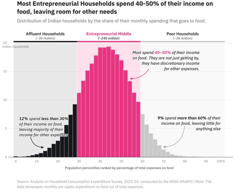
Image: Screenshot, Entrepreneurial Households 360 Report, Revisual Labs
EPIC World Foundation surveyed 5,220 households across 135 districts and 12 states between August and December 2025 to understand how India’s 250 million “entrepreneurial households” — multi-income families sitting between poor and affluent — actually earn, save, borrow, and manage risk. A bell-curve distribution chart tracks asset ownership across 19 items, from mattresses to motorcycles, showing most households own between 9 and 12, placing them in a financially capable middle. A horizontal bar chart then ranks uptake across 35 financial products, exposing a sharp drop-off beyond the basics — while bank transactions and UPI payments are near-universal, fewer than one in five households use mobile banking, health insurance covers just 26%, and mutual funds register at under 2%. The study concludes with a set of concrete recommendations for financial providers, arguing that products need to be built around how these households actually live and earn.
Comparing Popular Similes
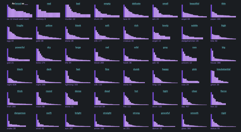
Image: Screenshot, The Pudding
English is full of figurative comparisons, but writers reach for the same ones again and again. The Pudding’s Russell Samora pulled 200,000 similes in the form “as ___ as ___” from tens of thousands of fiction books, using a natural language library to filter out non-figurative uses before running a second pass through three AI models to confirm which comparisons were genuinely metaphorical. An interactive prompt invites readers to complete the simile “my mouth has gone as dry as ___” before revealing where their answer ranks against the data. A series of bar charts then maps the most common nouns for each adjective, where a gentle slope signals a word with genuine range and a single spike signals a cliché. To measure just how locked-in some pairings are, Samora applied the Simpson diversity index: “hell” ranks in the top 10 for 17 different adjectives, making it one of the most versatile nouns in the English language, while “cool as a cucumber” is so dominant that if you were to randomly look at two sentences with “cool as a ___,” there is a 92% chance both say cucumber.
Hanna Duggal is the writer of GIJN’s fortnightly Top 10 in Data Journalism column, and a data journalist at AJ Labs, the data, visual storytelling, and experiments team of Al Jazeera. She has reported on issues such as policing, surveillance, and protests using data, and reported for GIJN on data journalism in the Middle East, investigating algorithms on TikTok, and on using data to investigate tribal lands in the US.

Tech Focus Project

GIJN Reporter’s Guide to Investigating Digital Threats

Investigating Disinformation in the Age of AI

Gabriel Geiger Shares Tips and Tools on Investigating Government Use of AI

Journalism-First Tools to Search Spreadsheet Text, Track Website Changes, and Mine Investigative Resources Through the Years

How to Tell the Stories of People Behind Data Points

How the Hindu Is Embedding AI Into Its Data Journalism

‘True Justice is Years in the Making’: 10 Years on from the Panama Papers

This work is licensed under a Creative Commons Attribution-NoDerivatives 4.0 International License
Republish our articles for free, online or in print, under a Creative Commons license.
Republish this article
This work is licensed under a Creative Commons Attribution-NoDerivatives 4.0 International License
Read Next
GIJN Toolbox
Journalism-First Tools to Search Spreadsheet Text, Track Website Changes, and Mine Investigative Resources Through the Years
In this latest GIJN Toolbox, we highlight three new powerful but easy-to-use investigative tools that have been specifically developed with the needs of data and investigative journalists in mind.
Data Journalism Methodology
How to Tell the Stories of People Behind Data Points
At the NICAR26 data journalism summit, a panel of veteran data reporters shared tips on how to amplify and contextualize data-driven public interest stories with ordinary people at the short end of policy.
Data Journalism
How the Hindu Is Embedding AI Into Its Data Journalism
LLMs are quietly reshaping data journalism workflows at The Hindu, helping reporters process vast document sets, write scripts and build interactive tools.
News & Analysis
‘True Justice is Years in the Making’: 10 Years on from the Panama Papers
A look back at a decade of changes after the Pulitzer-Prize winning exposé sent shockwaves through the offshore world, spawning criminal probes and bringing down governments.