Accessibility Settings

color options

monochrome muted color dark

reading tools

isolation ruler

Posts

3 posts
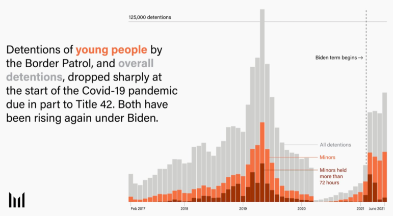
Marshall Project data analysis of child detentions at US border

Data Journalism News & Analysis

Data Journalism Top 10: Child Detentions at US Border, Slave Journeys, Aztec Iconography, Facebook’s ‘Broken Promises’

This week, our DDJ Top 10 looks at The Marshall Project’s analysis of child detention at the US border, the Baltimore Banner’s in-depth story on the city’s vacant housing crisis. Plus, we dive into stories using historical data to investigate how slavery broke apart families, a flight analysis on the new destinations of the Russian elite, and a look at Facebook’s “broken promises.”

Data Journalism News & Analysis

Data Journalism Top 10: Black Sea Blockade, Yemen Airstrikes, Hong Kong Shoebox Housing, Space Garbage

This week, GIJN’s roundup of the best in data journalism features an analysis of the impact of Russia’s Black Sea blockade on the global food chain, a deep dive into the US military’s role in aiding Saudi-led airstrikes in Yemen, and a look at how different forms of inequality affect the lives of residents in Brussels, Belgium.

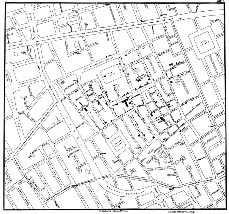
1854 Broad Street Cholera Outbreak Map

Data Journalism

Think You Know Your Data Visualization? Take GIJN’s Quiz to Find Out

From Wikileaks to the FinCEN files, huge stories have made use of data visualizations to engage their readers and simplify complicated topics. But while data journalism is a powerful tool for investigative journalists, the vast possibilities of this world are wasted if reporters cannot effectively communicate the data they have found to the reader. To test your knowledge, GIJN has created an annotated quiz so readers can assess their current knowledge and understand the mistakes we all make while creating data visualizations.