GIJN’s Data Journalism Top 10: UN Votes, Disaster Reporting, Big Data Stories in Small Newsrooms

Step-By-Step Guide for Journalists on the Basics of Google Sheets

Tipsheet for Using Ocean Data in Your Investigations

No Coding Required: A Step-by-Step Guide to Scraping Websites With Data Miner

GIJC23 – The Future of Data Journalism: New Analytical Tools, Data Visualization, and AI
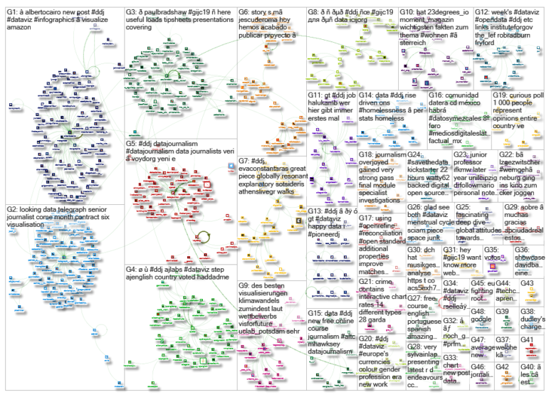
What’s the global data journalism community tweeting about this week? Our NodeXL #ddj mapping from September 30 to Oct 6 finds Al Jazeera Labs analyzing key issues debated and voted at the UN General Assembly since 1946, Datajournalism.com gathering expert advice on data journalism during natural disasters, the Knight Center for Journalism in the Americas offering a free data visualization course in three languages, and Pinar Dag at our own #GIJC19 on how small newsrooms can do big data stories.
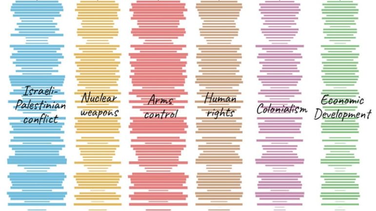
Key Issues at the UN
Every September, leaders worldwide gather at the United Nations General Assembly to examine the biggest issues facing the planet. To understand the key issues debated and voted upon by the UN members states over the decades, Al Jazeera Labs analyzed the voting patterns from 1946 to 2018. Read about their process here.
Data Journalism in Disaster Zones
Datajournalism.com spoke to a group of seasoned data journalists about how to overcome the challenges of deficient data and data unreliability during natural disasters, as well as how to improve data journalism and visualizations when reporting on these disasters.
https://twitter.com/TheKenyanJoshua/status/1174426561342296069
Small Newsroom, Big Data Stories
Trying to do data-driven stories while meeting the demands of working in a small newsroom can seem overwhelming. At the 11th Global Investigative Journalism Conference in Hamburg (#GIJC19), data journalism lecturer Pinar Dag shared strategies on how to overcome the challenges small newsrooms often confront while trying to do data journalism. Her presentation can be found here. More GIJC19 tipsheets here.
Free Data Visualization Course
The Knight Center for Journalism in the Americas is offering a free, six-week, massive open online course titled “Data Journalism and Visualization with Free Tools.” Learn from data visualization experts such as Simon Rogers, Alberto Cairo, and many more about how to find and get data, prepare data, find stories in data, visualize data, and more. The course is offered in English, Spanish, and Portuguese.
Explain Uncertainty
Data visualization expert Alberto Cairo wrote a critique on a piece in The New York Times by MIT Election Lab’s Alexander Agadjanian. In his post, Cairo points out that the graphs in the article lacked explanations of the data’s uncertainty, and he offered a suggestion of captions to improve the visualizations.
Support on Indiegogo: RAWGraphs 2.0
Have you used RAWGraphs before? It is a free and open source software that helps you visualize data in spreadsheets without coding skills. The software is now two years old and the team behind it launched an Indiegogo crowdfunding campaign to fund improvements of the technology behind the app and add a bunch of new features.
The Exodus Project
El Confidencial did a microdata analysis of Spain’s internal and external migration data from 1988 to 2018, based on data from the country’s National Statistics Institute, and then visualized it here. Data on Github.
News Data Journalism vs. Finance Dataviz
Former Bloomberg Businessweek data journalist Toph Tucker shares his observations on the similarities and differences in his transition from making charts for news to making charts for banks.
https://twitter.com/mitch_oneill/status/1180289240795475968
Most Deprived Neighborhood in England
England’s Ministry of Housing, Communities and Local Government revealed that a majority of the most deprived neighborhoods are in the north of the country, with seaside village Jaywick taking the top spot. The statistics were based on levels of income, employment, education, health, and crime as well as housing services and living environment. Data on Github.
Data Journalism Bulletin (in Turkish)
The weekly data bulletin produced by the Data Literacy Association (Veri Okuryazarlığı Derneği) has reached its 50th edition. If you’re doing data journalism in Turkish, you’ll want to subscribe here.
Thanks, once again, to Marc Smith of Connected Action for gathering the links and graphing them. The Top Ten #ddj list is curated weekly.
 Eunice Au is GIJN’s program coordinator. Previously, she was a Malaysia correspondent for Singapore’s The Straits Times, and a journalist at the New Straits Times. She has also written for The Sun, Malaysian Today and Madam Chair.
For a look at Marc Smith’s mapping on #ddj on Twitter, check out this map.
Step-By-Step Guide for Journalists on the Basics of Google Sheets
Tipsheet for Using Ocean Data in Your Investigations
No Coding Required: A Step-by-Step Guide to Scraping Websites With Data Miner
GIJC23 – The Future of Data Journalism: New Analytical Tools, Data Visualization, and AI

This work is licensed under a Creative Commons Attribution-NoDerivatives 4.0 International License
Republish our articles for free, online or in print, under a Creative Commons license.
Republish this article
This work is licensed under a Creative Commons Attribution-NoDerivatives 4.0 International License
Read Next

Data Journalism
Making Trillions Make Sense: How Reuters Visualized the AI Economy
How do you make a trillion dollars feel real to someone who has never seen that much money? Vineet Khare and Mayank Bhatt faced that very challenge for their data-driven investigation into AI investment.

Data Journalism
How the Hindu Is Embedding AI Into Its Data Journalism
LLMs are quietly reshaping data journalism workflows at The Hindu, helping reporters process vast document sets, write scripts and build interactive tools.

Data Journalism
Developing a Data State Of Mind: Key Tips for Editors
Data is woven into how journalists cover everything from local government spending to global climate change patterns, but for editors without a specialist background, it can be daunting.

Data Journalism
2026 Sigma Awards for Data Journalism Open for Entries – Deadline Extended
The Sigma Awards celebrate the best data journalism from around the world. Submissions are now open for data projects published in 2025.